Cem Olcay

42 个库
易于使用的自动布局包装器,围绕 NSLayoutConstraints 来实现。
ruby !use_frameworks pod 'ALKit'
将 ALKit 文件夹复制到您的项目中
初始化自动布局准备好的视图。
swift convenience init (withAutolayout: Bool) { self.init(frame: CGRect.zero) translatesAutoresizingMaskIntoConstraints = false }
swift class func AutoLayout() -> UIView { let view = UIView(frame: CGRect.zero) view.translatesAutoresizingMaskIntoConstraints = false return view }
所有套件的主要功能。包装 addConstraint: 方法来自动布局。
swift public func pin( edge: NSLayoutAttribute, toEdge: NSLayoutAttribute, ofView: UIView?, withInset: CGFloat = 0) { guard let view = superview else { return assertionFailure("view must be added as subview in view hierarchy") } view.addConstraint(NSLayoutConstraint( item: self, attribute: edge, relatedBy: .Equal, toItem: ofView, attribute: toEdge, multiplier: 1, constant: withInset)) }
```
override func viewDidLoad() { super.viewDidLoad()
//设置视图
let box = UIView.AutoLayout() box.backgroundColor = UIColor.greenColor() view.addSubview(box)
let blue = UIView.AutoLayout() blue.backgroundColor = UIColor.blueColor() box.addSubview(blue)
let red = UIView.AutoLayout() red.backgroundColor = UIColor.redColor() box.addSubview(red)
let yellow = UIView.AutoLayout() yellow.backgroundColor = UIColor.yellowColor() box.addSubview(yellow)
//设置约束
box.fill(toView: view)
blue.pinTop(toView: box, withInset: 10) blue.fillHorizontal(toView: box, withInset: 10) blue.pinHeight(90)
red.pinBottom(toView: box, withInset: 10) red.fillHorizontal(toView: box, withInset: 10) red.pinHeight(90)
yellow.pinToTop(ofView: red, withOffset: 10) yellow.pinCenterX(toView: red) yellow.pinSize(width: 50, height: 50) }
```
许可证: MIT
使用闭包在 Swift 中创建 UITableView 的一行代码,拥有强大的闭包功能。
将 BlockTableView.swift 复制到您的项目中。
let table = BlockTableView (frame: self.view.frame, numberOfRowsInSection: { (section) -> Int in return dataSource.count }, cellForRowAtIndexPath: { (tableView, indexPath) -> UITableViewCell in var cell = UITableViewCell (style: .Default, reuseIdentifier: "Identifer")
let current = dataSource[indexPath.row] cell.textLabel.text = current
return cell }, didSelectRowAtIndexPath: { (tableView, indexPath) -> () in let selected = dataSource[indexPath.row] println("(selected) selected")
tableView.deselectRowAtIndexPath(indexPath, animated: true) } )
convenience init(frame: CGRect, numberOfRowsInSection : (section: Int) -> Int, cellForRowAtIndexPath : (tableView: UITableView, indexPath: NSIndexPath) -> UITableViewCell, didSelectRowAtIndexPath : (tableView: UITableView, indexPath: NSIndexPath) -> ())
convenience init(frame: CGRect, numberOfSections : Int, titleForHeaderInSection : (section: Int) -> String, numberOfRowsInSection : (section: Int) -> Int, cellForRowAtIndexPath : (tableView: UITableView, indexPath: NSIndexPath) -> UITableViewCell, didSelectRowAtIndexPath : (tableView: UITableView, indexPath: NSIndexPath) -> ())
convenience init(frame: CGRect, registeredCells : [String: AnyClass], numberOfRows : (section: Int) -> Int, cellForRowAtIndexPath : (tableView: UITableView, indexPath: NSIndexPath) -> UITableViewCell, didSelectRowAtIndexPath : (tableView: UITableView, indexPath: NSIndexPath) -> ())
init(frame: CGRect, registeredCells : [String: AnyClass]?, numberOfSections : Int?, titleForHeaderInSection : ((section: Int) -> String)?, numberOfRowsInSection : (section: Int) -> Int, cellForRowAtIndexPath : (tableView: UITableView, indexPath: NSIndexPath) -> UITableViewCell, didSelectRowAtIndexPath : (tableView: UITableView, indexPath: NSIndexPath) -> ())
UITableViewDelegate/UITableViewDataSource 方法轻松添加更多初始化器。搜索栏实现从未如此简单
func addSearchBar (searchResultTableView tableView: BlockTableView, didSearch: (String)->())
只需创建另一个用于显示结果的 BlockTableView 并在 didSearch 中实现筛选或搜索函数,如下所示:
var filtered: [String]! // 搜索结果数据源
table.addSearchBar(searchResultTableView: BlockTableView (frame: self.view.frame, numberOfRowsInSection: { (section) -> Int in return filtered.count }, cellForRowAtIndexPath: { (tableView, indexPath) -> UITableViewCell in var cell = tableView.dequeueReusableCellWithIdentifier("Cell", forIndexPath: indexPath) as UITableViewCell cell.textLabel?.text = filtered[indexPath.row] return cell }, didSelectRowAtIndexPath: { (tableView, indexPath) -> () in return } ), didSearch: { searchText in filtered = filter (dataSource) { $0.rangeOfString(searchText) != nil } } )
许可证: MIT
用于选择类别的水平或垂直滑动视图。可以添加任何UIView类型的类目项视图。可完全自定义
将 CategorySliderView.h/m 文件复制到您的项目中。
UILabel *category1 = ......
UILabel *category2 = ......
UILabel *category3 = ......
...

CategorySliderView *sliderView = [[CategorySliderView alloc] initWithSliderHeight:60 andCategoryViews:@[category1, category2, category3] categorySelectionBlock:^(UIView *categoryView, NSInteger categoryIndex) {
    UILabel *selectedView = (UILabel *)categoryView;
    NSLog(@""%@" cateogry selected at index %d", selectedView.text, categoryIndex);
}];
[self.view addSubview:sliderView];
您可以添加任意多的项目
UIView *newCategoryView = .....
[sliderView addCategoryView:newCategoryView];
shouldAutoScrollSlider: scrolls to closest category item after dragging ends
shouldAutoSelectScrolledCategory: selects the closest category item after dragging ends
categoryViewPadding: padding between category item views
backgroundImage: background image for slider
许可证: MIT
UIKit工具集,用于快速原型设计和快速开发 https://github.com/cemolcay/CEMKit-Swift/blob/master/README.md
许可证: MIT
使文本居中的通用CATextLayer子类。
使用_frameworks! pod 'CenterTextLayer'
它只是一个普通的CATextLayer子类,使文本居中。像任何CATextLayer一样使用它
let textLayer = CenterTextLayer() textLayer.frame = bounds textLayer.string = "Center Text!"
许可证: MIT
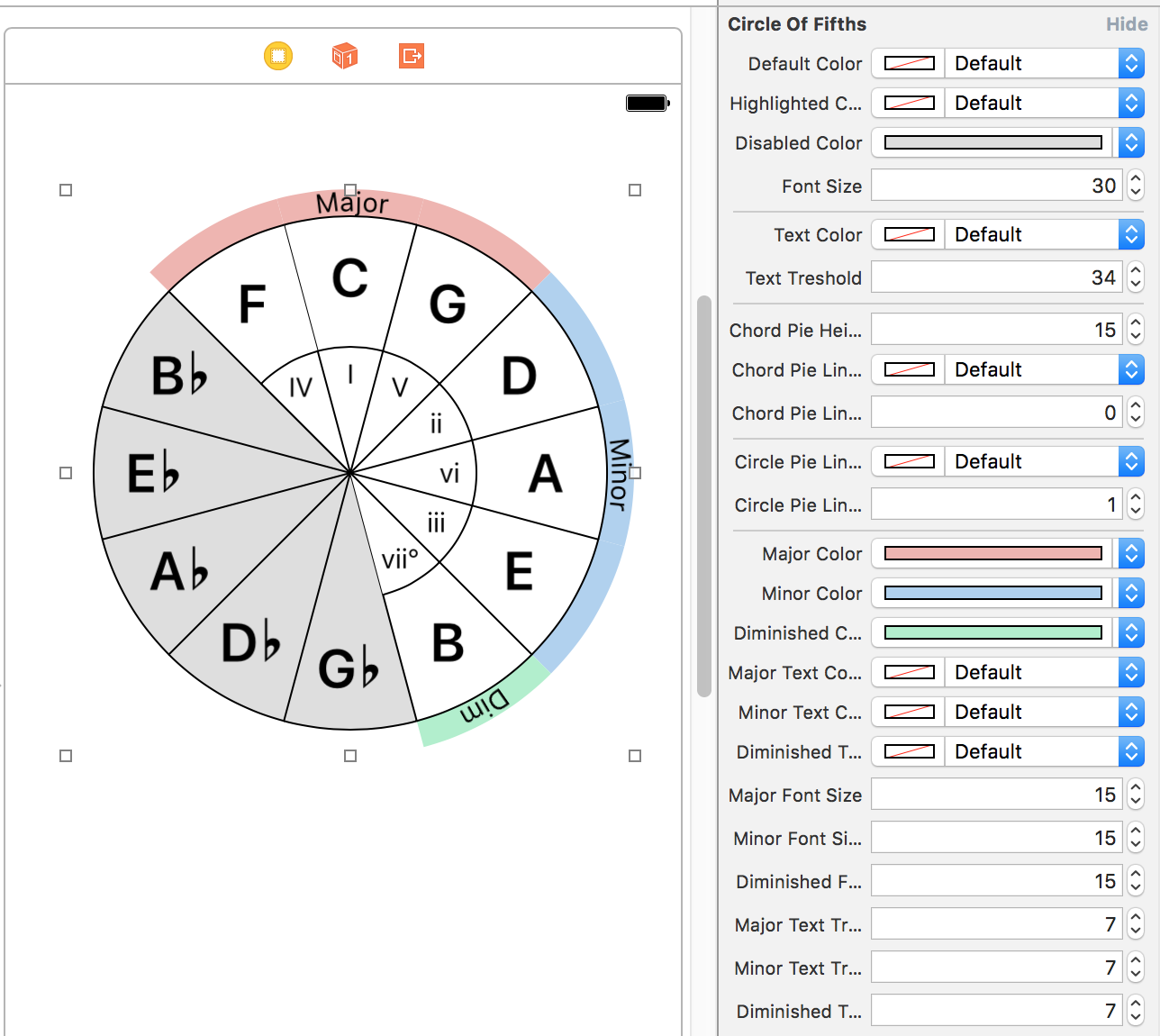
可完全自定义的第五圈实现。
pod 'CircleOfFifths'
为了使用 pods 中的 @IBDesignable 库,您需要在 podfile 中添加此 post installer 脚本。更多信息请参阅 cocoapods issue
post_install do |installer| installer.pods_project.build_configurations.each do |config| config.build_settings['LD_RUNPATH_SEARCH_PATHS'] = ['$(FRAMEWORK_SEARCH_PATHS)'] end end
UIView子类,使用自定义CALayer进行绘图,具有可自定义的@IBInspectable属性。Scale类型的音阶,在任何这个音乐理论库中的音阶。scale参数即可更改音阶和/或圆的音键。许可证: MIT
适用于iOS的调色板网格视图。

ruby pod 'ColorPalette'
从Storyboard或通过代码创建一个ColorPaletteView。将rowCount和columnCount设置为设置调色板网格。(默认值为2x10)。实现delegate和dataSource。
使用此数据源方法填充调色板中的颜色。
func colorPalette(_ colorPalette: ColorPaletteView, colorAt index: Int) -> UIColor?
使用此代理方法通知颜色选择更改。
func colorPalette(_ colorPalette: ColorPaletteView, didSelect color: UIColor, at index: Int)
您还可以观察colorPalette.selectedColor动态属性以创建绑定。
这是一个基本的结构,具有带有其选中或未选中状态的边框、圆角和背景颜色属性
您可以使用colorPalette.paletteItemDisplayOptions属性设置每个属性,或者使用从Storyboard桥接的@IBInspectable属性。

许可证: MIT
一个自定义选择器,允许您在不抬起手指的情况下从自动滚动的菜单中选择选项。
您可以使用@IBDesignable选择器按钮DragMenuPicker,或使用DragMenuView创建自己的选择器,该视图实现了所有选择器逻辑。

pod 'DragMenuPicker'
从Storyboard或通过编程方式创建一个DragMenuPicker。设置其title和items属性以显示在菜单中。设置其didSelectItem属性或实现dragMenuView(_ dragMenuView: DragMenuView, didSelect item: String, at index: Int)委托方法来设置选择后的动作。你也可以设置其direction,水平或垂直,并设置margins以显示屏幕边缘。
swift horizontalDragPicker?.title = "水平选择器" horizontalDragPicker?.items = ["第一项", "第二项", "第三项", "第四项", "其他", "另一项", "项目2", "项目3"] horizontalDragPicker?.direction = .horizontal horizontalDragPicker?.margins = 20 horizontalDragPicker?.menuDelegate = self horizontalDragPicker?.didSelectItem = { item, index in print("(item) selected at index (index)") }
DragMenuPicker显示DragMenuView,其中包含DragMenuItemView,当您触摸选择器时。您从菜单中选择某物后或取消选择并抬起手指离开菜单外,它就会消失。
它们具有高度可定制性。您可以设置applyStyle属性,它将原型菜单和项回调您可以进行样式设计,并将其应用于菜单。
此外,在DragMenuPicker上还有@IBInspectable属性,您可以在Storyboard中设计基本属性。
许可证: MIT
⌨️最简单的iOS自定义键盘生成器!
KeyboardLayoutEngine 主要用于动态地在矩形中以自定义样式轻松布局键盘按钮,但仍然保留了原始键盘的风格。为了提高灵活性,KeyboardLayoutEngine提供:
KeyboardLayout:用于布局具有自定义填充和颜色的行。KeyboardRow:用于布局按钮或另一组KeyboardRow的集合。KeyboardButton:用于在行中渲染按钮。它还提供了灵活的宽度、类型和其他非常有用的API。UIView,并在它们的layoutSubviews函数中处理它们的布局。CGFrame。KeyboardLayoutStyle、KeyboardRowStyle和KeyboardButtonStyle结构体可以处理大部分关于样式的操作。KeyboardLayoutDelegate 用于提供有关按钮按下的信息。DefaultKeyboard,它是原始键盘以外的功能齐全的起始点。``` ruby use_frameworks!
pod 'KeyboardLayoutEngine' ```
``` swift let keyboardLayout = KeyboardLayout( style: DefaultKeyboardLayoutStyle, rows: [ KeyboardRow( style: DefaultKeyboardRowStyle, characters: [ KeyboardButton(type: .Key("Q"), style: DefaultKeyboardKeyButtonStyle), KeyboardButton(type: .Key("W"), style: DefaultKeyboardKeyButtonStyle), KeyboardButton(type: .Key("E"), style: DefaultKeyboardKeyButtonStyle), KeyboardButton(type: .Key("R"), style: DefaultKeyboardKeyButtonStyle), KeyboardButton(type: .Key("T"), style: DefaultKeyboardKeyButtonStyle), KeyboardButton(type: .Key("Y"), style: DefaultKeyboardKeyButtonStyle), KeyboardButton(type: .Key("U"), style: DefaultKeyboardKeyButtonStyle), KeyboardButton(type: .Key("I"), style: DefaultKeyboardKeyButtonStyle), KeyboardButton(type: .Key("O"), style: DefaultKeyboardKeyButtonStyle), KeyboardButton(type: .Key("P"), style: DefaultKeyboardKeyButtonStyle), ] ) ] )
override func viewDidLoad() { super.viewDidLoad() view.addSubview(keyboardLayout) }
override func viewDidLayoutSubviews() { super.viewDidLayoutSubviews() keyboardLayout.setNeedsLayout() } ```
KeyboardLayoutDelegate以获取有关按钮按下的信息。swift @objc public protocol KeyboardLayoutDelegate { optional func keyboardLayoutDidStartPressingButton(keyboardLayout: KeyboardLayout, keyboardButton: KeyboardButton) optional func keyboardLayoutDidPressButton(keyboardLayout: KeyboardLayout, keyboardButton: KeyboardButton) }
swift public enum KeyboardButtonWidth { case Dynamic case Static(width: CGFloat) case Relative(percent: CGFloat) }
.Dynamic,行中的每个按钮都会通过KeyboardRowStyle.buttonPadding和行的总宽度来计算它们的宽度,并计算出有相同按钮填充的相同宽度。swift public enum KeyboardButtonType { case Key(String) case Text(String) case Image(UIImage?) }
Key、Text或Image。Key情况可能对textDocumentProxy.insertText操作有用。Text情况可能对“空格”、“返回”、“ABC”、“123”或包含emoji的任何字符串的按钮有用。Image情况可能对类似“shift”、“退格”、“切换键盘”等的按钮有用。init函数中没有分配值,它将使用其默认值。定义
swift public struct KeyboardLayoutStyle { public var topPadding: CGFloat public var bottomPadding: CGFloat public var rowPadding: CGFloat public var backgroundColor: UIColor }
例子
swift let DefaultKeyboardLayoutStyle = KeyboardLayoutStyle( topPadding: 10, bottomPadding: 5, rowPadding: 13, backgroundColor: UIColor(red: 208.0/255.0, green: 213.0/255.0, blue: 219.0/255.0, alpha: 1))
定义
swift public struct KeyboardRowStyle { public var leadingPadding: CGFloat public var trailingPadding: CGFloat public var buttonsPadding: CGFloat }
例子
swift let DefaultKeyboardRowStyle = KeyboardRowStyle( leadingPadding: 5, trailingPadding: 5, buttonsPadding: 6)
定义
``` swift public struct KeyboardButtonStyle { public var backgroundColor: UIColor public var cornerRadius: CGFloat
// Border public var borderColor: UIColor public var borderWidth: CGFloat
// Shadow public var shadowColor: UIColor public var shadowOpacity: Float public var shadowOffset: CGSize public var shadowRadius: CGFloat public var shadowPath: UIBezierPath?
// Text public var textColor: UIColor public var font: UIFont
// Image public var imageSize: CGFloat?
// Popup public var showsPopup: Bool public var popupWidthMultiplier: CGFloat public var popupHeightMultiplier: CGFloat } ```
例子
swift let DefaultKeyboardDarkImageButtonStyle = KeyboardButtonStyle( backgroundColor: UIColor(red: 180.0/255.0, green: 188.0/255.0, blue: 201.0/255.0, alpha: 1), imageSize: 18, showsPopup: false)
使用KeyboardLayoutEngine的默认iOS键盘实现。
textDocumentProxy与DefaultKeyboardDelegate的整合KeyboardViewController中实现极其简单的实现swift override func viewDidLoad() { super.viewDidLoad() DefaultKeyboardLayoutStyle.backgroundColor = UIColor.redColor() DefaultKeyboardRowStyle.buttonsPadding = 5 defaultKeyboard = DefaultKeyboard() defaultKeyboard.delegate = self view.addSubview(defaultKeyboard) }
KeyboardLayoutStyleKeyboardRowStyleKeyboardRowStyleKeyboardRowStyleKeyboardButtonStyleKeyboardButtonStyleKeyboardButtonStyleKeyboardButtonStyleKeyboardButtonStyleKeyboardButtonStyleKeyboardButtonStyleswift @objc public protocol DefaultKeyboardDelegate { optional func defaultKeyboardDidPressKeyButton(defaultKeyboard: DefaultKeyboard, key: String) optional func defaultKeyboardDidPressSpaceButton(defaultKeyboard: DefaultKeyboard) optional func defaultKeyboardDidPressBackspaceButton(defaultKeyboard: DefaultKeyboard) optional func defaultKeyboardDidPressGlobeButton(defaultKeyboard: DefaultKeyboard) optional func defaultKeyboardDidPressReturnButton(defaultKeyboard: DefaultKeyboard) }
许可证: MIT
创建一个 MaterialCardView
swift let c = MaterialCardView ( x: 10, y: StatusBarHeight + 10, w: ScreenWidth-20) view.addSubview (c)
并开始添加 MaterialCardCell
swift func addHeader (title: String) func addHeader (view: UIView)
swift addCell (text: String, action: (()->Void)? = nil) addCell (view: UIView, action: (()->Void)? = nil) addCell (cell: MaterialCardCell)
swift func addFooter (title: String) func addFooter (view: UIView)
当您添加或删除
MaterialCardCell时,Material Card 将更新其框架大小。这就是您在初始化它时不设置其height值的原因。
许可证: MIT
MIDI Sequencer 可以发送 MIDI 事件到其他应用。基于 AudioKit for iOS 和 macOS 上的 AKSequencer 构建。只需专注于音符即可创建智能 MIDI 定序器乐器。
ruby pod 'MIDISequencer'
MIDISequencer 基于 AudioKit 的 AKSequencer 构建,并使用 MusicTheory 库,专注于音符并支持多个轨道来创建序列。
MIDISequencer 实例。swift let sequencer = MIDISequencer(name: "Awesome Sequencer")
MIDISequencerTrack 并将其添加到定序器的轨道中。swift let track = MIDISequencerTrack( name: "Track 1", midiChannel: 1)
MIDISequencerStep 添加到轨道的 steps 中。swift track.steps = [ MIDISequencerStep( note: Note(type: .c, octave: 4), noteValue: NoteValue(type: .quarter), velocity: .standard(100)), MIDISequencerStep( note: Note(type: .d, octave: 4), noteValue: NoteValue(type: .quarter), velocity: .standard(100)), MIDISequencerStep( note: Note(type: .e, octave: 4), noteValue: NoteValue(type: .quarter), velocity: .standard(100)), MIDISequencerStep( note: Note(type: .f, octave: 4), noteValue: NoteValue(type: .quarter), velocity: .standard(100)), ]
``` MIDISequencerStep( chord: Chord(type: .maj, key: .c), octave: 4, noteValue: NoteValue(type: .quarter), velocity: .standard(60))
MIDISequencerStep( notes: [Note(type: .c, octave: 4), Note(type: .d, octave: 4)], octave: 4, noteValue: NoteValue(type: .quarter), velocity: .standard(60))
MIDISequencerStep( notes: Chord(type: .maj, key: .c).notes(octave: 4) + [Note(type: .c, octave: 4), Note(type: .d, octave: 4)], noteValue: NoteValue(type: .quarter), velocity: .standard(60)) ```
isMuted 属性设置为 true 以静音任何 MIDISequencerStep。许可证: MIT
可定制的 MIDI 或音频相关数据的度量编辑时间表网格。

pod 'MIDITimeTableView'
以编程方式或从 storyboard 中创建 MIDITimeTableView 并实现其 MIDITimeTableViewDataSource 和 MIDITimeTableViewDelegate 方法。
您需要一个数据对象来存储每一行及其单元格数据。
swift var rowData: [MIDITimeTableRowData] = [ MIDITimeTableRowData( cells: [ MIDITimeTableCellData(data: "C7", position: 0, duration: 4), MIDITimeTableCellData(data: "Dm7", position: 4, duration: 4), MIDITimeTableCellData(data: "G7b5", position: 8, duration: 4), MIDITimeTableCellData(data: "C7", position: 12, duration: 4), ], headerCellView: HeaderCellView(title: "Chords"), cellView: { cellData in let title = cellData.data as? String ?? "" return CellView(title: title) }), ]
MIDITimeTableViewDataSource 与 UITableViewDataSource 或 UICollectionViewDataSource API 很相似。只需提供行数据、行数、拍号,您就可以开始使用了。
``` swift func numberOfRows(in midiTimeTableView: MIDITimeTableView) -> Int { return rowData.count }
func timeSignature(of midiTimeTableView: MIDITimeTableView) -> MIDITimeTableTimeSignature { return MIDITimeTableTimeSignature(beats: 4, noteValue: .quarter) }
func midiTimeTableView(_ midiTimeTableView: MIDITimeTableView, rowAt index: Int) -> MIDITimeTableRowData { let row = rowData[index] return row }
您可以自定义小节数、网格、每个表头和数据单元格。查看示例项目。
MIDITimeTableCellView 是可编辑的,您可以在网格中移动它们,调整它们的持续时间或长按以打开删除菜单。此外,您需要创建子类来自定义自己的数据。
您可以通过设置 minMeasureWidth 和 maxMeasureWidth 来设置时间表的缩放级别。
许可证: MIT
一个包含 Swift 枚举中的 Note、Interval、Scale 和 Chord 表示的音乐理论库。
pod 'MusicTheorySwift'
MusicTheory 提供了许多基本的枚举和结构体,您可以定义几乎任何相关于音乐的数据。最重要是 Notes、Scale 和 Chord。
NoteType 和 NoteNoteType 枚举中定义的音符。NoteType 和八度来创建 Note。Note。swift let d: NoteType = .d let c = Note(type: .c, octave: 0)
IntervalIntegerLiteral,您可以在这些枚举间、音符或音符类型间进行加减。ScaleType 和 ScaleScaleType 枚举定义了许多现成的音阶。ScaleType.custom(intervals: [Interval], description: String) 创建自定义音阶类型。Scale 使用音阶类型和根音定义音阶。swift let c: NoteType = .c let maj: ScaleType = .major let cMaj = Scale(type: maj, key: c)
ChordType 和 ChordChordType 是一个包含 ChordPart 的结构体,它们是和弦的构建块。ChordType 定义任何存在的和弦。ChordPart 协议的结构体。Chord 使用类型和根音定义和弦。swift let m13 = ChordType( third: .minor, seventh: .dominant, extensions: [ ChordExtensionType(type: .thirteenth) ]) let cm13 = Chord(type: m13, key: .c)
Tempo 和 TimeSignatureTempo 是一个辅助结构体,用于在音乐应用中定义时间。TimeSignature 表示每小节的拍子数和每拍的 NoteValue。NoteValue 计算任何节奏下的音符时值。您可以在 MusicTheoryTests 目标中找到单元测试。按 ⌘+U 运行测试。
许可证: MIT
https://github.com/cemolcay/PullToRefreshCoreText/blob/master/README.md
许可证: MIT
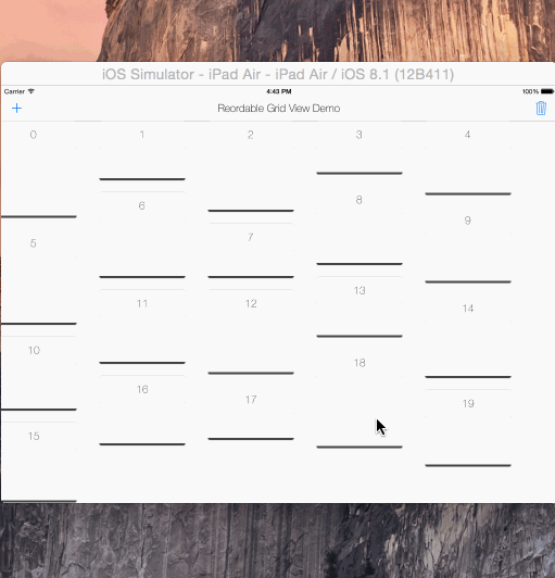
使用 Swift 实现的可重排网格视图解决方案。它是 UIScrollView 子类,不是 collection view 布局。通过项目宽度自动设置水平项间距。因此,项必须是固定宽度。同时也会自动设置其内容大小。如果你在方向改变后调用 gridView?.invalidateLayout(),它将根据新的方向布局网格。
将 ReorderableGridView.swift 拷贝并粘贴到你的项目中。
  gridView = ReorderableGridView(frame: self.view.frame, itemWidth: 180, verticalPadding: 20)
  self.view.addSubview(gridView!)
网格视图就绪!
现在你可以添加 ReorderableView 实例了
  let itemView = ReorderableView (x: 0, y: 0, w: 180, h: 250)
  ...
  gridView?.addReorderableView(itemView)

  // or
  let pos = GridPosition (x: 0, y: 1)
  gridView?addReorderableView (itemView, gridPosition: pos)
或者移除它们
gridView?.removeReorderableViewAtGridPosition(GridPosition (x: 0, y: 0))

// or
gridView?.removeReorderableView (itemView)
设计提示 视图本身没有任何边距填充。它使用所有框架宽度来计算每行可以容纳多少个
ReorderableView以及它们在水平方向上的填充。列之间的填充(即垂直填充)可以在初始化方法中设置,默认为 10。你可以有一个容器视图,并在使用有边距的网格时使用类似CGRectInset (containerView.frame, marginX, marginY)。
  var reorderable : Bool = true
  var draggable : Bool = true
  var draggableDelegate: Draggable?
如果你想使网格可编辑,则设置它们
Draggable 协议
func didDragStartedForView (reorderableGridView: ReordableGridView, view: ReordableView)
func didDraggedView (reorderableGridView: ReordableGridView, view: ReordableView)
func didDragEndForView (reorderableGridView: ReordableGridView, view: ReordableView)
如果你想访问网格中拖拽操作的信息,请设置 gridView.draggableDelegate = self 并实现 Draggable 协议函数。这可以用于多网格布局。示例包括在演示的第二标签页中。
许可证: MIT
一个简单的对象,用于向你的 CALayer 或 UIView 添加/移除阴影。你不再需要逐行定义或编辑所有阴影属性。
ruby use_frameworks! pod 'Shadow'
swift // 创建默认阴影 let shadow = Shadow() // 添加阴影 view.applyShadow(shadow: shadow) // 移除阴影 view.applyShadow(shadow: nil)
许可证: MIT
一个针对 iOS 的设备特定 UITraitCollection 辅助工具,用于检测分屏视图。

use_frameworks! pod 'SizeClasser'
SizeClasser 是一个 OptionSet 类型结构体。你可以使用你的 viewController 的 traitCollection 属性来初始化它,以确定当前设备的特定方向和分屏视图状态。
/// 屏幕高度大于宽度。所有设备的纵向模式。public static let portrait = SizeClasser(rawValue: 1 << 0) /// 屏幕宽度大于高度。所有设备的横向模式。public static let landscape = SizeClasser(rawValue: 1 << 1) /// iPhone 设备的纵向模式。public static let iPhonePortrait = SizeClasser(rawValue: 1 << 2) /// iPhone 设备的横向模式。public static let iPhoneLandscape = SizeClasser(rawValue: 1 << 3) /// iPad 设备的纵向模式。public static let iPadPortrait = SizeClasser(rawValue: 1 << 4) /// iPad 设备的横向模式。public static let iPadLandscape = SizeClasser(rawValue: 1 << 5) /// iPad 设备的 1/3 分屏模式。public static let iPadSplitOneThird = SizeClasser(rawValue: 1 << 8) /// iPad 设备的 1/2 分屏模式。public static let iPadSplitHalf = SizeClasser(rawValue: 1 << 9) /// iPad 设备的 2/3 分屏模式。public static let iPadSplitTwoThird = SizeClasser(rawValue: 1 << 10)
例如,如果你想检测横向模式下的 iPad 分屏视图 1/3,只需
guard let trait = SizeClasser(traitCollection: traitCollection ?? super.traitCollection) else { return } if trait.contains([.iPadLandscape, .iPadSplitOneThird]) { // 你在使用 iPad,横向模式,1/3 分屏视图模式 if SizeClasser.isiPadPro { // 你在使用 12.9" iPad Pro } else { // 你在使用常规 iPad / iPad mini } }
你也可以使用 SizeClasser.isiPadPro 来检测 12.9" iPad Pro,如果你想更具体地对视图进行布局。
traitCollectionDidChange:previousTraitCollection 函数的说明这个函数只在 traitCollection 发生变化时调用。如果你在使用 iPad,无论是在纵向还是横向模式下,它不会从 1/3 分屏视图转换为 2/3 分屏视图。iOS 将它们都计算为 紧凑宽度常规高度 模式。因此,我建议使用 viewDidLayoutSubviews: 函数来特定地检测分屏视图的变化。 
许可证: MIT
具有伸缩性和透视顶视图的uiscrollview
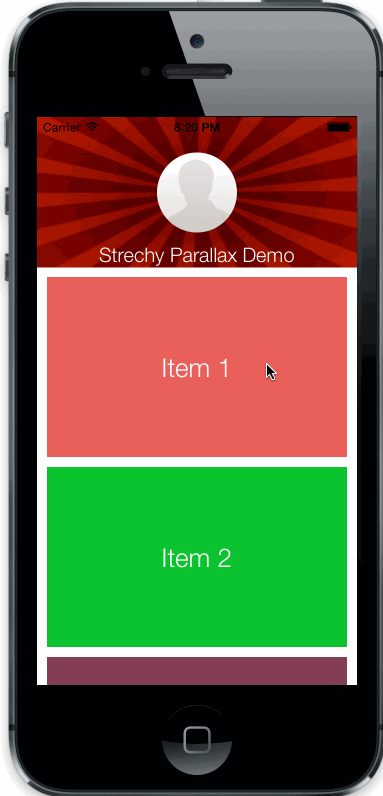
将StrechyParallaxScrollView.h/m文件复制到您的项目中。
//create the top view
UIView *topView = [UIView new];
...

//create scroll view with top view just created
StrechyParallaxScrollView *strechy = [[StrechyParallaxScrollView alloc] initWithFrame:self.view.frame andTopView:topView];

//add it to your controllers view
[self.view addSubview:strechy];
CGFloat parallaxWeight: 顶视图的透视速度
BOOL strechs: 启用/禁用伸缩行为(默认启用)
BOOL parallax: 启用/禁用透视行为(默认启用)
许可证: MIT
无痛苦的自定义过渡。容易扩展,容易设置,只需关注动画。
将TransitionManager.swift复制到您的项目中。
TransitionManager对象。TransitionManagerAnimation初始化它。transitioningDelegate。``` swift
var transition: TransitionManager!

override func viewDidLoad() {
   super.viewDidLoad()

   transition = TransitionManager (transitionAnimation: FadeTransitionAnimation())
   navigationController?.delegate = transition
}
```
创建TransitionManagerAnimation的子类
``` swift class FadeTransitionAnimation: TransitionManagerAnimation {
}
```
TransitionManagerAnimation类实现了TransitionManagerDelegate协议。
``` swift
protocol TransitionManagerDelegate {

    func transition (
        container: UIView,
        fromViewController: UIViewController,
        toViewController: UIViewController,
        duration: NSTimeInterval,
        completion: ()->Void)

    var interactionTransitionController: UIPercentDrivenInteractiveTransition? { get set }
}
```
对于过渡动画,我们应该重写transition函数,并在其中编写我们自己的动画。
``` swift
class FadeTransitionAnimation: TransitionManagerAnimation {
override func transition (
    container: UIView,
    fromViewController: UIViewController,
    toViewController: UIViewController,
    duration: NSTimeInterval,
    completion: ()->Void) {

        let fromView = fromViewController.view
        let toView = toViewController.view

        container.addSubview(toView)
        toView.alpha = 0

        UIView.animateWithDuration(
            duration,
            animations: {
                toView.alpha = 1
            },
            completion: { finished in
                completion ()
        })
}
}
```
一个重要部分是必须调用completion(),因为TransitionManager在它被调用后完成过渡。
创建一个TransitionManagerAnimation子类,并初始化一个带有UINavigationController参数的初始化器。
向它的view添加一个滑动手势
``` swift class LeftTransitionAnimation: TransitionManagerAnimation {
    var navigationController: UINavigationController!

    init (navigationController: UINavigationController) {
        super.init()

        self.navigationController = navigationController
        self.navigationController.view.addGestureRecognizer(UIPanGestureRecognizer (target: self, action: Selector("didPan:")))
    }

}
```
我们将在TransitionManagerDelegate中的手势处理程序中更新interactionTransitionController变量。
``` swift func didPan (gesture: UIPanGestureRecognizer) { let percent = gesture.translationInView(gesture.view!).x / gesture.view!.bounds.size.width
    switch gesture.state {
    case .Began:
        interactionTransitionController = UIPercentDrivenInteractiveTransition()
        navigationController.popViewControllerAnimated(true)

    case .Changed:
        interactionTransitionController!.updateInteractiveTransition(percent)

    case .Ended:
        if percent > 0.5 {
            interactionTransitionController!.finishInteractiveTransition()
        } else {
            interactionTransitionController!.cancelInteractiveTransition()
        }
        interactionTransitionController = nil

    default:
        return
    }
}
```
交互过渡有3部分:* 在手势(交互)开始时初始化interactionTransitionController并弹出或推送导航控制器。* 计算手势变化时的percent并使用该百分数通过updateInteractiveTransition:更新。* 当手势结束时,决定过渡是否完成,并通过finishInteractiveTransition ()和cancelInteractiveTransition ()向interactionTransitionController提供信息。
TransitionManager设置您可以创建一个TransitionManagerAnimation容器枚举,并给它所有的动画
swift enum TransitionManagerAnimations { case Fade case Left }
编写一个函数,返回枚举中的正确过渡动画
``` swift enum TransitionManagerAnimations { case Fade case Left (UINavigationController)
    func transitionAnimation () -> TransitionManagerAnimation {
        switch self {
        case .Fade:
            return FadeTransitionAnimation()

        case .Left (let nav):
            return LeftTransitionAnimation(navigationController: nav)

        default:
            return TransitionManagerAnimation()
        }
    }
}
```
扩展TransitionManager并编写一个新的初始化方法如下
``` swift
extension TransitionManager {

    convenience init (transition: TransitionManagerAnimations) {
        self.init (transitionAnimation: transition.transitionAnimation())
    }
}
```
现在您可以在视图控制器中创建TransitionManager,如下所示
swift transition = TransitionManager (transition: .Left(navigationController!)) navigationController?.delegate = transition
许可证: MIT
一个容器视图控制器,左和右抽屉可以通过滑动手势在tvOS中控制。受zova tvOS应用启发。
shrinks = false
shrinks = true
ruby gem 'TVOSSlideViewController'
TVOSSlideViewController的子类,并将您的视图控制器的类设置为IB中的子类。TVOSSlideViewController的@IBInspectable属性,而无需触摸代码。setup(contentViewController:)函数以设置内容视图。与分屏实现不同,您可以直接使用下面的方式初始化 TVOSSlideViewController:
swift public init(contentViewController: UIViewController, leftView: UIView?, rightView: UIView?)
TVOSSlideViewConroller 的控制协议。amount: CGFlaot 返回抽屉的可见范围,范围在 0-1 之间,以便更容易实现对动画的抽取。swift @objc public protocol TVOSSlideViewControllerDelegate { optional func slideViewControllerDidBeginUpdateLeftDrawer(slideViewController: TVOSSlideViewController) optional func slideViewControllerDidBeginUpdateRightDrawer(slideViewController: TVOSSlideViewController) optional func slideViewControllerDidUpdateLeftDrawer(slideViewController: TVOSSlideViewController, amount: CGFloat) optional func slideViewControllerDidUpdateRightDrawer(slideViewController: TVOSSlideViewController, amount: CGFloat) optional func slideViewControllerDidEndUpdateLeftDrawer(slideViewController: TVOSSlideViewController, amount: CGFloat) optional func slideViewControllerDidEndUpdateRightDrawer(slideViewController: TVOSSlideViewController, amount: CGFloat) optional func slideViewControllerDidSelectLeftDrawer(slideViewController: TVOSSlideViewController) optional func slideViewControllerDidSelectRightDrawer(slideViewController: TVOSSlideViewController) }
许可证: MIT
为显示活动指示器而对 Apple Watch 的 WKInterfaceImage 和 WKInterfaceGroup 扩展。
ruby target 'your_watch_extension_target' platform :watchos, 2.0 pod 'WatchActivityIndicator' end
在任何 WKInterfaceImage 或 WKInterfaceGroup 实例上调用 startActivityIndicator 和 stopActivityIndicator 函数以执行默认活动指示器。
swift // start imageView?.startActivityIndicator() group?.startActivityIndicator() // stop imageView?.stopActivityIndicator() group?.stopActivityIndicator()
可以设置自定义动画序列和持续时间的 startActivityIndicator 的参数。
swiftimageView?.startActivityIndicator( imageNamed: "CustomAnimation", animationRange: NSMakeRange(0, frameCount), duration: customAnimationDuration)
许可证: MIT
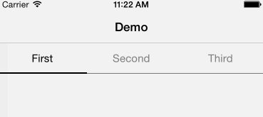
用 Swift 编写的类似 Android 的分段控制器。完全可自定义。
将 YSSegmentedControl.swift 拷贝并粘贴到项目文件中
ruby use_frameworks! pod 'YSSegmentedControl'
使用框架和日志创建 YSSegmentedControl,并设置框架和日志初始化
``` swift let segmented = YSSegmentedControl( frame: CGRect( x: 0, y: 64, width: view.frame.size.width, height: 44), titles: [ "First", "Second", "Third" ], action: { control, index in println ("segmented did pressed (index)") })
```
swiftlet segmented = YSSegmentedControl( frame: CGRect( x: 0, y: 64, width: view.frame.size.width, height: 44), titles: [ "First", "Second", "Third" ])
配置代理,一切就可以开始了!
swiftsegmented.delegate = self
``` swift @objc protocol YSSegmentedControlDelegate { optional func segmentedControlWillPressItemAtIndex (segmentedControl: YSSegmentedControl, index: Int) optional func segmentedControlDidPressedItemAtIndex (segmentedControl: YSSegmentedControl, index: Int) }
```
``` swift struct YSSegmentedControlAppearance {
var backgroundColor: UIColor var selectedBackgroundColor: UIColor
var textColor: UIColor var font: UIFont
var selectedTextColor: UIColor var selectedFont: UIFont
var bottomLineColor: UIColor var selectorColor: UIColor
var bottomLineHeight: CGFloat var selectorHeight: CGFloat } ```
默认外观是
``` swift appearance = YSSegmentedControlAppearance(
backgroundColor: UIColor.clearColor(), selectedBackgroundColor: UIColor.clearColor(),
textColor: UIColor.grayColor(), font: UIFont.systemFontOfSize(15),
selectedTextColor: UIColor.blackColor(), selectedFont: UIFont.systemFontOfSize(15),
bottomLineColor: UIColor.blackColor(), selectorColor: UIColor.blackColor(),
bottomLineHeight: 0.5, selectorHeight: 2) ```
可以通过以下方式修改外观:
``` swift segmented.appearance = YSSegmentedAppearance (...)
// 或者
segmented.appearance.titleColor = ... ```
许可证: MIT