Wakup SDK 库

原生的适用于 Wakup 平台 的 iOS SDK。
安装
要开始使用 Wakup,您需要在您的 iOS 应用程序中集成 Wakup SDK。如果您已安装 CocoaPods,可以通过执行以下操作打开示例项目:
pod try Wakup
这将打开项目,其中所有依赖项都已安装并准备好执行。
使用 CocoaPods
CocoaPods 是安装 Wakup SDK 最简单、最易维护的方式。如果您正在使用 CocoaPods(您应该这样做),请按照以下步骤操作:
-
在您的
Podfile中添加对 Wakup pod 的引用。pod 'Wakup' -
通过在命令行中执行以下操作安装 pods
pod install
基本Wakup SDK集成
基本集成包括启动Offer模块所需的一切,只需付出最少努力。
导入模块
如果您使用CocoaPods安装了Wakup SDK,您必须向所有访问任何Wakup类的文件导入Wakup模块。
import Wakup设置Wakup SDK
为了访问Wakup功能,必须在您的应用程序代理的application: didFinishLaunchingWithOptions:方法中设置WakupManager。
// Setup Wakup SDK with API Key
WakupManager.manager.setup("WAKUP_API_KEY")将WAKUP_API_KEY 替换为app.wakup.net中您应用程序的配置值。必须在显示任何Wakup视图控制器之前调用setup方法。
设置用户别名
要向服务器报告用户别名(或用户标识符),可以使用setAlias方法。
WakupManager.manager.setAlias("[email protected]".lowercased())默认情况下,用户别名是区分大小写的。如果您的别名不区分大小写,则可以将它们小写以防止出现大小写问题。
显示根Wakup控制器
配置完毕后,您可以在应用程序的任何地方显示Offer列表控制器。Wakup通过WakupManager实例的rootController方法提供对根控制器的访问。您可以将此控制器推送到任何UINavigationController。
// Obtain Wakup root controller
let wakupController = WakupManager.manager.rootController()
// Enable animation zoom-in and zoom-out transitions
navigationController.delegate = NavigationControllerDelegate()
// Present the Wakup root controller in the current navigation controller
navigationManager.pushViewController(wakupController, animated: true)
注意,Wakup需要一个透明的导航栏才能正确显示。
使用嵌套导航控制器
Wakup SDK 还提供了自己的 UINavigationController,该控制器已预配置动画代理,以简化其他呈现形式。可以通过调用 WakupManager 实例的 rootNavigationController 方法来获取。
// Obtain Wakup root navigation controller
let wakupController = WakupManager.manager.rootNavigationController()
// Present the Wakup root navigation controller modally
presentViewController(wakupController, animated: true, completion: nil)
Wakup 控制器将自动检测其是否以模态形式呈现,并将关闭按钮添加到导航栏中。
定制化
默认的 Wakup 集成看起来像这样


大多数应用程序的颜色、字体和图标都很容易进行定制。如果未定制,它们将以 Wakup 的默认外观和感觉出现。
自定义颜色
Wakup SDK 提供了一些使用 WakupAppearance 类进行外观配置的便捷方法。为了进行微调,大多数组件颜色可以使用 UIAppearance 代理进行配置,就像原生组件的定制一样。这种定制必须在呈现任何 Wakup 控制器之前应用。
主题和次要主题颜色
为了使颜色定制更简单,Wakup 提供了一种便捷方法,使用主主题颜色和可选的次要主题颜色来改变整个应用程序的颜色。
它将使用派生颜色(相同颜色的深色或浅色版本)为应用程序着色。如果颜色是浅色,则将使用较深的颜色作为对比色,反之亦然。此对比色也可以作为参数传递。
例如,这个调用
WakupManager.appearance.setTint(mainColor: UIColor(fromHexString: "#5788a9"))会产生以下着色的结果


如果您需要,您可以逐个配置组件。
导航栏
可以使用与任何其他iOS应用程序类似的UINavigationBar外观代理来自定义导航栏。图标和按钮将采用导航栏的tintColor属性来自定义它们。

let navBarColor = UIColor(red:0.26, green:0.07, blue:0.25, alpha:1)
let tintColor = UIColor(red:0.56, green:0.38, blue:0.57, alpha:1)

// Using convenience method
WakupManager.appearance.setNavigationBarTint(navBarColor: navBarColor, tintColor: tintColor)

// Using UIAppearance proxy
UINavigationBar.appearance().barTintColor = navBarColor
UINavigationBar.appearance().tintColor = tintColor
UINavigationBar.appearance().titleTextAttributes = [
    NSAttributedStringKey.foregroundColor: tintColor
]
NavBarIconView.appearance().iconColor = tintColor
分类和公司筛选栏
主场景视图中顶部定位的分类和公司筛选可以通过使用不同元素的外观代理来自定义。对于自定义背景滚动视图的颜色,可以使用CategoryFilterView和CompanyFilterView类。可以使用CategoryFilterButton和CompanyFilterButton自定义分类和公司按钮,最后,可以使用CompanyFilterIndicatorView来自定义小的选择指示器。

let backgroundColor = UIColor(red:0.26, green:0.15, blue:0.26, alpha:1)
let buttonColor = UIColor(red:0.56, green:0.38, blue:0.57, alpha:1)

// Using convenience method
WakupManager.appearance.setCategoryFilterTint(backgroundColor: backgroundColor, buttonColor: buttonColor)

// Using UIAppearance proxy
CategoryFilterButton.appearance().setTitleColor(buttonColor, for: [])
CategoryFilterButton.appearance().setTitleColor(.white, for: .selected)
CategoryFilterView.appearance().backgroundColor = backgroundColor
CompanyFilterIndicatorView.appearance().iconColor = backgroundColor
CompanyFilterView.appearance().backgroundColor = .white
优惠视图
除了修改列表和详细信息的绿色折扣标签的DiscountTagView外,还可以使用CollectionViewCell外观代理来自定义优惠级联视图。

let titleColor = UIColor.blackColor()
let descriptionColor = UIColor(white: 0.33, alpha: 1)
let detailsColor = UIColor(white:0.56, alpha:1)

CouponCollectionViewCell.appearance().storeNameTextColor = titleColor
CouponCollectionViewCell.appearance().descriptionTextColor = descriptionColor
CouponCollectionViewCell.appearance().distanceTextColor = detailsColor
CouponCollectionViewCell.appearance().distanceIconColor = detailsColor
CouponCollectionViewCell.appearance().expirationTextColor = detailsColor
CouponCollectionViewCell.appearance().expirationIconColor = detailsColor

let tagColor = UIColor(red:0.5, green:0.59, blue:0.1, alpha:1)
// Using convenience method
WakupManager.appearance.setDiscountTagTint(tagColor)

// Using UIAppearance proxy
DiscountTagView.appearance().backgroundColor = tagColor
DiscountTagView.appearance().labelColor = .white
优惠快速操作
优惠视图按下几秒后会显示快速操作。可以使用ContextItemView外观代理来自定义。

let quickActionColor = UIColor(red:0.56, green:0.39, blue:0.56, alpha:1)
let quickActionHighlightedColor = UIColor(red:0.7, green:0.42, blue:0.71, alpha:1)

// Using convenience method
WakupManager.appearance.setQuickActionsTint(quickActionColor, secondaryColor: quickActionHighlightedColor)

// Using UIAppearance proxy
ContextItemView.appearance().backgroundColor = quickActionColor
ContextItemView.appearance().highlightedBackgroundColor = quickActionHighlightedColor
ContextItemView.appearance().iconColor = UIColor.whiteColor()
ContextItemView.appearance().highlightedIconColor = UIColor.whiteColor()
ContextItemView.appearance().borderColor = UIColor.whiteColor()
优惠详情
可以使用CouponDetailHeaderView外观代理来自定义优惠详细信息视图。绿色标签可以使用DiscountTagView自定义,并与上面描述的主要优惠视图共享外观。

let titleColor = UIColor.blackColor()
let descriptionColor = UIColor(white: 0.33, alpha: 1)
let detailsColor = UIColor(white:0.56, alpha:1)

CouponDetailHeaderView.appearance().companyNameTextColor = titleColor
CouponDetailHeaderView.appearance().storeAddressTextColor = detailsColor
CouponDetailHeaderView.appearance().storeDistanceTextColor = detailsColor
CouponDetailHeaderView.appearance().storeDistanceIconColor = detailsColor
CouponDetailHeaderView.appearance().couponNameTextColor = descriptionColor
CouponDetailHeaderView.appearance().couponDescriptionTextColor = detailsColor
CouponDetailHeaderView.appearance().expirationTextColor = detailsColor
CouponDetailHeaderView.appearance().expirationIconColor = detailsColor
CouponDetailHeaderView.appearance().companyDisclosureColor = detailsColor
CouponDetailHeaderView.appearance().couponDescriptionDisclosureColor = detailsColor
CouponDetailHeaderView.appearance().companyNameTextColor = detailsColor

let tagColor = UIColor(red:0.5, green:0.59, blue:0.1, alpha:1)
// Using convenience method
WakupManager.appearance.setDiscountTagTint(tagColor)

// Using UIAppearance proxy
DiscountTagView.appearance().backgroundColor = tagColor
DiscountTagView.appearance().labelColor = .white
Offer操作的按钮
Offer操作的按钮出现在offer详细信息下方,可以使用CouponActionButton外观代理进行定制。

let actionColor = UIColor(red:0.56, green:0.38, blue:0.57, alpha:1)

// Using convenience method
WakupManager.appearance.setOfferActionButtonsTint(secondaryColor)

// Using UIAppearance proxy
CouponActionButton.appearance().iconColor = actionColor
CouponActionButton.appearance().highlightedBackgroundColor = actionColor
CouponActionButton.appearance().setTitleColor(actionColor, for: [])
CouponActionButton.appearance().normalBorderColor = actionColor
Offer标签云
可以使用WakupTagListView外观代理来定制标签云外观。

let darkColor = UIColor(red:0.26, green:0.07, blue:0.25, alpha:1)
let lightColor = UIColor(red:0.56, green:0.38, blue:0.57, alpha:1)

// Using convenience method
WakupManager.appearance.setTagListTint(tintColor)

// Using UIAppearance proxy
WakupTagListView.appearance().tagBackgroundColor = lightColor
WakupTagListView.appearance().tagHighlightedBackgroundColor = darkColor
WakupTagListView.appearance().wakupBorderColor = darkColor要隐藏标签列表视图,只需将CouponDetailHeadersView外观代理的hideTagsView属性设置为false。
// Disable tags view in offer details
CouponDetailHeaderView.appearance().hideTagsView = false
Offer查找器
Offer查找器通过SearchFilterButton外观代理和SearchResultCell来定制过滤图标和结果单元格。
let searchButtonColor = UIColor(red:0.56, green:0.38, blue:0.57, alpha:1)

// Using convenience method
WakupManager.appearance.setSearchTint(searchButtonColor)

// Using UIAppearance proxy
SearchFilterButton.appearance().iconColor = searchButtonColor
SearchFilterButton.appearance().highlightedBackgroundColor = searchButtonColor
SearchFilterButton.appearance().setTitleColor(searchButtonColor, for: [])
SearchFilterButton.appearance().normalBorderColor = searchButtonColor

SearchResultCell.appearance().iconColor = searchButtonColor当配置WakupManager时,可以使用WakupOptions的searchCategories属性替换分类快捷方式。
let options = WakupOptions()
options.searchCategories = [
    OfferCategory(title: "Food", icon: "restaurant", associatedTags: ["restaurants"]),
    OfferCategory(title: "Shopping", icon: "shopping", associatedTags: ["shopping"]),
    OfferCategory(title: "Services", icon: "services", associatedTags: ["services"])
]

WakupManager.manager.setup("YOUR API KEY", options: options)
将渲染此内容

可以使用NSLocalizedString将按钮标题国际化。请确保检查标题长度,以避免渲染问题。
要删除分类快捷方式,只需将searchCategories设置为nil。
let options = WakupOptions()
options.searchCategories = nil

WakupManager.manager.setup("YOUR API KEY", options: options)
Offer地图
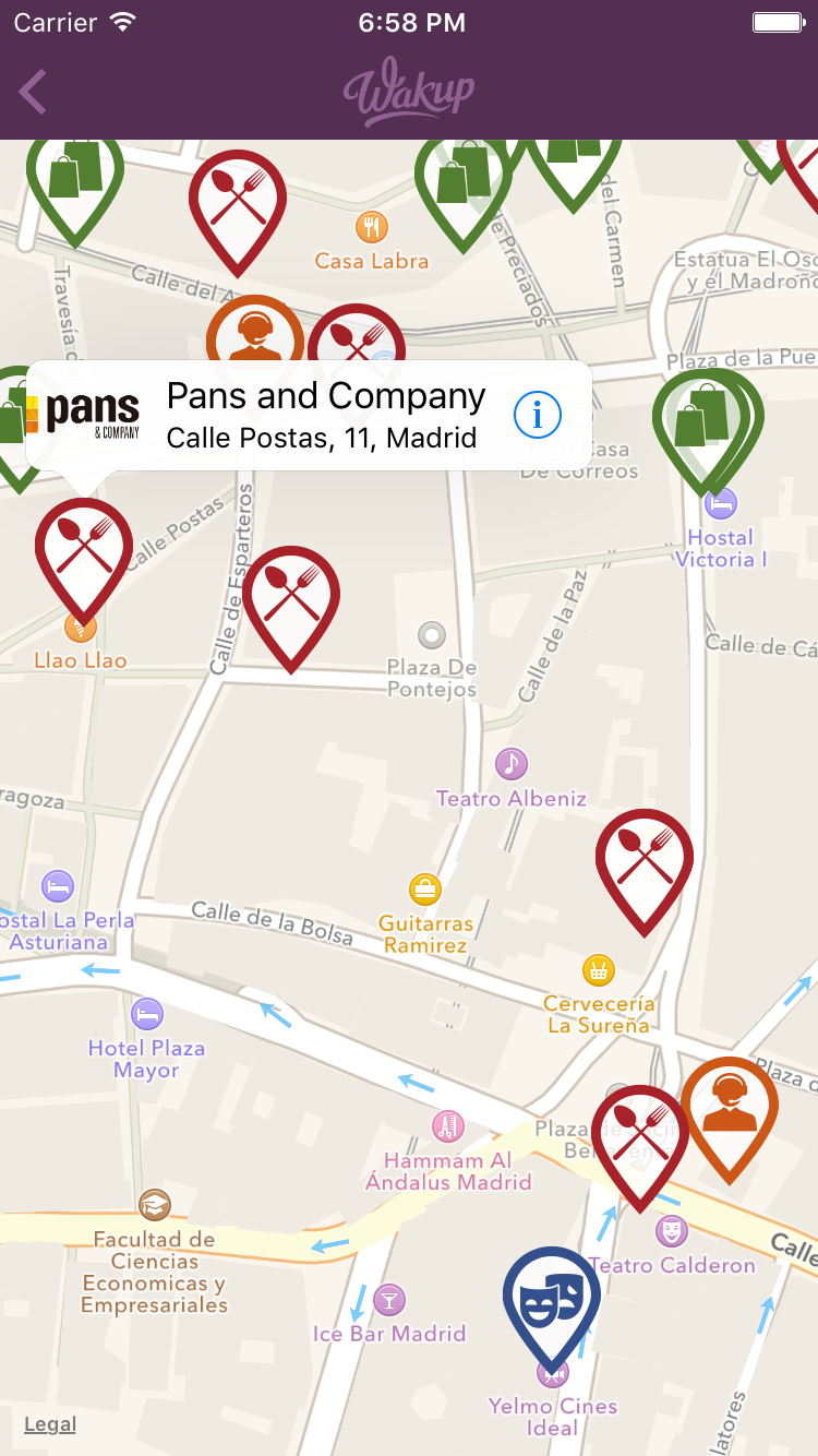
Offer地图视图允许使用CouponAnnotationView外观代理自定义地图图标和颜色。图标和颜色基于offer标签分配。您可以为一个组关联多个标签。您还可以为不匹配任何先前标签的offer声明一个空标签组。
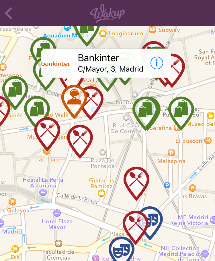
let restaurantCategoryColor: UIColor = UIColor(red: 0.660, green: 0.133, blue: 0.159, alpha: 1.000)
let leisureCategoryColor: UIColor = UIColor(red: 0.201, green: 0.310, blue: 0.550, alpha: 1.000)
let servicesCategoryColor: UIColor = UIColor(red: 0.803, green: 0.341, blue: 0.092, alpha: 1.000)
let shoppingCategoryColor: UIColor = UIColor(red: 0.321, green: 0.498, blue: 0.190, alpha: 1.000)

CouponAnnotationView.appearance().mapPinSize = CGSize(width: 46, height: 60)
CouponAnnotationView.appearance().iconAndColorForTags = [
    ColorForTags(tags: ["restaurants", "food"], mapIcon: "map-restaurant-pin", color: restaurantCategoryColor),
    ColorForTags(tags: ["leisure", "cinema"], mapIcon: "map-leisure-pin", color: leisureCategoryColor),
    ColorForTags(tags: ["services"], mapIcon: "map-services-pin", color: servicesCategoryColor),
    ColorForTags(tags: ["shopping"], mapIcon: "map-shopping-pin", color: shoppingCategoryColor),
    ColorForTags(tags: [], mapIcon: "map-pin", color: UIColor.darkGrayColor()) // Empty tag list for default pin and color
]
自定义字体
可以使用与颜色定制相同的UIAppearance代理来自定义Wakup视图的大多数字体。请注意,必须明确指定字体大小,并且一些标签具有最小字缩放比例,以避免单词剪切。
本例展示了如何使用Aller字体家族替换应用程序的大部分字体。
// Navigation bar
UINavigationBar.appearance().titleTextAttributes = [
    NSAttributedStringKey.font: UIFont(name: "Aller", size: 18)!
]

// Top menu and search bar
TopMenuButton.appearance().titleFont = UIFont(name: "Aller-Light", size: 14)
SearchFilterButton.appearance().titleFont = UIFont(name: "Aller", size: 10)

// Collection view cells
CouponCollectionViewCell.appearance().storeNameFont = UIFont(name: "Aller-Bold", size: 17)
CouponCollectionViewCell.appearance().descriptionTextFont = UIFont(name: "Aller-Italic", size: 15)
CouponCollectionViewCell.appearance().distanceFont = UIFont(name: "Aller-Italic", size: 11)
CouponCollectionViewCell.appearance().expirationFont = UIFont(name: "Aller-Italic", size: 11)
DiscountTagView.appearance().labelFont = UIFont(name: "AllerDisplay", size: 17)

// Offer details
CouponActionButton.appearance().titleFont = UIFont(name: "Aller", size: 10)
CouponDetailHeaderView.appearance().companyNameFont = UIFont(name: "Aller", size: 18)
CouponDetailHeaderView.appearance().storeAddressFont = UIFont(name: "Aller-LightItalic", size: 14)
CouponDetailHeaderView.appearance().storeDistanceFont = UIFont(name: "Aller-Italic", size: 11)
CouponDetailHeaderView.appearance().couponNameFont = UIFont(name: "Aller", size: 19)
CouponDetailHeaderView.appearance().couponDescriptionFont = UIFont(name: "Aller", size: 14)
CouponDetailHeaderView.appearance().expirationFont = UIFont(name: "Aller-Italic", size: 13)

if #available(iOS 9.0, *) {
    let headerTitle = UILabel.appearanceWhenContainedInInstancesOfClasses([UITableViewHeaderFooterView.self])
    headerTitle.font = UIFont(name: "Aller", size: 16)

    let searchBarTextField = UITextField.appearanceWhenContainedInInstancesOfClasses([UISearchBar.self])
    searchBarTextField.defaultTextAttributes = [
        NSFontAttributeName: UIFont(name: "Aller", size: 14)!
    ]
}
自定义图标
Wakup SDK 利用 CoreGraphics 的矢量方法来绘制图标,这允许使用本地 iOS 功能调整图标大小和着色。所有 Wakup 图标都打包在一个 '图标库' 中,可以扩展(或者完全覆盖)以替换应用程序图标。
要实现此功能,只需继承 DefaultIconLibrary 类并返回所需图标的新的绘制方法。
例如,我们想覆盖默认的分享图标

使用新的纸张飞机版本

使用 PaintCode 与矢量图标结合
首先,使用 PaintCode 或其他矢量到 CoreGraphics 应用将图标转换为 CoreGraphics 格式。请记住设置缩放掩码以确保图标大小相对于框架。生成的代码看起来是这样的
class CustomDrawMethods {
    // Draw method generated using PaintCode
    class func drawPaperPlane(frame frame: CGRect = CGRectMake(0, 0, 88, 87), fillColor: UIColor = UIColor(red: 0.381, green: 0.421, blue: 0.442, alpha: 1.000)) {

        //// Subframes
        let group: CGRect = CGRectMake(frame.minX - 0.39, frame.minY + 0.07, frame.width + 0.39, frame.height - 0.07)

        //// Group
        //// Bezier 86 Drawing
        let bezier86Path = UIBezierPath()
        bezier86Path.moveToPoint(CGPointMake(group.minX + 0.79353 * group.width, group.minY + 1.00000 * group.height))
        bezier86Path.addLineToPoint(CGPointMake(group.minX + 0.51238 * group.width, group.minY + 0.77596 * group.height))
        bezier86Path.addLineToPoint(CGPointMake(group.minX + 0.31396 * group.width, group.minY + 1.00000 * group.height))
        bezier86Path.addLineToPoint(CGPointMake(group.minX + 0.28096 * group.width, group.minY + 0.66389 * group.height))
        bezier86Path.addLineToPoint(CGPointMake(group.minX + 0.00000 * group.width, group.minY + 0.46550 * group.height))
        bezier86Path.addLineToPoint(CGPointMake(group.minX + 1.00000 * group.width, group.minY + 0.00000 * group.height))
        bezier86Path.addLineToPoint(CGPointMake(group.minX + 0.79353 * group.width, group.minY + 1.00000 * group.height))
        bezier86Path.addLineToPoint(CGPointMake(group.minX + 0.79353 * group.width, group.minY + 1.00000 * group.height))
        bezier86Path.closePath()
        bezier86Path.moveToPoint(CGPointMake(group.minX + 0.49593 * group.width, group.minY + 0.66389 * group.height))
        bezier86Path.addLineToPoint(CGPointMake(group.minX + 0.99177 * group.width, group.minY + 0.00861 * group.height))
        bezier86Path.addLineToPoint(CGPointMake(group.minX + 0.36377 * group.width, group.minY + 0.63805 * group.height))
        bezier86Path.addLineToPoint(CGPointMake(group.minX + 0.49593 * group.width, group.minY + 0.66389 * group.height))
        bezier86Path.addLineToPoint(CGPointMake(group.minX + 0.49593 * group.width, group.minY + 0.66389 * group.height))
        bezier86Path.closePath()
        bezier86Path.miterLimit = 4;

        bezier86Path.usesEvenOddFillRule = true;

        fillColor.setFill()
        bezier86Path.fill()
    }
}
配置图标库
然后,继承 DefaultIconLibrary 并重写 drawMethodForIcon 以返回 share 标识符的新绘制方法(标识符的完整列表请参阅DefaultIconLibrary 源代码)
class CustomIconLibrary: DefaultIconLibrary {
    override func drawMethodForIcon(iconIdentifier: String) -> (drawMethod: IconDrawMethod, aspectRatio: CGFloat) {
        switch iconIdentifier {
        case "share":
            // Replace share icon with a paper plane
            return (CustomDrawMethods.drawPaperPlane, 88/87)
        default:
            // For any other method, return default draw method
            return super.drawMethodForIcon(iconIdentifier: iconIdentifier)
        }
    }
}
然后,在设置 WakupManager 时,将 WakupOptions 的 iconLibrary 属性设置为您的 CustomIconLibrary 实例(或您刚刚给出的名称)
let wakupOptions = WakupOptions()
wakupOptions.iconLibrary = CustomIconLibrary()
WakupManager.manager.setup("YOUR_API_TOKEN_HERE", options: wakupOptions)
运行应用后,您将看到您的新图标,无论大小像素完美,并且可以根据您的要求着色
使用非矢量图像
尽管非常推荐将图像转换为矢量格式,但并非总是可行。在这种情况下,您可以使用标准的 UIImage 图像回退。建议使用透明背景的 PNG 文件。
它们在你实现的IconLibrary中的配置方式与矢量图生成的图标完全相同,使用了CodeIconLibrary.drawMethodForImage辅助方法。
class CustomIconLibrary: DefaultIconLibrary {
    override func drawMethodForIcon(iconIdentifier: String) -> (drawMethod: IconDrawMethod, aspectRatio: CGFloat) {
        switch iconIdentifier {
        case "share":
            // Replace share icon with a paper plane
            return CodeIconLibrary.drawMethodForImage(UIImage(named: "paper_plane.png")!)
        default:
            // For any other method, return default draw method
            return super.drawMethodForIcon(iconIdentifier: iconIdentifier)
        }
    }
}提供的图像将使用指定的调和色进行着色。如果标志不应着色(例如,多色公司标志),请确保将drawMethodForImage的tinted参数设置为false。
return CodeIconLibrary.drawMethodForImage(UIImage(named: "my-logo")!, tinted: false)
矢量图和非矢量图可以混合在同一IconLibrary中。但是,为了获得更好的结果,尽可能使用矢量图。
添加额外语言或替换字符串
添加额外语言或替换已存在的语言中的字符串非常简单。Wakup SDK将在当前语言的Wakup.strings文件中查找字符串;如果未找到该文件或特定字符串,则会回退到嵌入的SDK字符串。
将Wakup.strings文件从SDK源代码复制到您的项目中。现在您可以替换所需的字符串,并将该文件国际化到您支持的语言。
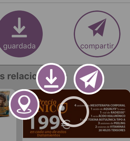
自定义分享优惠的方法
当用户从应用程序分享优惠时,默认的分享控制器会展示一些关于优惠的信息。可以通过在字符串文件中自定义ShareOfferFooter键来更改文本的底部(参见前面的说明)。
为了进一步的定制,您可以在初始化库时在WakupOptions对象中设置一个方法,当用户分享优惠时将被调用。此方法会覆盖默认行为,并可用于执行任何操作。提供了当前顶级控制器和一个通用的加载模态展示者作为方法参数,以便更容易集成。此外,还提供了一个针对UIViewController的类扩展,这将有助于下载图像或展示分享控制器。
此示例自定义了共享文本,并提供了自定义的URL,除了分享优惠图像外。
let options = WakupOptions()
options.customShareFunction = { (offer, presenter, loadingPresenter) in
    // Create a custom URL based on the offer ID
    let url = URL(string: "http://mycompany.com/offer/\(offer.id)")
    // Share the offer image
    let imageUrl = offer.image?.sourceUrl
    // Create a custom text to share
    let text = "Mira esta oferta! \(offer.shortDescription) de \(offer.company.name)"

    // Call the convenience method for showing the share controller
    presenter.shareTextImageAndURL(text: text, imageURL: imageUrl, linkURL: url, loadingProtocol: loadingPresenter)
}

WakupManager.manager.setup(API_KEY, options: options)