VHBoomMenuButton 2.0.0
| 测试已测试 | ✗ |
| Lang语言 | Obj-CObjective C |
| 许可 | MIT |
| 发布最后发布 | 2017年5月 |
| SwiftSwift 版本 | 3.0 |
由 Nightonke 维护。
VHBoomMenuButton 2.0.0
- 由
- Nightonke


指南
使用方法
Pod
使用 BMB 的方法:
- Pod:
pod "VHBoomMenuButton", "~> 1.0.2" - 或者将 BMB 的源代码复制到项目中。
注意
- 来自我的 Android 版本的 BMB。
- 我是一个 iOS 新手,所以如果有任何错误或改进,请直接在问题中提出或在邮件中告诉我([email protected])
- BMB 的结构

BMB 被分为 3 个子部分和 1 个主要部分,用于管理动画、BMB 上的碎片以及屏幕上的爆裂按钮。所以如果您想要在 BMB 中添加更多爆裂按钮,例如称为 A,则只需- 创建一个 ABuilder 在 BoomButton 中继承自 VHBoomButtonBuilder
- 创建一个 AButton 在 BoomButton 中继承自 VHBoomButton
- 创建一个 APiece 在 Piece 中继承自 VHBoomPiece
- 在 VHPiecePlaceManager 和 VHButtonPlaceManager 中添加您的碎片位置和按钮位置逻辑

使用方法
基本使用
让我们检查一个非常简单的例子,只需要 3 个按钮。
//
//  ViewController.m
//  VHBoomMenuButtonTest
//
//  Created by 黄伟平 on 16/8/7.
//  Copyright © 2016年 黄伟平. All rights reserved.
//

#import "ViewController.h"
#import "VHBoomMenuButton.h"

#define UIColorFromRGB(rgbValue) [UIColor colorWithRed:((float)((rgbValue & 0xFF0000) >> 16)) / 255.0 green:((float)((rgbValue & 0xFF00) >> 8)) / 255.0 blue:((float)(rgbValue & 0xFF)) / 255.0 alpha:1.0]

@interface ViewController ()

@end

@implementation ViewController

- (void)loadView
{
    CGRect screenFrame         = [[UIScreen mainScreen] bounds];
    self.view                  = [[UIView alloc] initWithFrame:screenFrame];
    self.view.backgroundColor  = [UIColor whiteColor];
    self.view.autoresizingMask = UIViewAutoresizingFlexibleHeight | UIViewAutoresizingFlexibleWidth;

    // 1. Put bmb in your VC
    CGFloat bmbRadius          = 60;
    VHBoomMenuButton *bmb      = [[VHBoomMenuButton alloc] initWithFrame:CGRectMake(screenFrame.size.width - 20 - bmbRadius,
                                                                                    screenFrame.size.height - 20 - bmbRadius,
                                                                                    bmbRadius,
                                                                                    bmbRadius)];

    // 2. Select the button type you want
    bmb.buttonEnum             = VHButtonSimpleCircle;

    // 3. Tell BMB how to place the button on itself(before BOOM)
    bmb.piecePlaceEnum         = VHPiecePlace_DOT_3_1;

    // 4. Tell BMB how to place the button on screen(after BOOM)
    bmb.buttonPlaceEnum        = VHButtonPlace_SC_3_3;

    // 5. Add some buttons by builder
    [bmb addSimpleCircleButtonBuilderBlock:^(VHSimpleCircleButtonBuilder *builder) {
        builder.imageNormal        = @"bat";
        builder.buttonNormalColor  = UIColorFromRGB(0xD32F2F);
        builder.buttonPressedColor = UIColorFromRGB(0xF44336);
    }];

    [bmb addSimpleCircleButtonBuilderBlock:^(VHSimpleCircleButtonBuilder *builder) {
        builder.imageNormal        = @"bear";
        builder.buttonNormalColor  = UIColorFromRGB(0xD32F2F);
        builder.buttonPressedColor = UIColorFromRGB(0xF44336);
    }];

    [bmb addSimpleCircleButtonBuilderBlock:^(VHSimpleCircleButtonBuilder *builder) {
        builder.imageNormal        = @"bee";
        builder.buttonNormalColor  = UIColorFromRGB(0xD32F2F);
        builder.buttonPressedColor = UIColorFromRGB(0xF44336);
    }];

    [self.view addSubview:bmb];
}

@end
您只需选择一些属性,然后添加您的按钮即可。
但是,警告!你必须保持 piecePlaceEnum 的数量,buttonPlaceEnum 的数量,你添加的构建者的数量相同。PiecePlaceEnum 的名称是 VHPiecePlace_XXX_N_M,其中 XXX 是名称,N 是数量,M 是不同类型。类似地,buttonPlaceEnum 的名称是 VHButtonPlace_YYY_N_M。你必须保持第一个 N 等于第二个 N。但你不需要保持两个 M 相同。(就像上面的代码:VHPiecePlace_DOT_3_1 和 VHButtonPlace_SC_3_3)
Boom 按钮
简单圆形按钮

这是这里最简单的按钮类型。为您的 BMB 设置按钮类型:bmb.buttonEnum = VHButtonSimpleCircle
零件放置类型
为您的 BMB 设置零件放置类型:bmb.piecePlaceEnum = VHPiecePlace_DOT_3_1。对于数字 1 到 9,BMB 支持以下放置类型:(1 <= M <= 图像数量)
| 按钮数量 | VHPiecePlaceEnum | 图片 |
|---|---|---|
| 1 | VHPiecePlace_DOT_1 |  |
| 2 | VHPiecePlace_DOT_2_M |
 
|
| 3 | VHPiecePlace_DOT_3_M |
   
|
| 4 | VHPiecePlace_DOT_4_M |
 
|
| 5 | VHPiecePlace_DOT_5_M |
   
|
| 6 | VHPiecePlace_DOT_6_M |
     
|
| 7 | VHPiecePlace_DOT_7_M |
     
|
| 8 | VHPiecePlace_DOT_8_M |
      
|
| 9 | VHPiecePlace_DOT_9_M |
  
|
按钮放置类型
为您的 BMB 设置按钮放置类型:bmb.buttonPlaceEnum = VHButtonPlace_SC_3_3。
点击 VHButtonPlaceEnum 检查 BMB 目前支持哪种按钮放置类型。只需知道在 VHButtonPlace_SC_N_M 中,N 是按钮数量。


属性
对于每个简单圆形按钮,您可以通过设置构建器的属性来设置其属性。属性包括
[bmb addSimpleCircleButtonBuilderBlock:^(VHSimpleCircleButtonBuilder *builder) {
    builder.shadowOffset          = CGSizeMake(5, 5);            // Shadow offset
    builder.shadowOpacity         = 0;                           // Shadow opactity
    builder.shadowColor           = [UIColor redColor];          // Shadow color
    builder.imageNormal           = @"bat";                      // Image of button normally
    builder.imagePressed          = @"bear";                     // Image of button when button is clicked
    builder.buttonNormalColor     = UIColorFromRGB(0xD32F2F);    // Color of button normally
    builder.buttonPressedColor    = UIColorFromRGB(0xF44336);    // Color of button when the button is clicked
    builder.imageNormalTintColor  = UIColorFromRGB(0xD32F2F);    // Tint color of image normally
    builder.imagePressedTintColor = UIColorFromRGB(0xffffff);    // Tint color of image when button is clicked
    builder.imageFrame            = CGRectMake(10, 10, 60, 60);  // Frame of image
    builder.buttonRadius          = 50;                          // Radius of button
    builder.shadowRadius          = 55;                          // Radius of shadow
}];
请注意,您不必在这里设置所有属性。检查当您不设置时使用的 默认属性。
圆形按钮中的文本

这是一个带内部文本的圆形按钮。为您的 BMB 设置按钮类型:bmb.buttonEnum = VHButtonTextInsideCircle
零件放置类型
与简单圆形按钮相同。
按钮放置类型
与简单圆形按钮相同。
属性
[bmb addTextInsideCircleButtonBuilderBlock:^(VHTextInsideCircleButtonBuilder *builder) {
    builder.shadowOffset          = CGSizeMake(5, 5);              // Shadow offset
    builder.shadowOpacity         = 0;                             // Shadow opactity
    builder.shadowColor           = [UIColor redColor];            // Shadow color
    builder.imageNormal           = @"bat";                        // Image of button normally
    builder.imagePressed          = @"bear";                       // Image of button when button is clicked
    builder.buttonNormalColor     = UIColorFromRGB(0xD32F2F);      // Color of button normally
    builder.buttonPressedColor    = UIColorFromRGB(0xF44336);      // Color of button when the button is clicked
    builder.imageNormalTintColor  = UIColorFromRGB(0x000000);      // Tint color of image normally
    builder.imagePressedTintColor = UIColorFromRGB(0xffffff);      // Tint color of image when button is clicked
    builder.imageFrame            = CGRectMake(10, 10, 80, 80);    // Frame of image
    builder.buttonRadius          = 50;                            // Radius of button
    builder.shadowRadius          = 55;                            // Radius of shadow
    builder.textNormalColor       = UIColorFromRGB(0xffffff);      // Color of text normally
    builder.textPressedColor      = UIColorFromRGB(0x000000);      // Color of text when the button is clicked
    builder.textFrame             = CGRectMake(0, 10, 100, 20);    // Frame of text
    builder.textContent           = @"BAT HERE!";                  // Text
    builder.font                  = [UIFont systemFontOfSize:18];  // Font
    builder.lineBreakMode         = NSLineBreakByClipping;         // Line break mode
    builder.lines                 = 0;                             // Lines
    builder.rotateImage           = YES;                           // Whether rotate the image
    builder.rotateText            = YES;                           // Whether rotate the text
}];
圆形按钮外的文本

与名称相同,圆形按钮外的文本是一个带外部文本的圆形按钮。为您的 BMB 设置按钮类型:bmb.buttonEnum = VHButtonTextOutsideCircle
零件放置类型
与简单圆形按钮相同。
按钮放置类型
与简单圆形按钮相同。但请注意,当按钮显示在屏幕上时,仍有不同之处,因为文本外的圆形按钮不是圆形而是矩形。
属性
[bmb addTextOutsideCircleButtonBuilderBlock:^(VHTextOutsideCircleButtonBuilder *builder) {
    builder.shadowOffset          = CGSizeMake(5, 5);              // Shadow offset
    builder.textShadowOffset      = CGSizeMake(2, 2);              // Shadow offset of text
    builder.shadowOpacity         = 0;                             // Shadow opactity
    builder.shadowColor           = [UIColor redColor];            // Shadow color
    builder.textShadowColor       = UIColorFromARGB(0xffff0000);   // Shadow color of text
    builder.imageNormal           = @"bat";                        // Image of button normally
    builder.imagePressed          = @"bear";                       // Image of button when button is clicked
    builder.buttonNormalColor     = UIColorFromRGB(0xD32F2F);      // Color of button normally
    builder.buttonPressedColor    = UIColorFromRGB(0xF44336);      // Color of button when the button is clicked
    builder.imageNormalTintColor  = UIColorFromRGB(0x000000);      // Tint color of image normally
    builder.imagePressedTintColor = UIColorFromRGB(0xffffff);      // Tint color of image when button is clicked
    builder.imageFrame            = CGRectMake(15, 15, 60, 60);    // Frame of image
    builder.textFrame             = CGRectMake(0, 90, 90, 20);     // Frame of text
    builder.buttonWidth           = 90;                            // Width of button
    builder.buttonHeight          = 120;                           // Height of button
    builder.textNormalColor       = UIColorFromRGB(0xffffff);      // Color of text normally
    builder.textPressedColor      = UIColorFromRGB(0x000000);      // Color of text when the button is clicked
    builder.textContent           = @"BAT HERE!";                  // Text
    builder.lineBreakMode         = NSLineBreakByClipping;         // Line break mode
    builder.lines                 = 0;                             // Lines
    builder.rotateImage           = YES;                           // Whether rotate the image
    builder.rotateText            = YES;                           // Whether rotate the text
    builder.shadowText            = YES;                           // Whether show the shadow of text
}];
Hamburger 按钮

火腿按钮是一种可以包含图像、标题和副标题的矩形按钮。当然,您也可以像上面的“取消”按钮一样,自定义火腿按钮所需的内容。为您的BMB设置按钮类型:bmb.buttonEnum = VHButtonTextOutsideCircle
拼贴位置类型
火腿按钮的拼贴位置类型只是一系列水平排列的线条。因此,这里我将不展示图像。
VHPiecePlace_HAM_1
VHPiecePlace_HAM_2
VHPiecePlace_HAM_3
VHPiecePlace_HAM_4
VHPiecePlace_HAM_5
按钮位置类型
火腿按钮的按钮位置类型只是在屏幕上水平排列的一系列线条。请查看README中的开头gif动画。
VHButtonPlace_HAM_1
VHButtonPlace_HAM_2
VHButtonPlace_HAM_3
VHButtonPlace_HAM_4
VHButtonPlace_HAM_5
属性
[bmb addHamButtonBuilderBlock:^(VHHamButtonBuilder *builder) {
    builder.shadowOffset          = CGSizeMake(5, 5);              // Shadow offset
    builder.shadowOpacity         = 0.5;                           // Shadow opactity
    builder.shadowColor           = [UIColor blueColor];           // Shadow color
    builder.imageNormal           = @"bat";                        // Image of button normally
    builder.imagePressed          = @"bear";                       // Image of button when button is clicked
    builder.buttonNormalColor     = UIColorFromRGB(0xD32F2F);      // Color of button normally
    builder.buttonPressedColor    = UIColorFromRGB(0xF44336);      // Color of button when the button is clicked
    builder.imageNormalTintColor  = UIColorFromRGB(0x0000ff);      // Tint color of image normally
    builder.imagePressedTintColor = UIColorFromRGB(0x00ff00);      // Tint color of image when button is clicked
    builder.imageFrame            = CGRectMake(10, 0, 60, 60);     // Frame of image
    builder.titleFrame            = CGRectMake(120, 30, 120, 30);  // Frame of title
    builder.subTitleFrame         = CGRectMake(120, 0, 120, 30);   // Frame of sub title
    builder.shadowWidth           = 300;                           // Width of shadow
    builder.shadowHeight          = 80;                            // Height of shadow
    builder.shadowCornerRadius    = 0;                             // Corner radius of shadow
    builder.buttonWidth           = 300;                           // Width of button
    builder.buttonHeight          = 80;                            // Height of button
    builder.buttonCornerRadius    = 0;                             // Corner radius of button
    builder.titleContent          = @"Title Here";                 // Title
    builder.titleNormalColor      = UIColorFromRGB(0x0000ff);      // Color of title normally
    builder.titlePressedColor     = UIColorFromRGB(0x00ffff);      // Color of title when the button is pressed
    builder.titleFont             = [UIFont systemFontOfSize:30];  // Font of title
    builder.titleLineBreakMode    = NSLineBreakByClipping;         // Line break mode of title
    builder.titlelines            = 0;                             // Lines of title
    builder.titleAlignment        = NSTextAlignmentCenter;         // Text alignment of title
    builder.subTitleContent       = @"Sub title here";             // Sub title
    builder.subTitleNormalColor   = UIColorFromRGB(0x0000ff);      // Color of sub title normally
    builder.subTitlePressedColor  = UIColorFromRGB(0x00ffff);      // Color of sub title when the button is pressed
    builder.subTitleFont          = [UIFont systemFontOfSize:8];   // Font of sub title
    builder.subTitleLineBreakMode = NSLineBreakByClipping;         // Line break mode of sub title
    builder.subTitlelines         = 0;                             // Lines of sub title
    builder.subTitleAlignment     = NSTextAlignmentCenter;         // Text alignment of sub title
    builder.rotateImage           = YES;                           // Whether rotate the image
    builder.containImage          = YES;                           // Whether contains image
}];
再次强调,您不必在这里设置所有属性。未设置时,将使用默认属性。
最后一个火腿按钮顶部边距更大
您可以将最后一个按钮的顶部边距属性设置得更大,使其看起来像“取消”按钮。


只需设置BMB以下属性来切换最后一个火腿按钮顶部边距更大,或直接设置其值。
bmb.lastHamButtonMarginMoreTop = YES;
bmb.lastHamButtonTopMargin     = 50;
常见按钮位置类型
VHButtonPlace_Horizontal
VHButtonPlace_Horizontal是任何按钮的常见按钮位置类型。它简单地将所有按钮水平放置在同一水平线上。您可以在iPad上使用此类型,因为iPad足够宽。

VHButtonPlace_Vertical
类似于VHButtonPlace_Horizontal。

按钮位置对齐
如果您不想将按钮放置在屏幕中心,就像上面的图像一样,您可以使用VHButtonPlaceAlignmentEnum来调整对齐。
bmb.buttonPlaceAlignmentEnum = VHButtonPlaceAlignmentBottom;


##检查爆炸类型 VHBoomEnum 来使用不同的爆炸类型,并通过bmb.boomEnum = VHBoomParabola_3;使BMB更加可爱。


VHBoomStraightLine仅是一条直线。而VHBoomRandom是所有其他爆炸类型的组合。
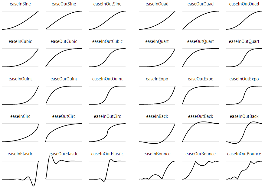
##缓动类型 要使BMB更加可爱,您可以使用VHEaseEnum来设置以下6个属性
bmb.showMoveEaseEnum   = VHEaseOutCirc;
bmb.showScaleEaseEnum  = VHEaseOutCirc;
bmb.showRotateEaseEnum = VHEaseOutCubic;
bmb.hideMoveEaseEnum   = VHEaseInBack;
bmb.hideScaleEaseEnum  = VHEaseInCirc;
bmb.hideRotateEaseEnum = VHEaseInCubic;
所有缓动类型
帧、持续时间和延迟
bmb.frames   = 30;
bmb.duration = 3;
bmb.delay    = 1;
帧属性用于控制动画的帧数,有助于提高应用程序的性能。
持续时间意味着按钮每个动画的持续时间。
延迟意味着按钮之间的延迟。
因此,动画的总时间是 (N - 1) * 延迟 + 持续时间,其中N是按钮的数量。
背景变暗
使用bmb.dimColor = [UIColor blueColor];设置BMB爆炸时的背景颜色。
自动隐藏
使用bmb.autoHide = NO;来设置BMB在被点击按钮时是否重新弹出。
可取消
使用bmb.cancelable = NO;来设置BMB是否可以被点击背景隐藏。
无背景
使用bmb.noBackground = YES;移除BMB的背景。这有用吗?是的,您不会在有背景的NavigationBar中使用BMB,对吧?
可拖动
使用bmb.draggable = YES;来使BMB可拖动。
旋转角度
使用bmb.rotationDegree = M_PI * 10;来设置在动画中可以旋转的视图的旋转角度。
阴影和背景颜色
bmb.shadowOffset       = CGSizeMake(0, 10);
bmb.shadowColor        = [UIColor redColor];
bmb.shadowOpacity      = 1;
bmb.shadowRadius       = 40;
bmb.buttonNormalColor  = [UIColor redColor];
bmb.buttonPressedColor = [UIColor blueColor];
通过上述属性设置BMB的阴影和背景颜色。
尺寸
bmb.dotRadius              = 3;   // The radius of dot on the BMB
bmb.hamWidth               = 30;  // The width of piece-ham on the BMB
bmb.hamHeight              = 4;   // The height of piece-ham on the BMB
bmb.pieceHorizontalMargin  = 3;   // The horizontal margin between pieces
bmb.pieceVerticalMargin    = 5;   // The vertical margin between pieces
bmb.pieceInclinedMargin    = 3;   // The inclined margin between pieces
bmb.buttonHorizontalMargin = 10;  // The horizontal margin between buttons
bmb.buttonVerticalMargin   = 10;  // The vertical margin between buttons
bmb.buttonInclinedMargin   = 10;  // The inclined margin between buttons
bmb.buttonBottomMargin     = 10;  // The vertical margin between the most-bottom button and the border of screen
bmb.buttonTopMargin        = 10;  // The vertical margin between the most-top button and the border of screen
bmb.buttonLeftMargin       = 10;  // The horizontal margin between the most-left button and the border of screen
bmb.buttonRightMargin      = 10;  // The horizontal margin between the most-right button and the border of screen
程序化弹跳
[bmb boom];
[bmb reboom];
委派
实现VHBoomDelegate委派。选择您想要的方法。
/**
 *  When one of the sub button was clicked.
 *
 *  @param index Index of the clicked sub button.
 */
- (void)onBoomClicked:(int)index
{

}

/**
 *  When the background was clicked.
 */
- (void)onBoomBackgroundClicked
{

}

/**
 *  The reboom animation is going to start.
 */
- (void)onBoomWillHide
{

}

/**
 *  The reboom animation is finished.
 */
- (void)onBoomDidHide
{

}

/**
 *  The boom animation is going to start.
 */
- (void)onBoomWillShow
{

}

/**
 *  The boom animation is finished.
 */
- (void)onBoomDidShow
{

}
版本
1.0.2
第一个版本,我的第一个iOS库。
许可证
Copyright 2016 Nightonke

Licensed under the Apache License, Version 2.0 (the "License");
you may not use this file except in compliance with the License.
You may obtain a copy of the License at

   https://apache.ac.cn/licenses/LICENSE-2.0

Unless required by applicable law or agreed to in writing, software
distributed under the License is distributed on an "AS IS" BASIS,
WITHOUT WARRANTIES OR CONDITIONS OF ANY KIND, either express or implied.
See the License for the specific language governing permissions and
limitations under the License.