VATextureKit
Texture库包装器,增加了一些功能。
安装
CocoaPods
在Podfile中添加以下内容
pod 'VATextureKit'
or
pod 'VATextureKitRx' // includes RxSwift and additinal wrappers.
在终端中项目的目录下
pod install
或直接尝试示例项目
pod try 'VATextureKit'
最低部署目标: iOS 11
布局规范
以下 LayoutSpec DSL 组件可以用来组合简单或非常复杂的布局。
| VATextureKit | Texture |
|---|---|
| 列 | ASStackLayoutSpec(垂直) |
| 行 | ASStackLayoutSpec(水平) |
| 堆叠 | |
| 安全域 | ASInsetLayoutSpec(带安全域间隔) |
| 内边距 | ASInsetLayoutSpec |
| .wrapped | ASWrapperLayoutSpec |
| .corner | ASCornerLayoutSpec |
| .safe | ASInsetLayoutSpec(带安全域间隔) |
| .centered | ASCenterLayoutSpec |
| .ratio | ASRatioLayoutSpec |
| .overlay | ASOverlayLayoutSpec |
| .background | ASBackgroundLayoutSpec |
| .relatively | ASRelativeLayoutSpec |
| .absolutely | ASAbsoluteLayoutSpec |
列
使用 ASStackLayoutSpec
override func layoutSpecThatFits(_ constrainedSize: ASSizeRange) -> ASLayoutSpec {
    ASStackLayoutSpec(
        direction: .vertical,
        spacing: 8,
        justifyContent: .start,
        alignItems: .start,
        children: [
            firstRectangleNode,
            secondRectangleNode,
        ]
    )
}
使用 Column
override func layoutSpecThatFits(_ constrainedSize: ASSizeRange) -> ASLayoutSpec {
    Column(spacing: 8) {
        firstRectangleNode
        secondRectangleNode
    }
}
示例

行
使用 ASStackLayoutSpec
ASStackLayoutSpec(
    direction: .horizontal,
    spacing: 4,
    justifyContent: .spaceBetween,
    alignItems: .start,
    children: [
        firstRectangleNode,
        secondRectangleNode,
    ]
)
使用 Row
Row(spacing: 4, main: .spaceBetween) {
    firstRectangleNode
    secondRectangleNode
}
示例

堆叠
堆叠:
Stack {
    firstRectangleNode
    secondRectangleNode
}
示例

安全域
在 ASDisplayNode 中使用 ASStackLayoutSpec,其中 automaticallyRelayoutOnSafeAreaChanges = true
ASInsetLayoutSpec(
    insets: UIEdgeInsets(
        top: safeAreaInsets.top,
        left: safeAreaInsets.left,
        bottom: safeAreaInsets.bottom,
        right: safeAreaInsets.right
    ),
    child: ...
)
使用 SafeArea
SafeArea {
    ...
}
内边距
使用 ASInsetLayoutSpec
ASInsetLayoutSpec(
    insets: UIEdgeInsets(
        top: 8,
        left: 8,
        bottom: 8,
        right: 8
    ),
    child: titleTextNode
)
使用 .padding
titleTextNode
    .padding(.all(8))
.wrapped
使用 ASWrapperLayoutSpec
ASWrapperLayoutSpec(layoutElement: imageNode)使用 .wrapped
imageNode
    .wrapped()
.corner
使用 ASWrapperLayoutSpec
override func layoutSpecThatFits(_ constrainedSize: ASSizeRange) -> ASLayoutSpec {
    let spec = ASCornerLayoutSpec(
        child: imageNode,
        corner: badgeNode,
        location: .topRight
    )
    spec.offset = CGPoint(x: 4, y: 2)
    spec.wrapsCorner = false
    return spec
}
使用 .corner
imageNode
    .corner(badgeNode, offset: CGPoint(x: 4, y: 2))
.safe
在 ASDisplayNode 中使用 ASStackLayoutSpec,其中 automaticallyRelayoutOnSafeAreaChanges = true
override func layoutSpecThatFits(_ constrainedSize: ASSizeRange) -> ASLayoutSpec {
    ASInsetLayoutSpec(
        insets: UIEdgeInsets(
            top: safeAreaInsets.top,
            left: safeAreaInsets.left,
            bottom: safeAreaInsets.bottom,
            right: safeAreaInsets.right
        ),
        child: listNode
    )
}
使用 .safe
listNode
    .safe(in: self)
.centered
使用 ASCenterLayoutSpec
ASCenterLayoutSpec(
    centeringOptions: .XY,
    sizingOptions: .minimumXY,
    child: buttonNode
)
使用 .centered
buttonNode
    .centered()
.ratio
使用 ASRatioLayoutSpec
ASRatioLayoutSpec(
    ratio: 2 / 3,
    child: imageNode
)
使用 .ratio
imageNode
    .ratio(2 / 3)
.overlay
使用 ASOverlayLayoutSpec
ASOverlayLayoutSpec(
    child: imageNode,
    overlay: gradientNode
)
使用 .overlay
imageNode
    .overlay(gradientNode)
.background
使用 ASOverlayLayoutSpec
ASBackgroundLayoutSpec(
    child: gradientNode,
    background: imageNode
)
使用 .background
imageNode
    .background(gradientNode)
.relatively
使用 ASOverlayLayoutSpec
ASRelativeLayoutSpec(
    horizontalPosition: .start,
    verticalPosition: .end,
    sizingOption: .minimumSize,
    child: buttonNode
)
使用 .relatively
buttonNode
    .relatively(horizontal: .start, vertical: .end)
.absolutely
使用 ASAbsoluteLayoutSpec
buttonNode.style.preferredSize = frame.size
buttonNode.style.layoutPosition = frame.origin
return ASAbsoluteLayoutSpec(
    sizing: .sizeToFit,
    children: [buttonNode]
)
使用 .absolutely
buttonNode
    .absolutely(frame: .frame, sizing: .sizeToFit)
更复杂的布局示例
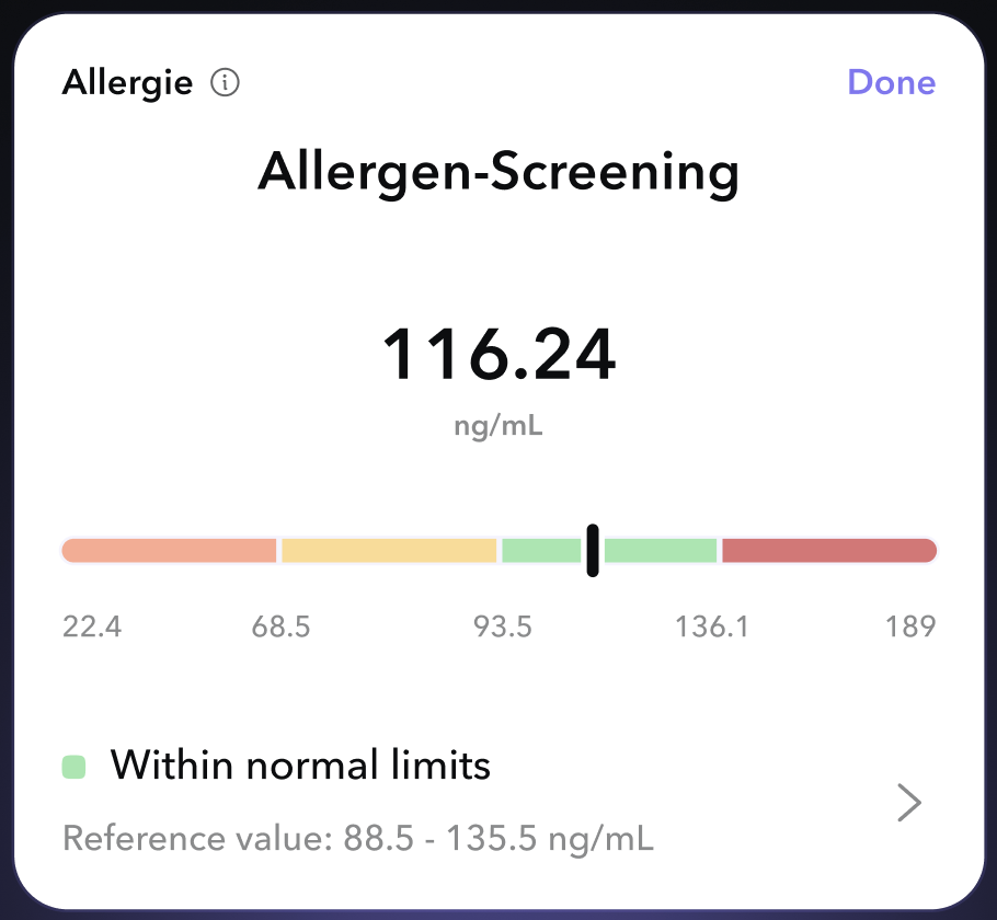
使用 VATextureKit
override func layoutSpecThatFits(_ constrainedSize: ASSizeRange) -> ASLayoutSpec {
    Column(cross: .stretch) {
        Row(main: .spaceBetween) {
            Row(spacing: 8, cross: .center) {
                testNameTextNode
                testInfoButtonNode
            }
            testStatusTextNode
        }
        titleTextNode
            .padding(.top(8))
        resultTextNode
            .padding(.top(32))
            .centered(.X)
        resultUnitsTextNode
            .centered(.X)
        referenceResultBarNode
            .padding(.vertical(24))
        Row(spacing: 16, cross: .center) {
            Column(spacing: 8) {
                Row(spacing: 8) {
                    resultBadgeImageNode
                    resultDescriptionTextNode
                }
                referenceValuesTextNode
            }
            accessoryImageNode
        }
    }
    .padding(.all(16))
}
使用原始 Texture
override func layoutSpecThatFits(_ constrainedSize: ASSizeRange) -> ASLayoutSpec {
    ASInsetLayoutSpec(
        insets: UIEdgeInsets(
            top: 16,
            left: 16,
            bottom: 16,
            right: 16
        ),
        child: ASStackLayoutSpec(
            direction: .vertical,
            spacing: 0,
            justifyContent: .start,
            alignItems: .stretch,
            children: [
                ASStackLayoutSpec(
                    direction: .horizontal,
                    spacing: 0,
                    justifyContent: .spaceBetween,
                    alignItems: .start,
                    children: [
                        ASStackLayoutSpec(
                            direction: .horizontal,
                            spacing: 8,
                            justifyContent: .start,
                            alignItems: .center,
                            children: [
                                testNameTextNode,
                                testInfoButtonNode,
                            ]
                        ),
                        testStatusTextNode,
                    ]
                ),
                ASInsetLayoutSpec(
                    insets: UIEdgeInsets(
                        top: 8,
                        left: 0,
                        bottom: 0,
                        right: 0
                    ),
                    child: titleTextNode
                ),
                ASCenterLayoutSpec(
                    centeringOptions: .X,
                    sizingOptions: .minimumXY,
                    child: ASInsetLayoutSpec(
                        insets: UIEdgeInsets(
                            top: 32,
                            left: 0,
                            bottom: 0,
                            right: 0
                        ),
                        child: resultTextNode
                    )
                ),
                ASCenterLayoutSpec(
                    centeringOptions: .X,
                    sizingOptions: .minimumXY,
                    child: resultUnitsTextNode
                ),
                ASInsetLayoutSpec(
                    insets: UIEdgeInsets(
                        top: 24,
                        left: 0,
                        bottom: 24,
                        right: 0
                    ),
                    child: referenceResultBarNode
                ),
                ASStackLayoutSpec(
                    direction: .horizontal,
                    spacing: 0,
                    justifyContent: .start,
                    alignItems: .center,
                    children: [
                        ASStackLayoutSpec(
                            direction: .vertical,
                            spacing: 8,
                            justifyContent: .start,
                            alignItems: .start,
                            children: [
                                ASStackLayoutSpec(
                                    direction: .horizontal,
                                    spacing: 8,
                                    justifyContent: .start,
                                    alignItems: .start,
                                    children: [
                                        resultBadgeImageNode,
                                        resultDescriptionTextNode,
                                    ]
                                ),
                                referenceValuesTextNode,
                            ]
                        ),
                        accessoryImageNode,
                    ]
                ),
            ]
        )
    )
}
修饰符
.sized
设置 Node 的大小。
使用 style
imageNode.style.width = ASDimension(unit: .points, value: 320)
imageNode.style.height = ASDimension(unit: .points, value: 480)
使用 .sized
imageNode
    .sized(width: 320, height: 480)
.flex
设置 Node 的伸缩性。
使用 style
titleTextNode.style.flexShrink = 0.1
titleTextNode.style.flexGrow = 1
使用 .flex
titleTextNode
    .flex(shrink: 0.1, grow: 1)
.maxConstrained
设置 Node 的最大可能大小。
使用 style
titleTextNode.style.maxWidth = ASDimension(unit: .points, value: 320)
titleTextNode.style.maxHeight = ASDimension(unit: .points, value: 100)
使用 .maxConstrained
titleTextNode
    .maxConstrained(width: 320, height: 480)
.minConstrained
设置 Node 的最小可能大小。
使用 style
titleTextNode.style.minWidth = ASDimension(unit: .points, value: 100)
titleTextNode.style.minHeight = ASDimension(unit: .points, value: 50)
使用 .minConstrained
titleTextNode
    .minConstrained(width: 100, height: 50)
节点
VADisplayNode
是 ASDisplayNode 的一个子类,可以自动管理子节点并处理主题更新。
VATextNode
ASTextNode的子类,用于处理内容大小和主题更新。提供默认文本样式。
VAButtonNode
ASButtonNode的子类,包含onTap闭包。
VACellNode
ASCellNode的子类,自动管理子节点并处理主题更新。
VAImageNode
ASImageNode的子类,具有参数化初始化器。
VASpacerNode
ASDisplayNode的子类,用于填充Row / Column的空间。
VASafeAreaDisplayNode
VADisplayNode的子类,在安全区域更改时自动重新布局。
VABaseGradientNode
ASDisplayNode的子类,具有CAGradientLayer根层。
VALinearGradientNode
VABaseGradientNode的子类,具有参数化初始化器,简化线性渐变的创建。
VARadialGradientNode
VABaseGradientNode的子类,具有参数化初始化器,简化径向渐变的创建。
VAShapeNode
ASDisplayNode的子类,具有CAShapeLayer根层。
VAEmitterNode
ASDisplayNode的子类,具有CAEmitterLayer支持。
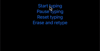
VATypingTextNode
VATextNode的子类,具有打字动画。
示例
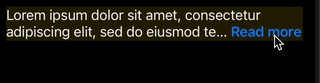
VAReadMoreTextNode
VATextNode的子类,提供简单方式处理“阅读更多”截断。
代码
lazy var readMoreTextNode = VAReadMoreTextNode(
    text: .loremText,
    maximumNumberOfLines: 2,
    readMore: .init(
        text: "Read more",
        fontStyle: .headline,
        colorGetter: { $0.systemBlue }
    )
)
示例
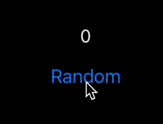
VACountingTextNode
VATextNode的子类,具有计数启动。
代码
countingTextNode.updateCount(to: Int.random(in: 0...1000))
示例
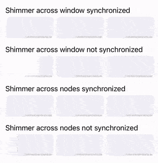
VAShimmerNode
VADisplayNode的子类,具有闪烁动画。
示例
容器
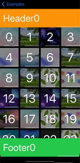
VAListNode
*是VATextureKitRx的一部分
ASCollectionNode的子类,用于声明性方式使用。
示例

VATableListNode
*是VATextureKitRx的一部分
ASTableNode的子类,用于声明性方式使用。
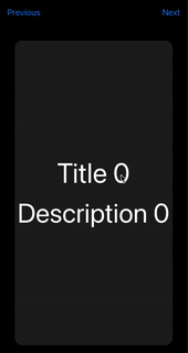
VAPagerNode
*是VATextureKitRx的一部分
ASPagerNode的子类,用于声明性方式使用。一些用于模拟循环滚动的工具。
示例
VAViewController
ASDKViewController的子类,处理主题更新。
VANavigationController
ASDKNavigationController的子类,处理主题更新和内容大小变化。
VATabBarController
ASTabBarController的子类,处理主题更新。
VAWindow
VAWindow的子类,处理主题更新和内容大小变化。提供应用程序上下文。
VAContainerCellNode
用于包装任何节点和单元格节点。
包装器
VAViewWrapperNode
使用节点和UIView的容器。
VANodeWrapperView
使用节点和视图的容器。
VASizedViewWrapperNode
使用节点和UIView的容器,继承其大小。
动画
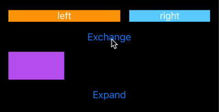
布局过渡动画
以简单的方式实现布局过渡动画。只需编写
override func animateLayoutTransition(_ context: ASContextTransitioning) {
    animateLayoutTransition(context: context)
}
示例
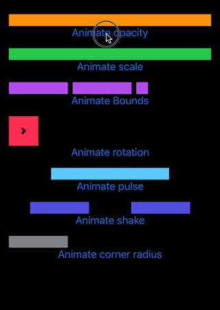
节点动画
以简单的方式实现节点动画。
示例
pulseNode.animate(.scale(values: [1, 1.1, 0.9, 1.2, 0.8, 1.1, 0.9, 1]), duration: 1)
结果

更多示例
主题
简单方式支持主题。默认浅色/深色或自定义初始化。
扩展
ASDimension
初始化支持。
使用原始 Texture
style.height = ASDimension(unit: .auto, value: 0)
style.height = ASDimension(unit: .points, value: height)
style.height = ASDimension(unit: .fraction, value: 0.3)
使用 VATextureKit
style.height = .auto
style.height = .points(height)
style.height = .fraction(0.3)
style.height = .fraction(percent: 30)
CGSize
数学
CGSize(width: 2, height: 2) * 2 = CGSize(width: 4, height: 4)

CGSize(width: 2, height: 2) + 1 = CGSize(width: 3, height: 3)
初始化器
CGSize(same: 16) == CGSize(width: 16, height: 16)
UIEdgeInsets
变量
/// (top, left)
origin: CGPoint

/// top + bottom
vertical: CGFloat

/// left + right
horizontal: CGFloat
初始化器
UIEdgeInsets(all: 16) == UIEdgeInsets(top: 16, left: 16, bottom: 16, right: 16)

UIEdgeInsets(vertical: 16) == UIEdgeInsets(top: 16, left: 0, bottom: 16, right: 0)

UIEdgeInsets(horizontal: 16) == UIEdgeInsets(top: 0, left: 16, bottom: 0, right: 16)

UIEdgeInsets(vertical: 4, horizontal: 8) == UIEdgeInsets(top: 4, left: 8, bottom: 4, right: 8)
预览
使用支持功能简单方式显示节点预览
sRepresentation(layout:)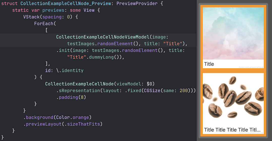
属性包装器
*是VATextureKitRx的一部分
- Obs
- Relay(value:) (BehaviorRelay)
- Relay() (PublishRelay)
使用这些包装器,代码变得更加简洁。
BehaviorRelay
var someObs: Observable<String> { someRelay.asObservable() }

private let someRelay = BehaviorRelay<String>(value: "value")
...
someRelay.accept("value1")
变为
@Obs.Relay(value: "value")
var someObs: Observable<String>
...
_someObs.rx.accept("value1")
PublishRelay
var someObs: Observable<String> { someRelay.asObservable() }

private let someRelay = PublishRelay<String>()
变为
@Obs.Relay()
var someObs: Observable<String>
实验
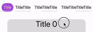
VASlidingTabBarNode
VAEmitterNode

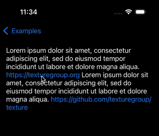
VALinkTextNode