


Texture 库封装,增加了某些功能。
此外,也可以看看这个带有辅助宏的包:VATextureKitMacro
将以下内容添加到您的 Podfile 中
pod 'VATextureKitRx'    // includes additional wrappers.
or
pod 'VATextureKit'      // includes Texture node wrappers.
or
pod 'VATextureKitSpec'  // includes only Layout Spec wrappers.
在终端中的项目目录
pod install
或尝试示例项目
pod try 'VATextureKit'
最低部署目标
1.9.x:iOS 11
2.x.x:iOS 14
以下 LayoutSpec DSL 组件可用于组合简单或非常复杂的布局。
| VATextureKit | Texture |
|---|---|
| 列 | ASStackLayoutSpec (垂直) |
| 行 | ASStackLayoutSpec (水平) |
| 堆叠 | |
| 安全区域 | ASInsetLayoutSpec(带有安全区域边距) |
| .padding | ASInsetLayoutSpec |
| .wrapped | ASWrapperLayoutSpec |
| .corner | ASC نمایشگذارLayoutSpec |
| .safe | ASInsetLayoutSpec(带有安全区域边距) |
| .centered | ASCenterLayoutSpec |
| .ratio | ASRatioLayoutSpec |
| .overlay | ASOverlayLayoutSpec |
| .background | ASBackgroundLayoutSpec |
| .relatively | ASRelativeLayoutSpec |
| .absolutely | ASAbsoluteLayoutSpec |
列
使用 ASStackLayoutSpec
override func layoutSpecThatFits(_ constrainedSize: ASSizeRange) -> ASLayoutSpec {
    ASStackLayoutSpec(
        direction: .vertical,
        spacing: 8,
        justifyContent: .start,
        alignItems: .start,
        children: [
            firstRectangleNode,
            secondRectangleNode,
        ]
    )
}
使用 Column
override func layoutSpecThatFits(_ constrainedSize: ASSizeRange) -> ASLayoutSpec {
    Column(spacing: 8) {
        firstRectangleNode
        secondRectangleNode
    }
}
示例

行
使用 ASStackLayoutSpec
ASStackLayoutSpec(
    direction: .horizontal,
    spacing: 4,
    justifyContent: .spaceBetween,
    alignItems: .start,
    children: [
        firstRectangleNode,
        secondRectangleNode,
    ]
)
使用 Row
Row(spacing: 4, main: .spaceBetween) {
    firstRectangleNode
    secondRectangleNode
}
示例

堆叠
堆叠:
Stack {
    firstRectangleNode
    secondRectangleNode
}
示例

安全区域
在自动在安全区域更改时重新布局的 ASDisplayNode 中使用 ASStackLayoutSpec
ASInsetLayoutSpec(
    insets: UIEdgeInsets(
        top: safeAreaInsets.top,
        left: safeAreaInsets.left,
        bottom: safeAreaInsets.bottom,
        right: safeAreaInsets.right
    ),
    child: ...
)
使用 SafeArea
SafeArea {
    ...
}
.padding
使用 ASInsetLayoutSpec
ASInsetLayoutSpec(
    insets: UIEdgeInsets(
        top: 8,
        left: 8,
        bottom: 8,
        right: 8
    ),
    child: titleTextNode
)
使用 .padding
titleTextNode
    .padding(.all(8))
.wrapped
使用 ASWrapperLayoutSpec
ASWrapperLayoutSpec(layoutElement: imageNode)使用 .wrapped
imageNode
    .wrapped()
.corner
使用 ASWrapperLayoutSpec
override func layoutSpecThatFits(_ constrainedSize: ASSizeRange) -> ASLayoutSpec {
    let spec = ASCornerLayoutSpec(
        child: imageNode,
        corner: badgeNode,
        location: .topRight
    )
    spec.offset = CGPoint(x: 4, y: 2)
    spec.wrapsCorner = false
    return spec
}
使用 .corner
imageNode
    .corner(badgeNode, offset: CGPoint(x: 4, y: 2))
.safe
在自动在安全区域更改时重新布局的 ASDisplayNode 中使用 ASStackLayoutSpec
override func layoutSpecThatFits(_ constrainedSize: ASSizeRange) -> ASLayoutSpec {
    ASInsetLayoutSpec(
        insets: UIEdgeInsets(
            top: safeAreaInsets.top,
            left: safeAreaInsets.left,
            bottom: safeAreaInsets.bottom,
            right: safeAreaInsets.right
        ),
        child: listNode
    )
}
使用 .safe
listNode
    .safe(in: self)
.centered
使用 ASCenterLayoutSpec
ASCenterLayoutSpec(
    centeringOptions: .XY,
    sizingOptions: .minimumXY,
    child: buttonNode
)
使用 .centered
buttonNode
    .centered()
.ratio
使用 ASRatioLayoutSpec
ASRatioLayoutSpec(
    ratio: 2 / 3,
    child: imageNode
)
使用 .ratio
imageNode
    .ratio(2 / 3)
.overlay
使用 ASOverlayLayoutSpec
ASOverlayLayoutSpec(
    child: imageNode,
    overlay: gradientNode
)
使用 .overlay
imageNode
    .overlay(gradientNode)
.background
使用 ASOverlayLayoutSpec
ASBackgroundLayoutSpec(
    child: gradientNode,
    background: imageNode
)
使用 .background
imageNode
    .background(gradientNode)
.relatively
使用 ASOverlayLayoutSpec
ASRelativeLayoutSpec(
    horizontalPosition: .start,
    verticalPosition: .end,
    sizingOption: .minimumSize,
    child: buttonNode
)
使用 .relatively
buttonNode
    .relatively(horizontal: .start, vertical: .end)
.absolutely
使用 ASAbsoluteLayoutSpec
buttonNode.style.preferredSize = frame.size
buttonNode.style.layoutPosition = frame.origin
return ASAbsoluteLayoutSpec(
    sizing: .sizeToFit,
    children: [buttonNode]
)
使用 .absolutely
buttonNode
    .absolutely(frame: .frame, sizing: .sizeToFit)
更复杂的布局示例
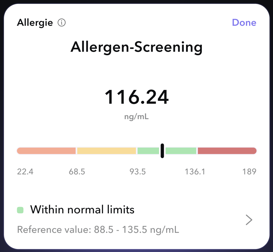
使用 VATextureKit
override func layoutSpecThatFits(_ constrainedSize: ASSizeRange) -> ASLayoutSpec {
    Column(cross: .stretch) {
        Row(main: .spaceBetween) {
            Row(spacing: 8, cross: .center) {
                testNameTextNode
                testInfoButtonNode
            }
            testStatusTextNode
        }
        titleTextNode
            .padding(.top(8))
        resultTextNode
            .padding(.top(32))
            .centered(.X)
        resultUnitsTextNode
            .centered(.X)
        referenceResultBarNode
            .padding(.vertical(24))
        Row(spacing: 16, cross: .center) {
            Column(spacing: 8) {
                Row(spacing: 8) {
                    resultBadgeImageNode
                    resultDescriptionTextNode
                }
                referenceValuesTextNode
            }
            accessoryImageNode
        }
    }
    .padding(.all(16))
}
使用原始 Texture
override func layoutSpecThatFits(_ constrainedSize: ASSizeRange) -> ASLayoutSpec {
    ASInsetLayoutSpec(
        insets: UIEdgeInsets(
            top: 16,
            left: 16,
            bottom: 16,
            right: 16
        ),
        child: ASStackLayoutSpec(
            direction: .vertical,
            spacing: 0,
            justifyContent: .start,
            alignItems: .stretch,
            children: [
                ASStackLayoutSpec(
                    direction: .horizontal,
                    spacing: 0,
                    justifyContent: .spaceBetween,
                    alignItems: .start,
                    children: [
                        ASStackLayoutSpec(
                            direction: .horizontal,
                            spacing: 8,
                            justifyContent: .start,
                            alignItems: .center,
                            children: [
                                testNameTextNode,
                                testInfoButtonNode,
                            ]
                        ),
                        testStatusTextNode,
                    ]
                ),
                ASInsetLayoutSpec(
                    insets: UIEdgeInsets(
                        top: 8,
                        left: 0,
                        bottom: 0,
                        right: 0
                    ),
                    child: titleTextNode
                ),
                ASCenterLayoutSpec(
                    centeringOptions: .X,
                    sizingOptions: .minimumXY,
                    child: ASInsetLayoutSpec(
                        insets: UIEdgeInsets(
                            top: 32,
                            left: 0,
                            bottom: 0,
                            right: 0
                        ),
                        child: resultTextNode
                    )
                ),
                ASCenterLayoutSpec(
                    centeringOptions: .X,
                    sizingOptions: .minimumXY,
                    child: resultUnitsTextNode
                ),
                ASInsetLayoutSpec(
                    insets: UIEdgeInsets(
                        top: 24,
                        left: 0,
                        bottom: 24,
                        right: 0
                    ),
                    child: referenceResultBarNode
                ),
                ASStackLayoutSpec(
                    direction: .horizontal,
                    spacing: 0,
                    justifyContent: .start,
                    alignItems: .center,
                    children: [
                        ASStackLayoutSpec(
                            direction: .vertical,
                            spacing: 8,
                            justifyContent: .start,
                            alignItems: .start,
                            children: [
                                ASStackLayoutSpec(
                                    direction: .horizontal,
                                    spacing: 8,
                                    justifyContent: .start,
                                    alignItems: .start,
                                    children: [
                                        resultBadgeImageNode,
                                        resultDescriptionTextNode,
                                    ]
                                ),
                                referenceValuesTextNode,
                            ]
                        ),
                        accessoryImageNode,
                    ]
                ),
            ]
        )
    )
}.sized
设置 Node 的大小。
使用 style
imageNode.style.width = ASDimension(unit: .points, value: 320)
imageNode.style.height = ASDimension(unit: .points, value: 480)
使用 .sized
imageNode
    .sized(width: 320, height: 480)
.flex
设置 Node 的灵活性。
使用 style
titleTextNode.style.flexShrink = 0.1
titleTextNode.style.flexGrow = 1
使用 .flex
titleTextNode
    .flex(shrink: 0.1, grow: 1)
.maxConstrained
设置 Node 的最大可能大小。
使用 style
titleTextNode.style.maxWidth = ASDimension(unit: .points, value: 320)
titleTextNode.style.maxHeight = ASDimension(unit: .points, value: 100)
使用 .maxConstrained
titleTextNode
    .maxConstrained(width: 320, height: 480)
.minConstrained
设置 Node 的最小可能大小。
使用 style
titleTextNode.style.minWidth = ASDimension(unit: .points, value: 100)
titleTextNode.style.minHeight = ASDimension(unit: .points, value: 50)
使用 .minConstrained
titleTextNode
.minConstrained(width: 100, height: 50)VADisplayNode
ASDisplayNode 的子类,自动管理子节点和处理主题更新。
VATextNode
ASTextNode 的子类,处理内容大小和处理主题更新。有默认的文本样式。
VAButtonNode
带有 onTap 闭包的 ASButtonNode 的子类。
VACellNode
ASCellNode 的子类,自动管理子节点和处理主题更新。
VAImageNode
带有参数化初始化器的 ASImageNode 的子类。
VASpacerNode
用于填充 Row / Column 空间的 ASDisplayNode 的子类。
VASafeAreaDisplayNode
自动在安全区域更改时重新布局的 VADisplayNode 的子类。
VABaseGradientNode
带有 CAGradientLayer 根层的 ASDisplayNode 的子类。
VALinearGradientNode
带有简化线性渐变创建的参数化初始化器的 VABaseGradientNode 的子类。
VARadialGradientNode
带有简化径向渐变创建的参数化初始化器的 VABaseGradientNode 的子类。
VAShapeNode
带有 CAShapeLayer 根层的 ASDisplayNode 的子类。
VAEmitterNode
带有 CAEmitterLayer 支持的 ASDisplayNode 的子类。
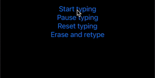
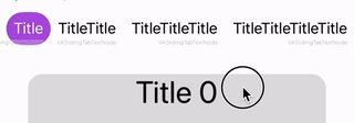
VATypingTextNode
带有输入动画的
示例
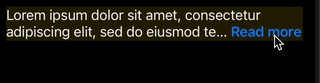
VAReadMoreTextNode
以易于方式进行“读取更多”截断的 VATextNode 的子类。
代码
lazy var readMoreTextNode = VAReadMoreTextNode(
    text: .loremText,
    maximumNumberOfLines: 2,
    readMore: .init(
        text: "Read more",
        fontStyle: .headline,
        colorGetter: { $0.systemBlue }
    )
)
示例
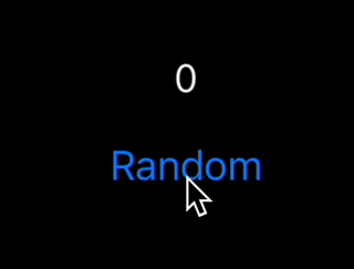
VACountingTextNode
带有计数初始化的 VATextNode 的子类。
代码
countingTextNode.updateCount(to: Int.random(in: 0...1000))
示例
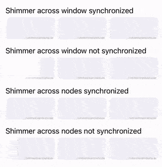
VAShimmerNode
带有闪烁动画的 VADisplayNode 的子类。
示例
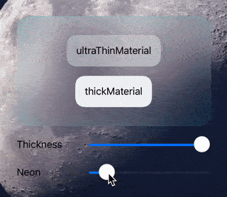
VAVisualEffectNode
视觉效果节点。
示例代码
VAMaterialVisualEffectNode(
    style: .ultraThinMaterial,
    context: .init(
        corner: .init(radius: 24),
        border: .init(color: AppearanceColor(light: .cyan.withAlphaComponent(0.2), dark: .orange.withAlphaComponent(0.2)).wrappedValue),
        shadow: .init(radius: 24),
        neon: .init(color: AppearanceColor(light: .cyan, dark: .orange).wrappedValue, width: 2),
        pointer: .init(radius: 32, color: AppearanceColor(light: .cyan, dark: .orange).wrappedValue),
        excludedFilters: [.luminanceCurveMap, .colorSaturate, .colorBrightness]
    )
)
示例
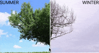
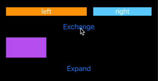
VAComparisonNode
是 ASDisplayNode 的子类,用于滑动比较两个子节点。
示例
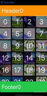
VAListNode
是 VATextureKitRx 的一部分
是 ASCollectionNode 的子类,可以声明式地使用。
示例

VATableListNode
是 VATextureKitRx 的一部分
是 ASTableNode 的子类,可以声明式地使用。
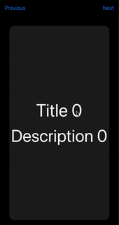
VAPagerNode
是 VATextureKitRx 的一部分
是 ASPagerNode 的子类,可以声明式地使用。一些帮助实现循环滚动的技巧。
示例
VAViewController
是处理主题更新的 ASDKViewController 的子类。
VANavigationController
是处理主题更新和内容大小变化的 ASDKNavigationController 的子类。
VATabBarController
是处理主题更新的 ASTabBarController 的子类。
VAWindow
是处理主题更新和内容大小变化的 VAWindow 的子类。提供应用上下文。
VAContainerCellNode
用于包装任何节点与单元格节点。
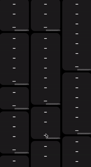
VASelfSizingListContainerNode
用于包装 ASCollectionNode 以在垂直或水平方向上启用自定大小行为。建议不要与大型列表一起使用此类。
VAViewWrapperNode
用于在节点中使用的 UIView。
VANodeWrapperView
用于在视图中使用节点的容器。
VASizedViewWrapperNode
用于使用自动布局的 UIView 与节点继承其大小。
示例
VASizedViewWrapperNode(
    childGetter: { MyAwesomeView() },
    sizing: .viewWidth
)
.sized(height: 140)
VAViewWrapperNode
用于使用 UIView 与节点继承其大小的容器。
示例
VAViewWrapperNode(
    childGetter: { MyAwesomeView(frame: .init(width: 48, height: 24)) },
    sizing: .inheritedWidth
)
.sized(height: 140)
VAViewHostingNode
用于使用 SwiftUI View 与节点继承其大小的容器。
示例
VAViewHostingNode(
    body: {
        Text("Some text")
            .background(Color.green.opacity(0.1))
    },
    sizing: .viewSize
)
布局过渡动画
以简单的方式实现布局过渡动画。只需写入
override func animateLayoutTransition(_ context: ASContextTransitioning) {
    animateLayoutTransition(context: context)
}
示例
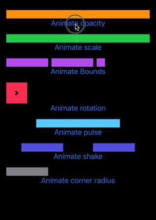
节点动画
以简单的方式实现节点动画。
示例
pulseNode.animate(.scale(values: [1, 1.1, 0.9, 1.2, 0.8, 1.1, 0.9, 1]), duration: 1)
结果

更多示例
以简单的方式支持主题。默认为浅色/深色或自定义初始化。
ASDimension
支持初始化。
使用原始 Texture
style.height = ASDimension(unit: .auto, value: 0)
style.height = ASDimension(unit: .points, value: height)
style.height = ASDimension(unit: .fraction, value: 0.3)
使用 VATextureKit
style.height = .auto
style.height = .points(height)
style.height = .fraction(0.3)
style.height = .fraction(percent: 30)
CGSize
数学
CGSize(width: 2, height: 2) * 2 = CGSize(width: 4, height: 4)

CGSize(width: 2, height: 2) + 1 = CGSize(width: 3, height: 3)
初始化器
CGSize(same: 16) == CGSize(width: 16, height: 16)
UIEdgeInsets
变量
/// (top, left)
origin: CGPoint

/// top + bottom
vertical: CGFloat

/// left + right
horizontal: CGFloat
初始化器
UIEdgeInsets(all: 16) == UIEdgeInsets(top: 16, left: 16, bottom: 16, right: 16)

UIEdgeInsets(vertical: 16) == UIEdgeInsets(top: 16, left: 0, bottom: 16, right: 0)

UIEdgeInsets(horizontal: 16) == UIEdgeInsets(top: 0, left: 16, bottom: 0, right: 16)

UIEdgeInsets(vertical: 4, horizontal: 8) == UIEdgeInsets(top: 4, left: 8, bottom: 4, right: 8)
使用支持函数以简单的方式预览节点
sRepresentation(layout:)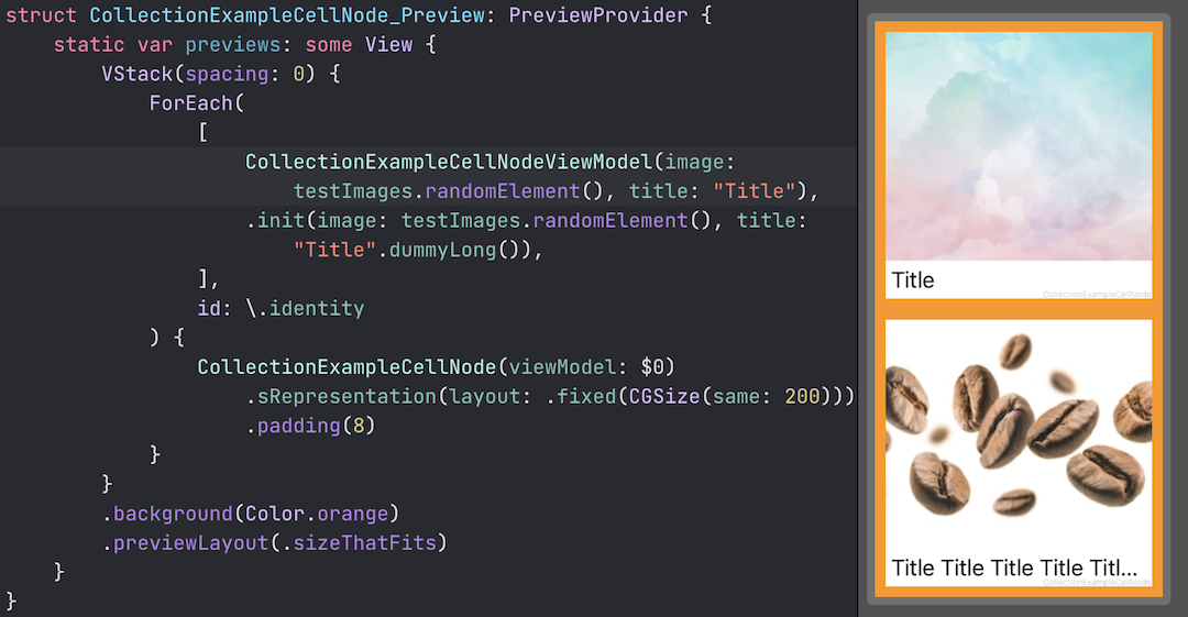
是 VATextureKitRx 的一部分
- Obs
- Relay(value:) (BehaviorRelay)
- Relay() (PublishRelay)
使用这些包装器,代码变得更加简洁。
BehaviorRelay
var someObs: Observable<String> { someRelay.asObservable() }

private let someRelay = BehaviorRelay<String>(value: "value")
...
someRelay.accept("value1")
成为
@Obs.Relay(value: "value")
var someObs: Observable<String>
...
_someObs.rx.accept("value1")
PublishRelay
var someObs: Observable<String> { someRelay.asObservable() }

private let someRelay = PublishRelay<String>()
成为
@Obs.Relay()
var someObs: Observable<String>
VASlidingTabBarNode
VAEmitterNode

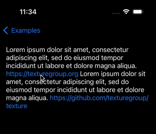
VALinkTextNode