TabCollectionView


标签屏幕是单一屏幕上整齐显示多个页面时最受欢迎的设计之一。使用 UIKit,此组件并非免费提供。TabCollectionView 帮助您只需几行代码即可创建复杂的标签屏幕。 TabCollectionView 完全用 Swift 编写,非常轻量级,因为它基于底层的 UICollectionView。 TabCollectionView 支持ViewController的懒加载,使您能够灵活地控制内存。它使用类似于任何其他基于UIKit集合数据的视图的委托架构,因此易于适应和实现。

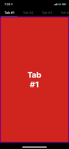
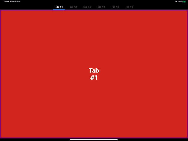
开始滑动吧!
要求
- iOS 11.0+
- XCode 10.2+
- Swift 5.0+
安装
TabCollectionView 通过 CocoaPods 提供。要安装它,只需将以下行添加到您的 Podfile 中。
pod 'TabCollectionView'示例
要运行示例项目,请首先克隆仓库,然后从 Example 目录运行 pod install。
使用
TabCollectionViewController
TabCollectionViewController是视图
let controller = TabCollectionViewController()
controller.viewControllers = [...]  // Your View Controllers
... // Present the controller, the way you want...
这就是全部内容!你的标签视图已经准备好了。
你可以将
TabCollectionView
TabCollectionView是用于布局的核心组件。它由两个collectionView组成 -
weak var datasource: TabCollectionViewDataSource?
weak var delegate: TabCollectionViewDelegate?public var tabHeaderCellWidth: CGFloat = 100 // Header Cell width. This property is used as default value if delegate method not implemented
public var tabHeaderHeight: CGFloat = 44 // Header Height. Defines the height of the top section.
public var isTabHeaderHidden: Bool = false // Bool indicating the visibility of header section
public var tabHeaderFollowsReadableLayoutGuide: Bool = true // Bool to tell the layout engine to follow readable width on large screen
public var headerAlignment: HeaderAlignment = .leading // Defines the alignment of header cells in the toop section
public var normalHeaderColor: UIColor = .tertiaryLabel // Header title color. Works only with LabelHeaderCell.
public var selectedHeaderColor: UIColor = .label // Selected Header title color. Works only with LabelHeaderCell.
public var tintColor: UIColor = .systemBlue // Defines the color of the Selected tab bar indicator.使用
TabCollectionViewDataSource
var tabHeaderCellType: UICollectionViewCell.Type { get }
var tabContentCellType: UICollectionViewCell.Type { get }
func numberOfItems(_ tabCollectionView: TabCollectionView) -> Int
func tabCollectionView(_ tabCollectionView: TabCollectionView, setupHeader header: UICollectionViewCell, at index: Int, selectedTab: Bool)
func tabCollectionView(_ tabCollectionView: TabCollectionView, setupContentCell cell: UICollectionViewCell, at index: Int)
func tabCollectionView(_ tabCollectionView: TabCollectionView, titleForTabAt index: Int) -> String?  // Optional
func tabCollectionView(_ tabCollectionView: TabCollectionView, viewControllerAt index: Int) -> UIViewController?  // Optional
头部单元格类型和内容单元格类型都是完全可定制的。如果你想使用自己的UICollectionViewCell类型用于头部和内容,通过
子视图控制器填充
要使用 UIViewController 作为每个屏幕,将数据源的 tabContentCellType 传递为 ViewCell.self,并将 TabCollectionView 的 parentViewController 属性设置为当前 TabCollectionView 的容器 ViewController。该属性有助于将 viewControllers 添加为当前 viewController 的子 viewController,从而有效地维持生命周期。
class ViewController: UIViewController, TabCollectionViewDataSource {

    lazy var tabCollectionView: TabCollectionView = {
        let view = TabCollectionView()
        view.parentViewController = self
        view.datasouce = self
        ...
        return view
    }()

    var tabContentCellType: UICollectionView.Type {
        return ViewCell.self
    }

    func tabCollectionView(_ tabCollectionView: TabCollectionView, setupContentCell cell: UICollectionViewCell, at index: Int) {
        let controller: UIViewController = ...  // ViewController to display
        guard let contentCell = cell as? ViewCell else { assert() }
        contentCell.setupCell(with: controller)
    }

    ...

}
自适应
TabCollectionView 完全自动适应屏幕大小变化。要强制布局更新,只需调用 TabCollectionView 的 reloadLayout() 方法。

作者
Akaash Dev, [email protected]
许可协议
TabCollectionView 在 MIT 许可证下可用。有关更多信息,请参阅 LICENSE 文件。