SwiftAlertView
一个用 Swift 编写的强大可定制的 Alert View 库。
SwiftAlertView 是 UIAlertController 和 SwiftUI alert 的最佳替代品。使用 SwiftAlertView,您可以通过几行代码轻松创建所需的 Alert View。
安装
CocoaPods
CocoaPods 是 Cocoa 项目的依赖管理器。要使用 CocoaPods 将 SwiftAlertView 集成到 Xcode 项目中,请在您的 Podfile 中指定它
pod 'SwiftAlertView', '~> 2.2.1'Carthage
Carthage是一种去中心化的依赖管理器,可以构建您的依赖并为您提供二进制框架。要使用Carthage将SwiftAlertView集成到Xcode项目中,请在您的Cartfile中指定它。
github "https://github.com/dinhquan/SwiftAlertView" ~> 2.2.1
Swift包管理器
Swift包管理器是一个自动化Swift代码发行的工具,集成到了swift编译器中。
一旦您设置好Swift包,将SwiftAlertView作为依赖项添加就如同在您的Package.swift的dependencies值中添加它一样简单。
dependencies: [
    .package(url: "https://github.com/dinhquan/SwiftAlertView", .upToNextMajor(from: "2.2.1"))
]
手动操作
在项目的Source中拖放名为SwiftAlertView的文件,您就完成了。
突出功能
- 更改警告框背景颜色、背景图像、边框半径。
- 更改标题字体、颜色、边距、可见性。
- 更改消息字体、颜色、边距、可见性。
- 更改按钮字体、颜色。
- 更改警告框外观行为。
- 添加文本字段(如UIAlertController)。
- 支持深色模式。
- 使用自定义视图初始化警告视图。
- 使用xib文件初始化警告视图。
- 处理按钮触摸事件的回调。
- 还有更多...
使用方法
显示警告框
SwiftAlertView.show(title: "Title", message: "Message", buttonTitles: "Cancel", "OK")自定义
SwiftAlertView.show(title: "Title",
                    message: "Message",
                    buttonTitles: "OK", "Cancel") { alert in
    alert.backgroundColor = .yellow
    alert.cancelButtonIndex = 1
    alert.buttonTitleColor = .blue
}
处理按钮点击事件
SwiftAlertView.show(title: "Title",
                    message: "Message",
                    buttonTitles: "OK", "Cancel") {
    $0.style = .dark
}
.onButtonClicked { _, buttonIndex in
    print("Button Clicked At Index \(buttonIndex)")
}
添加文本字段
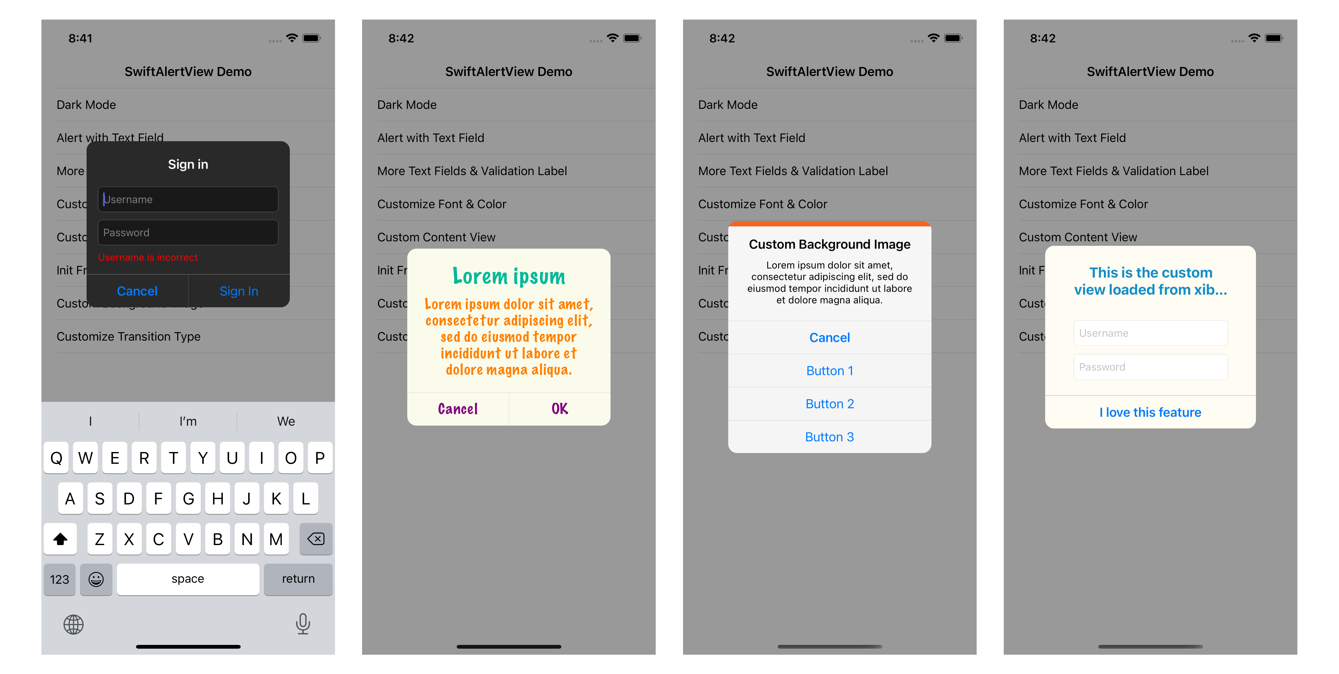
SwiftAlertView.show(title: "Sign in", buttonTitles: "Cancel", "Sign In") { alertView in
    alertView.addTextField { textField in
        textField.placeholder = "Username"
    }
    alertView.addTextField { textField in
        textField.placeholder = "Password"
    }
    alertView.isEnabledValidationLabel = true
    alertView.isDismissOnActionButtonClicked = false
}
.onActionButtonClicked { alert, buttonIndex in
    let username = alert.textField(at: 0)?.text ?? ""
    if username.isEmpty {
        alert.validationLabel.text = "Username is incorrect"
    } else {
        alert.dismiss()
    }
}
.onTextChanged { _, text, index in
    if index == 0 {
        print("Username text changed: ", text ?? "")
    }
}
您可以显示带有自定义内容视图的警告框
// with xib file
SwiftAlertView.show(nibName: "CustomView", buttonTitles: "OK")

// with custom UIView
SwiftAlertView.show(contentView: customView, buttonTitles: "OK")
通过代码创建警告
初始化警告
let alertView = SwiftAlertView(title: "Title", message: "Message", buttonTitles: "Cancel", "Button 1", "Button 2", "Button 3")

let alertView = SwiftAlertView(contentView: customView, buttonTitles: "OK")

let alertView = SwiftAlertView(nibName: "CustomView", buttonTitles: "OK")
显示或隐藏
// Show at center of screen
alertView.show()

// Show at center of a view
alertView.show(in: view)

// Programmatically dismiss the alert view
alertView.dismiss()
处理按钮点击事件
alertView.onButtonClicked = { buttonIndex in
    print("Button Clicked At Index \(buttonIndex)")
}
alertView.onCancelButtonClicked = {
    print("Cancel Button Clicked")
}
alertView.onActionButtonClicked = { buttonIndex in
    print("Action Button Clicked At Index \(buttonIndex)")
}
如果你不想使用闭包,让视图控制器遵守 SwiftAlertViewDelegate 协议并使用委托方法
alertView.delegate = self

func alertView(_ alertView: SwiftAlertView, clickedButtonAtIndex buttonIndex: Int) {
    println("Button Clicked At Index \(buttonIndex)")
}

func didPresentAlertView(_ alertView: SwiftAlertView) {
    println("Did Present Alert View")
}

func didDismissAlertView(_ alertView: SwiftAlertView) {
    println("Did Dismiss Alert View")
}
自定义
SwiftAlertView 可以使用以下属性进行自定义
public var style: Style = .auto // default is based on system color

public var titleLabel: UILabel! // access titleLabel to customize the title font, color
public var messageLabel: UILabel! // access messageLabel to customize the message font, color

public var backgroundImage: UIImage?
// public var backgroundColor: UIColor? // inherits from UIView

public var cancelButtonIndex = 0 // default is 0, set this property if you want to change the position of cancel button
public var buttonTitleColor = UIColor(red: 0, green: 0.478431, blue: 1, alpha: 1) // to change the title color of all buttons
public var buttonHeight: CGFloat = 44.0

public var separatorColor = UIColor(red: 196.0/255, green: 196.0/255, blue: 201.0/255, alpha: 1.0) // to change the separator color
public var isHideSeparator = false
public var cornerRadius: CGFloat = 12.0

public var isDismissOnActionButtonClicked = true // default is true, if you want the alert view will not be dismissed when clicking on action buttons, set this property to false
public var isHighlightOnButtonClicked = true
public var isDimBackgroundWhenShowing = true
public var isDismissOnOutsideTapped = false
public var dimAlpha: CGFloat = 0.4
public var dimBackgroundColor: UIColor? = .init(white: 0, alpha: 0.4)

public var appearTime = 0.2
public var disappearTime = 0.1

public var transitionType: TransitionType = .default

// customize the margin & spacing of title & message
public var titleSideMargin: CGFloat = 20.0
public var messageSideMargin: CGFloat = 20.0
public var titleTopMargin: CGFloat = 20.0
public var messageBottomMargin: CGFloat = 20.0
public var titleToMessageSpacing: CGFloat = 20.0

// customize text fields
public var textFieldHeight: CGFloat = 34.0
public var textFieldSideMargin: CGFloat = 15.0
public var textFieldBottomMargin: CGFloat = 15.0
public var textFieldSpacing: CGFloat = 10.0
public var isFocusTextFieldWhenShowing = true
public var isEnabledValidationLabel = false
public var validationLabel: UILabel! // access to validation label to customize font, color
public var validationLabelTopMargin: CGFloat = 8.0
public var validationLabelSideMargin: CGFloat = 15.0
贡献
欢迎为错误修复或改进做出贡献。请随意提交拉取请求。如果您有任何问题、功能建议或错误报告,请给我发电子邮件至 [email protected]。