Swift-Icons 1.0.0
| 测试已测试 | ✗ |
| 语言语言 | SwiftSwift |
| 许可 | MIT |
| 发布最后发布 | 2017年3月 |
| SwiftSwift 版本 | 3.0 |
| SPM支持 SPM | ✗ |
由 Saurabh Rane 维护。
Swift-Icons 1.0.0
- 由
- Saurabh Rane
Swift 字体图标库
请 ★ 这库。
现在,您不需要下载不同的库来包含不同的字体图标。这个 SwiftIcons 库可以帮助您使用以下字体图标中的任意一个。
- Dripicons
- 表情符号
- FontAwesome
- Ionicons
- Linearicons
- Map-icons
- Material icons
- Open iconic
- State face icons
- Weather icons
SwiftIcons 支持对象库中的不同对象。
- UIImage
- UIImageView
- UILabel
- UIButton
- UISegmentedControl
- UITabBarItem
- UISlider
- UIBarButtonItem
- UIViewController
- UITextfield
- UIStepper
要求
- iOS 8.0+
- Xcode 8
安装
复制 Source 文件夹下的所有文件。 文件链接。
- SwiftIcons.swift
- Dripicons.ttf
- Emoji.ttf
- FontAwesome.ttf
- Ionicons.ttf
- Linearicons.ttf
- MapIcons.ttf
- MaterialIcons.ttf
- OpenIconic.ttf
- Stateface.ttf
- WeatherIcons.ttf
检查是否导入所有 ttf 文件到项目中,选择“项目” > “目标” > “复制到目标资源包”
使用方法
- 不再需要图像图标了
每个字体图标都有不同的字体类型
| 字体图标 | 版本 | 字体类型 | 图标 |
|---|---|---|---|
| Dripicons | 2.0 | dripicons | dripicons |
| 表情符号 | emoji | emoji | |
| FontAwesome | 4.7.0 | fontAwesome | fontAwesome |
| Ionicons | 2.0.1 | ionicons | ionicons |
| Linearicons | 1.0.0 | linearIcons | linearIcons |
| Map-icons | 3.0.2 | mapicons | mapicons |
| Material icons | 2.2.0 | googleMaterialDesign | googleMaterialDesign |
| Open iconic | 1.1.1 | openIconic | openIconic |
| State face icons | state | state | |
| Weather icons | 2.0.10 | weather | weather |
当你要将图标设置到任何对象时,你必须说明它是哪种字体类型,然后从该特定的字体图标中选择你想要设置的图标。
UIImage
UIImage.init(icon: .emoji(.airplane), size: CGSize(width: 35, height: 35))

// Icon with colors
UIImage.init(icon: .emoji(.airplane), size: CGSize(width: 35, height: 35), textColor: .red)
UIImage.init(icon: .emoji(.airplane), size: CGSize(width: 35, height: 35), textColor: .white, backgroundColor: .red)

// Stacked icons with bigger background
UIImage.init(bgIcon: .fontAwesome(.circleO), topIcon: .fontAwesome(.squareO))

// Stacked icons with smaller background
UIImage.init(bgIcon: .fontAwesome(.camera), topIcon: .fontAwesome(.ban), topTextColor: .red, bgLarge: false)

// Stacked icons with custom size
UIImage.init(bgIcon: .fontAwesome(.camera), topIcon: .fontAwesome(.ban), topTextColor: .red, bgLarge: false, size: CGSize(width: 50, height: 50))
UIImageView
// Setting icon to image view
imageView.setIcon(icon: .weather(.rainMix))

// Icon with colors
imageView.setIcon(icon: .mapicons(.amusementPark), textColor: .white, backgroundColor: .blue, size: nil)
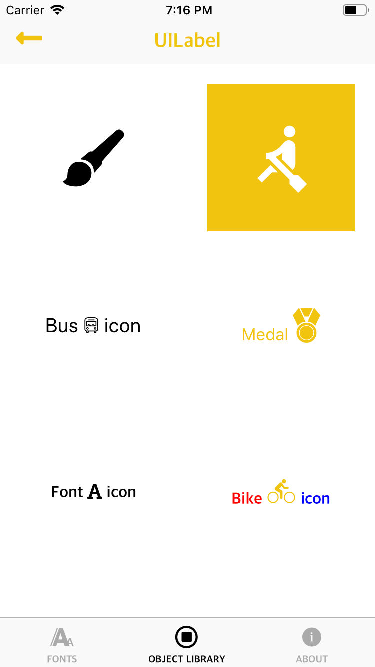
UILabel
// Setting icon to label
label.setIcon(icon: .ionicons(.paintbrush), iconSize: 70)

// Icon with colors
label.setIcon(icon: .googleMaterialDesign(.rowing), iconSize: 70, color: .white, bgColor: textColor)

// Icon with text around it
label.setIcon(prefixText: "Bus ", icon: .linearIcons(.bus), postfixText: " icon", size: 20)

// Icon with color & colored text around it
label.setIcon(prefixText: "Medal ", prefixTextColor: .red, icon: .ionicons(.ribbonA), iconColor: .red, postfixText: "", postfixTextColor: .red, size: nil, iconSize: 40)

// Icon with text with different fonts around it
label.setIcon(prefixText: "Font ", prefixTextFont: font1!, icon: .fontAwesome(.font), postfixText: " icon", postfixTextFont: font2!)

// Icon with text with different fonts & colors around it
label.setIcon(prefixText: "Bike ", prefixTextFont: font1!, prefixTextColor: .red, icon: .mapicons(.bicycling), iconColor: textColor, postfixText: " icon", postfixTextFont: font2!, postfixTextColor: .blue, iconSize: 30)
UIButton
// Setting icon to button
button.setIcon(icon: .linearIcons(.phone), forState: .normal)

// Icon with size and color
button.setIcon(icon: .openIconic(.clipboard), iconSize: 70, color: .blue, forState: .normal)

// Icon with text around it
button.setIcon(prefixText: "Please ", icon: .googleMaterialDesign(.print), postfixText: " print", forState: .normal)

// Icon with color & colored text around it
button.setIcon(prefixText: "Lock ", prefixTextColor: .red, icon: .googleMaterialDesign(.lock), iconColor: .yellow, postfixText: " icon", postfixTextColor: .blue, forState: .normal, textSize: 15, iconSize: 20)

// Icon with text with different fonts around it
button.setIcon(prefixText: "Happy ", prefixTextFont: font1!, icon: .ionicons(.happy), postfixText: " face", postfixTextFont: font2!, forState: .normal)

// Icon with text with different fonts & colors around it
button.setIcon(prefixText: "Pulse ", prefixTextFont: font1!, prefixTextColor: .darkGray, icon: .openIconic(.pulse), iconColor: .red, postfixText: " icon", postfixTextFont: font2!, postfixTextColor: .purple, forState: .normal, iconSize: 40)
UISegmentedControl
// Setting icon at particular index
segmentedControl.setIcon(icon: .linearIcons(.thumbsUp), forSegmentAtIndex: 0)
segmentedControl.setIcon(icon: .linearIcons(.thumbsDown), forSegmentAtIndex: 1)

// Icons with sizes & colors
segmentedControl.setIcon(icon: .fontAwesome(.male), color: .red, iconSize: 50, forSegmentAtIndex: 0)
segmentedControl.setIcon(icon: .fontAwesome(.female), color: .purple, iconSize: 50, forSegmentAtIndex: 1)
UITabBarItem
// Setting icon to tab bar item
tabBar.items?[0].setIcon(icon: .fontAwesome(.font), size: nil, textColor: .lightGray)

// Stacked icons for tab bar item
tabBar.items?[1].setIcon(bgIcon: .fontAwesome(.circleThin), bgTextColor: .lightGray, topIcon: .fontAwesome(.squareO), topTextColor: .lightGray, bgLarge: true, size: nil)
UISlider
// Change minimum & maximum value icons
slider.setMaximumValueIcon(icon: .emoji(.digitNine))
slider.setMinimumValueIcon(icon: .emoji(.digitZero))

// Change minimum & maximum value icons with colors
slider.setMaximumValueIcon(icon: .linearIcons(.pointerUp), customSize: nil, textColor: .red, backgroundColor: .clear)
slider.setMinimumValueIcon(icon: .linearIcons(.pointerDown), customSize: nil, textColor: .blue, backgroundColor: .clear)
UIBarButtonItem
// Setting icon to bar button item
barButtonItem.setIcon(icon: .ionicons(.iosFootball), iconSize: 30)

// Icon with colors
barButtonItem.setIcon(icon: .ionicons(.iosFootball), iconSize: 30, color: textColor)

// Icon with text around it
barButtonItem.setIcon(prefixText: "Please ", icon: .ionicons(.iosDownload), postfixText: " download", cgRect: CGRect(x: 0, y: 0, width: 30, height: 30), size: 23)

// Icon with color & colored text around it
barButtonItem.setIcon(prefixText: "Blue ", prefixTextColor: .red, icon: .ionicons(.iosFootball), iconColor: .blue, postfixText: " football", postfixTextColor: .green, cgRect: CGRect(x: 0, y: 0, width: 30, height: 30), size: 20, iconSize: 30)

// Icon with text with different fonts around it
barButtonItem.setIcon(prefixText: "Digit ", prefixTextFont: font1!, icon: .emoji(.digitOne), postfixText: " One", postfixTextFont: font2!, cgRect: CGRect(x: 0, y: 0, width: 30, height: 30))

// Icon with text with different fonts & colors around it
barButtonItem.setIcon(prefixText: "", prefixTextFont: font1!, prefixTextColor: .red, icon: .ionicons(.iosFootball), iconColor: .blue, postfixText: " football", postfixTextFont: font2!, postfixTextColor: .green, cgRect: CGRect(x: 0, y: 0, width: 30, height: 30), iconSize: 24)
UIViewController
// Setting icon to the title
self.setTitleIcon(icon: .emoji(.animalHorse), iconSize: 30, color: .red)
UITextField
// Setting left view icon
textfield.setLeftViewIcon(icon: .fontAwesome(.search))

// Left view icon with colors & leftViewMode
textfield.setLeftViewIcon(icon: .state(.TX), leftViewMode: .always, textColor: .blue, backgroundColor: .clear, size: nil)
textfield.setLeftViewIcon(icon: .googleMaterialDesign(.plusOne), leftViewMode: .unlessEditing, textColor: .green, backgroundColor: .clear, size: nil)

// Setting right view icon
textfield.setRightViewIcon(icon: .openIconic(.questionMark))

// Right view icon with colors & rightViewMode
textfield.setRightViewIcon(icon: .weather(.rainMix), rightViewMode: .always, textColor: .red, backgroundColor: .clear, size: nil)
UIStepper
// Setting icons
stepper.setDecrementIcon(icon: .ionicons(.iosPause), forState: .normal)
stepper.setIncrementIcon(icon: .ionicons(.iosPlay), forState: .normal)
示例
请查看SwiftIcons应用程序
作者
Saurabh Rane
特别感谢 Patrik Vaberer 以及他最初在 Font-Awesome-Swift 库上的工作
许可证
SwiftIcons 在MIT许可证下可用。有关更多信息,请参阅LICENSE文件。