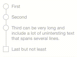
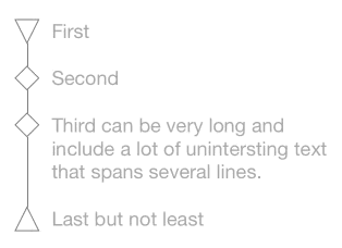
StepProgressView
带有标签和形状的逐步进度视图。是 UIActivityIndicatorView 和 UIProgressView 的良好替代品。


用法
let progressView   = StepProgressView(frame: view.bounds)
progressView.steps = ["First", "Second", "Third", "Last"]
progressView.details = [0: "The beginning", 3: "The end"] // appears below step title

progressView.currentStep = 0 // started first step
...
progressView.currentStep = 4 // all done
SwiftUI 使用
StepsView(currentStep: $step, steps: ["First", "Second", "Third", "Done"])
    .stepShape(.rhombus)
更改外观
以下属性可以在 Interface Builder 中设置,在代码中设置,或通过 UIAppearance 代理(例如,StepProgressView.appearance().stepShape = .circle)设置。使用 SwiftUI 时,您可以在 StepsView 初始化器中设置它们,或使用 SwiftUI 视图修饰符。
步骤图标的形状
progressView.stepShape = .circle
progressView.firstStepShape = .rhombus
progressView.lastStepShape = .square
// also available: .triangle, .downTriangle
文本字体和大小
progressView.textFont = myFont
progressView.detailFont = anotherFont
行间距大小
progressView.lineWidth = 2.5
progressView.verticalPadding = 8 // between steps (0 => default based on textFont)
progressView.horizontalPadding: 8 // between shape and text (0 => default based on textFont)
颜色
progressView.tintColor = myGeneralTintColor

// alternatively:

progressView.currentStepColor = .red
progressView.pastStepColor = .gray
progressView.futureStepColor = .gray

progressView.currentStepFillColor = .yellow
progressView.pastStepFillColor = .gray
progressView.futureStepFillColor = .lightGray

progressView.currentTextColor = .blue
progressView.pastTextColor = .gray
progressView.futureTextColor = .lightGray
progressView.currentDetailColor = .cyan // nil => use currentStepColor
安装
CocoaPods
pod 'StepProgressView'旧版本
| Swift版本 | StepProgressView版本 |
|---|---|
| 4.0 (Xcode 9.4) | pod 'MiniLayout', '~> 1.2.1'pod 'StepProgressView', '~> 1.4.1' |
| 3 | pod 'MiniLayout', '~> 1.1.0'pod 'StepProgressView', '~> 1.3.0' |
| 2.3 | pod 'MiniLayout', '~> 1.0.1'pod 'StepProgressView', '~> 1.2.1' |
Swift包管理器
dependencies: [
    .package(url: "https://github.com/yonat/StepProgressView", from: "1.6.1")
]