QuickTableViewController


创建设置表格视图的简单方法,包括
- 带有
UISwitch的表格视图单元格 - 带中间对齐文本的可点击操作表格视图单元格
- 提供互斥选项的分区
- 当行对用户交互做出反应时执行的操作
- 轻松指定表格视图单元格图片、样式和附件类型

使用方法
在 viewDidLoad 中设置 tableContents
import QuickTableViewController
final class ViewController: QuickTableViewController {
override func viewDidLoad() {
super.viewDidLoad()
tableContents = [
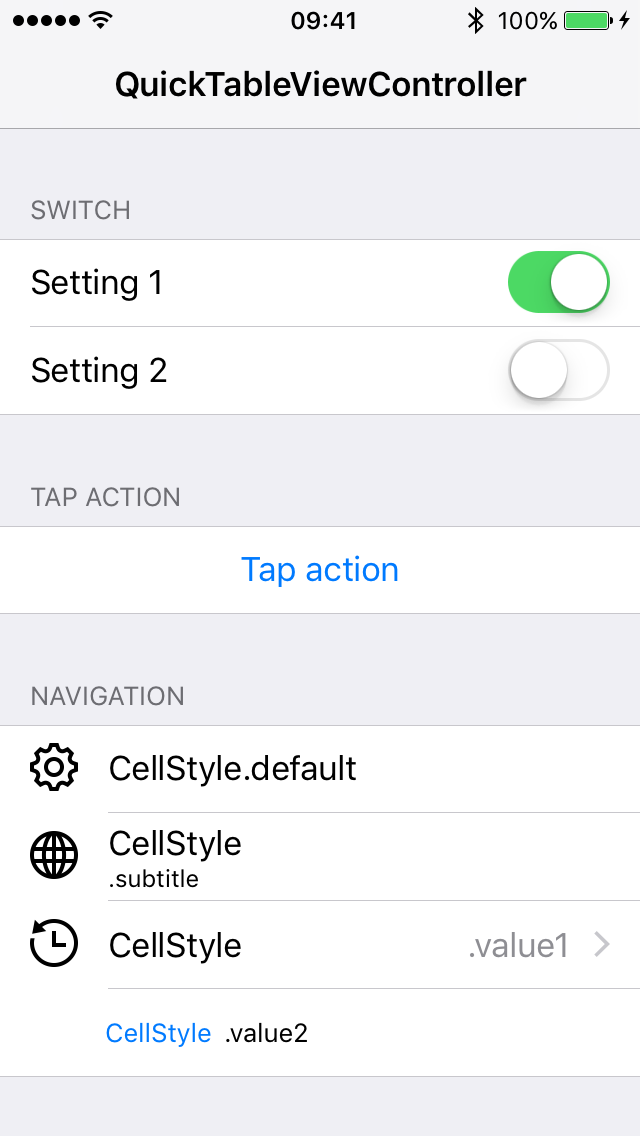
Section(title: "Switch", rows: [
SwitchRow(text: "Setting 1", switchValue: true, action: { _ in }),
SwitchRow(text: "Setting 2", switchValue: false, action: { _ in })
]),
Section(title: "Tap Action", rows: [
TapActionRow(text: "Tap action", action: { [weak self] in self?.showAlert($0) })
]),
Section(title: "Navigation", rows: [
NavigationRow(text: "CellStyle.default", detailText: .none, icon: .named("gear")),
NavigationRow(text: "CellStyle", detailText: .subtitle(".subtitle"), icon: .named("globe")),
NavigationRow(text: "CellStyle", detailText: .value1(".value1"), icon: .named("time"), action: { _ in }),
NavigationRow(text: "CellStyle", detailText: .value2(".value2"))
], footer: "UITableViewCellStyle.Value2 hides the image view."),
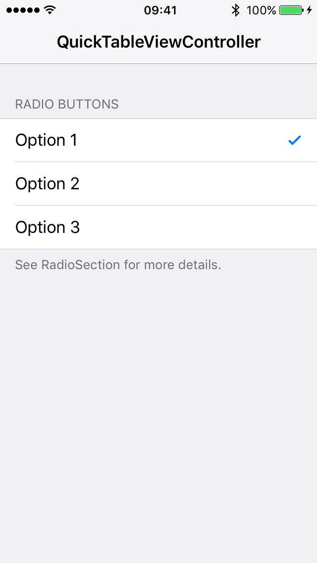
RadioSection(title: "Radio Buttons", options: [
OptionRow(text: "Option 1", isSelected: true, action: didToggleSelection()),
OptionRow(text: "Option 2", isSelected: false, action: didToggleSelection()),
OptionRow(text: "Option 3", isSelected: false, action: didToggleSelection())
], footer: "See RadioSection for more details.")
]
}
// MARK: - Actions
private func showAlert(_ sender: Row) {
// ...
}
private func didToggleSelection() -> (Row) -> Void {
return { [weak self] row in
// ...
}
}
}导航行
详情文本样式
NavigationRow(text: "UITableViewCellStyle.default", detailText: .none)
NavigationRow(text: "UITableViewCellStyle", detailText: .subtitle(".subtitle")
NavigationRow(text: "UITableViewCellStyle", detailText: .value1(".value1")
NavigationRow(text: "UITableViewCellStyle", detailText: .value2(".value2"))
Subtitle 和 具有标题/副标题的初始化方法 已弃用,将在 v2.0.0 版本中移除。
附件类型
NavigationRow会根据action和accessoryButtonAction闭包显示不同的附件类型。
var accessoryType: UITableViewCell.AccessoryType {
  switch (action, accessoryButtonAction) {
  case (nil, nil):      return .none
  case (.some, nil):    return .disclosureIndicator
  case (nil, .some):    return .detailButton
  case (.some, .some):  return .detailDisclosureButton
  }
}- 当表格视图单元格被选择时,将调用
action。 - 当选择附件按钮时,将调用
accessoryButtonAction。
图像
enum Icon {
  case named(String)
  case image(UIImage)
  case images(normal: UIImage, highlighted: UIImage)
}- 可以通过指定每行的
icon来设置表格视图单元格中的图像。 - 在
UITableViewCellStyle.value2中的表格视图单元格不会显示图像视图。
开关行
- 一个
SwitchRow表示具有作为其accessoryView的UISwitch的表格视图单元格。 - 当开关值改变时,将调用
action。
点击动作行
- 一个
TapActionRow表示类似按钮的表格视图单元格。 - 当表格视图单元格被选择时,将调用
action。 - 在
TapActionRow中禁用了图标、详细文本和附件类型。
选项行
- 一个
OptionRow表示带有.checkmark的表格视图单元格。 - 当选中状态切换时,将调用
action。
let didToggleSelection: (Row) -> Void = { [weak self] in
  if let option = $0 as? OptionRowCompatible, option.isSelected {
    // to exclude the event where the option is toggled off
  }
}
RadioSection
RadioSection允许一次只选择一个选项。- 将
alwaysSelectsOneOption设置为 true 将保持其中一个选项被选中。 OptionRow还可以与Section一起使用进行多选。
自定义
行
所有行必须符合 Row 以及 RowStyle 协议。用于处理特定类型的行的额外接口用不同的 协议 表示。
NavigationRowCompatibleOptionRowCompatibleSwitchRowCompatibleTapActionRowCompatible
单元格类
在初始化过程中,可以为行指定自定义的单元格类型。
// Default is UITableViewCell.
NavigationRow<CustomCell>(text: "Navigation", detailText: .none)

// Default is SwitchCell.
SwitchRow<CustomSwitchCell>(text: "Switch", switchValue: true, action: { _ in })

// Default is TapActionCell.
TapActionRow<CustomTapActionCell>(text: "Tap", action: { _ in })

// Default is UITableViewCell.
OptionRow<CustomOptionCell>(text: "Option", isSelected: true, action: { _ in })
由于行携带不同的单元格类型,因此可以使用具体的类型或相关的协议进行匹配。
let action: (Row) -> Void = {
  switch $0 {
  case let option as OptionRow<CustomOptionCell>:
    // only matches the option rows with a specific cell type
  case let option as OptionRowCompatible:
    // matches all option rows
  default:
    break
  }
}
覆盖默认配置
您可以使用 register(_:forCellReuseIdentifier:) 方法为 表格视图 指定自定义单元格类型。请参阅 CustomizationViewController 以获取不同行单元格的重用标识符。
符合 Configurable 协议的表格视图单元格类可以在 tableView(_:cellForRowAt:) 方法期间接受自定义设置。
protocol Configurable {
  func configure(with row: Row & RowStyle)
}也可以使用customize闭包为每行添加额外的设置。
protocol RowStyle {
  var customize: ((UITableViewCell, Row & RowStyle) -> Void)? { get }
}customize闭包覆盖了Configurable设置。
UIAppearance
如第#12号问题中所述,当单元格从Storyboard中回收时,UIAppearance定制将生效。一种解决方法是向表格视图注册nib对象。有关配置信息,请查看AppearanceViewController。
tvOS的差异
- 在
SwitchCell中,UISwitch被复选标记取代。 TapActionCell不使用居中对齐的文本。NavigationRow.accessoryButtonAction不可用。- 单元格图像视图的左侧边距为0。
限制
何时使用QuickTableViewController?
QuickTableViewController适合用于展示静态表格内容,在这些内容中,在viewDidLoad之后,章节和行不会动态改变。
可以通过替换特定的章节或行来更新表格内容。如果每行使用不同的样式,则需要按照定制部分所述进行额外的配置。
何时不使用它?
QuickTableViewController不适合插入和删除行。它也不处理表格视图的重载动画。如果你的表格视图需要动态更新,你可能需要考虑其他解决方案,如IGListKit。
文档
要求
1.0版本之前的版本
| QuickTableViewController | iOS | tvOS | Xcode | Swift |
|---|---|---|---|---|
~> 0.1.0 |
8.0+ | - | 6.4 | 1.2 |
~> 0.2.0 |
8.0+ | - | 7.0 | 2.0 |
~> 0.3.0 |
8.0+ | - | 7.3 | 2.2 |
~> 0.4.0 |
8.0+ | - | 8.0 | 2.3 |
~> 0.5.0 |
8.0+ | - | 8.0 | 3.0 |
~> 0.6.0 |
8.0+ | - | 8.3 | 3.1 |
~> 0.7.0 |
8.0+ | - | 9.0 | 3.2 |
~> 0.8.0 |
8.0+ | - | 9.1 | 4.0 |
~> 0.9.0 |
8.0+ | - | 9.3 | 4.1 |
| QuickTableViewController | iOS | tvOS | Xcode | Swift |
|---|---|---|---|---|
~> 1.0.0 |
8.0+ | 9.0+ | 9.4 | 4.1 |
~> 1.1.0 |
8.0+ | 9.0+ | 10.1 | 4.2 |
~> 1.2.0 |
8.0+ | 9.0+ | 10.2 | 5.0 |
~> 1.3.0 |
9.0+ | 9.0+ | 11.7 | 5.2 |
安装
使用 Swift Package Manager
请根据将包依赖添加到您的应用程序说明进行操作,并使用版本 v1.2.1 或更高版本。(需要 Xcode 11)
使用 CocoaPods
创建包含以下规范的 Podfile 并运行 pod install。
platform :ios, '9.0'
use_frameworks!

pod 'QuickTableViewController'
使用 Carthage
创建包含以下规范的 Cartfile 并运行 carthage update QuickTableViewController。遵循指示将框架添加到您的项目中。
github "bcylin/QuickTableViewController"
Xcode 12 解决方案指南:https://github.com/Carthage/Carthage/blob/master/Documentation/Xcode12Workaround.mdx
使用 Git 子模块
git submodule add -b master [email protected]:bcylin/QuickTableViewController.git Dependencies/QuickTableViewController
- 将 QuickTableViewController.xcodeproj 拖拽到您的应用程序项目中作为子项目。
- 在您应用程序目标的 构建阶段 设置选项卡上,将 QuickTableViewController-iOS 添加到 目标依赖 中。
许可
QuickTableViewController遵循MIT许可协议发布。有关更多详细信息,请参阅LICENSE。图片来源:iconmonstr。