


ProgressIndicatorView
使用 SwiftUI 创建的许多预设进度指示器


用法
创建一个如下的进度指示器
ProgressIndicatorView(isVisible: $showProgressIndicator, type: .bar(progress: $progress))其中
showProgressIndicator - 可修改的布尔值,用于显示或隐藏指示器
type - 从 ProgressIndicatorView.IndicatorType 枚举中获取的值
您可以使用标准的 SwiftUI 方法进行修改,如下所示
ProgressIndicatorView(isVisible: $showProgressIndicator, type: .bar(progress: $progress))
     .frame(width: 50.0, height: 50.0)
     .foregroundColor(.red)
指示器类型
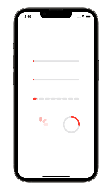
default - 进度指示器看起来像默认的 iOS UIActivityIndicatorView。
bar - 带有 Binding 进度值和背景色的线条进度条,默认为 Color.clear
 ProgressIndicatorView(isVisible: $showProgressIndicator, type: .bar(progress: $progress, backgroundColor: .gray)
     .frame(height: 8.0)
     .foregroundColor(.red)
impulseBar - 冲击波线条进度条,类似于 bar 指示器,并具有冲击波效果。
dashBar - 带有多个段落的离散线条进度条,默认为 8 段
  ProgressIndicatorView(isVisible: $showProgressIndicator, type: .dashBar(progress: $progress, numberOfItems: 8))
     .frame(height: 8.0)
     .foregroundColor(.red)
circle - 带有 lineWidth 和 strokeColor 的圆形进度指示器
   ProgressIndicatorView(isVisible: $showProgressIndicator, type: .circle(progress: $progress, lineWidth: 8.0, strokeColor: .red))
      .frame(height: 8.0)
      .foregroundColor(.red)
示例
要尝试 ProgressIndicatorView 的示例
- 克隆仓库:
git clone [email protected]:exyte/ProgressIndicatorView.git - 打开终端并运行
cd <ProgressIndicatorViewRepo>/Example - 运行
pod install以安装所有依赖项 - 运行
xed .打开 Xcode 项目 - 试试看!
安装
Swift 包管理器
dependencies: [
    .package(url: "https://github.com/exyte/ProgressIndicatorView.git", from: "0.0.1")
]
CocoaPods
pod 'ProgressIndicatorView'Carthage
github "Exyte/ProgressIndicatorView"
要求
- iOS 13+ / watchOS 6+ / tvOS 13+ / macOS 10.15+
- Xcode 11+
我们的其他开源 SwiftUI 库
PopupView - Toasts 和弹出窗口库
Grid - 最强大的网格容器
ScalingHeaderScrollView - 有粘性标题的滚动视图,标题在滚动时缩小
AnimatedTabBar - 带有预设动画的 TabBar
MediaPicker - 可定制的媒体选择器
Chat - 具有完全可定制的消息单元格、输入视图和内置媒体选择器的聊天 UI 框架
ConcentricOnboarding - 动画引导流程
FloatingButton - 浮动按钮菜单
ActivityIndicatorView - 多种动画加载指示器
SVGView - SVG 解析器
LiquidSwipe - 流体导航动画