


简介
Popup Dialog 是一个用 Swift 编写的简单、可定制的弹出对话框。
功能
- 易于使用的 API,几乎无需编写任何样板代码
- 方便的默认视图,带图像、标题和消息
- 支持自定义视图控制器
- 流畅的过渡动画
- 通过外观全面可定主题,包括字体、颜色、圆角、阴影、叠加颜色和模糊等
- 可以通过滑动和背景点击关闭
- 兼容 Objective-C
- 在支持 iOS 10.0+ 的所有屏幕和设备上运行
安装
此版本与 Swift 5 兼容。对于 Swift 4.2 版本,请使用 V1.0.0。
CocoaPods
PopupDialog通过CocoaPods提供。只需将以下内容添加到您的 Podfile 中
use_frameworks!

target '<Your Target Name>'
pod 'PopupDialog', '~> 1.1'
Carthage
Carthage是一个去中心化的依赖管理器,它构建您的依赖并提供二进制框架。需要最小版本0.17。
要安装,只需将以下行添加到您的Cartfile中
github "Orderella/PopupDialog" ~> 1.1手动安装
如果您不希望使用上述任何依赖管理器,可以通过将Classes文件夹中的文件添加到项目中手动集成PopupDialog到您的项目中。此外,您还需要将DynamicBlurView的类手动添加到项目中。
示例
您可以在仓库中找到这个和更多示例项目。要运行它,首先克隆仓库,然后从Example目录运行pod install。
import PopupDialog

// Prepare the popup assets
let title = "THIS IS THE DIALOG TITLE"
let message = "This is the message section of the popup dialog default view"
let image = UIImage(named: "pexels-photo-103290")

// Create the dialog
let popup = PopupDialog(title: title, message: message, image: image)

// Create buttons
let buttonOne = CancelButton(title: "CANCEL") {
    print("You canceled the car dialog.")
}

// This button will not the dismiss the dialog
let buttonTwo = DefaultButton(title: "ADMIRE CAR", dismissOnTap: false) {
    print("What a beauty!")
}

let buttonThree = DefaultButton(title: "BUY CAR", height: 60) {
    print("Ah, maybe next time :)")
}

// Add buttons to dialog
// Alternatively, you can use popup.addButton(buttonOne)
// to add a single button
popup.addButtons([buttonOne, buttonTwo, buttonThree])

// Present dialog
self.present(popup, animated: true, completion: nil)
用法
PopupDialog是UIViewController的子类,因此可以以模态形式将其添加到视图控制器中。您可以通过方便的默认视图或自定义视图控制器来初始化它。
默认对话框
public convenience init(
title: String?,
message: String?,
image: UIImage? = nil,
buttonAlignment: UILayoutConstraintAxis = .vertical,
transitionStyle: PopupDialogTransitionStyle = .bounceUp,
preferredWidth: CGFloat = 340,
tapGestureDismissal: Bool = true,
panGestureDismissal: Bool = true,
hideStatusBar: Bool = false,
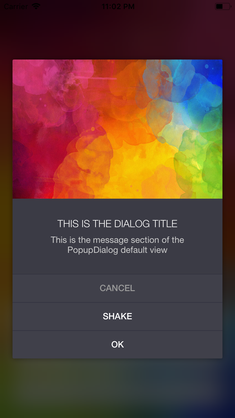
completion: (() -> Void)? = nil) 默认对话框初始化器是创建带有图像、标题和消息的弹出窗口的便捷方式(见图像一和三)。
基本上,所有参数都是可选的,尽管这完全没有意义。您至少需要添加消息和一个按钮,否则对话框无法关闭,除非您手动关闭。
如果提供图像,它将被固定在对话框的顶部/左/右。将使用图像的宽高比来设置图像视图的高度,因此不会发生扭曲。
自定义视图控制器
public init(
    viewController: UIViewController,
    buttonAlignment: UILayoutConstraintAxis = .vertical,
    transitionStyle: PopupDialogTransitionStyle = .bounceUp,
    preferredWidth: CGFloat = 340,
    tapGestureDismissal: Bool = true,
    panGestureDismissal: Bool = true,
    hideStatusBar: Bool = false,
completion: (() -> Void)? = nil) 您可以将自己的视图控制器传递给PopupDialog(参见第二张图片)。可以通过PopupDialog的viewController属性访问它,该属性必须转换为视图控制器的类才能访问其属性。确保自定义视图定义了所需的所有约束,以避免出现任何autolayout问题。
按钮被添加到控制器的视图下方,然而,这些按钮是可选的。如果您决定不添加任何按钮,您必须手动处理对话框的消失。作为视图控制器的一个子类,这可以通过使用dismissViewControllerAnimated(flag: Bool, completion: (() -> Void)?)轻松完成。
按钮对齐
按钮可以水平或垂直分布,后者是默认选项。请注意,如果按钮超过两个,水平分布按钮可能不是好主意。
public enum UILayoutConstraintAxis : Int {
	case horizontal
	case vertical
}
转场样式
您可以通过设置.bounceUp作为默认过渡动画样式。以下是一些可用的过渡样式:
public enum PopupDialogTransitionStyle: Int {
    case bounceUp
    case bounceDown
    case zoomIn
    case fadeIn
}
首选宽度
PopupDialog始终尝试保持最大宽度为340。在屏幕更小的iPhone上,如iPhone 5 SE,宽度将为320。340也是iPad的标准宽度。通过设置首选宽度,您可以仅覆盖iPad的最大宽度340。
手势消失
手势消失功能允许您的对话框通过背景点击或向下划动手势来消失。默认情况下,此选项设置为true。您可以在初始化器中将tapGestureDismissal或panGestureDismissal设置为false来防止这种行为。
隐藏状态栏
当弹出对话框显示时,可以隐藏状态栏。默认为false。请确保在Info.plist中添加UIViewControllerBasedStatusBarAppearance并将其设置为YES。
完成
当对话框消失时将调用此完成句柄。这对于捕获手势消失特别有用。
默认对话框属性
如果您正在使用默认对话框,可以修改所选属性。
// Create the dialog
let popup = PopupDialog(title: title, message: message, image: image)

// Present dialog
self.present(popup, animated: true, completion: nil)

// Get the default view controller and cast it
// Unfortunately, casting is necessary to support Objective-C
let vc = popup.viewController as! PopupDialogDefaultViewController

// Set dialog properties
vc.image = UIImage(...)
vc.titleText = "..."
vc.messageText = "..."
vc.buttonAlignment = .horizontal
vc.transitionStyle = .bounceUp
设计 PopupDialog
外观是自定义 PopupDialog 风格的首选方法。PopupDialog 的理念是在单个位置定义一个主题,而不需要为每个实例提供样式设置。这样,创建一个 PopupDialog 只需要编写少量代码,并且不需要“包装器”。
这一点更有意义,因为弹出对话框和警告应该在整个应用程序中保持一致的看起来,即保持单一的风格。
对话框默认视图外观设置
如果您使用默认弹出视图,以下外观设置可用。
let dialogAppearance = PopupDialogDefaultView.appearance()

dialogAppearance.backgroundColor      = .white
dialogAppearance.titleFont            = .boldSystemFont(ofSize: 14)
dialogAppearance.titleColor           = UIColor(white: 0.4, alpha: 1)
dialogAppearance.titleTextAlignment   = .center
dialogAppearance.messageFont          = .systemFont(ofSize: 14)
dialogAppearance.messageColor         = UIColor(white: 0.6, alpha: 1)
dialogAppearance.messageTextAlignment = .center
对话框容器外观设置
容器视图包含PopupDialogDefaultView或您的自定义视图控制器。以下是一些外观设置可供选择
let containerAppearance = PopupDialogContainerView.appearance()

containerAppearance.backgroundColor = UIColor(red:0.23, green:0.23, blue:0.27, alpha:1.00)
containerAppearance.cornerRadius    = 2
containerAppearance.shadowEnabled   = true
containerAppearance.shadowColor     = .black
containerAppearance.shadowOpacity   = 0.6
containerAppearance.shadowRadius    = 20
containerAppearance.shadowOffset    = CGSize(width: 0, height: 8)
containerAppearance.shadowPath      = CGPath(...)
覆盖视图外观设置
这指的是用作底层视图控制器上方但弹出对话框视图下方覆盖视图的视图。如果这有意义 :)
let overlayAppearance = PopupDialogOverlayView.appearance()

overlayAppearance.color           = .black
overlayAppearance.blurRadius      = 20
overlayAppearance.blurEnabled     = true
overlayAppearance.liveBlurEnabled = false
overlayAppearance.opacity         = 0.7
注意事项
将 liveBlurEnabled 设置为 true,这意味着开启背景视图的实时更新,这将导致显著更高的CPU使用量/功耗,因此默认情况下是关闭的。请仔细考虑是否需要此功能 ;)
按钮外观设置
可用的标准按钮类有 DefaultButton、CancelButton 和 DestructiveButton。所有按钮都具有相同的外观设置,并且可以单独进行样式化。
var buttonAppearance = DefaultButton.appearance()

// Default button
buttonAppearance.titleFont      = .systemFont(ofSize: 14)
buttonAppearance.titleColor     = UIColor(red: 0.25, green: 0.53, blue: 0.91, alpha: 1)
buttonAppearance.buttonColor    = .clear
buttonAppearance.separatorColor = UIColor(white: 0.9, alpha: 1)

// Below, only the differences are highlighted

// Cancel button
CancelButton.appearance().titleColor = .lightGray

// Destructive button
DestructiveButton.appearance().titleColor = .red
此外,您可以通过子类化 PopupDialogButton 来创建自定义按钮。以下示例创建了一个实色蓝色按钮,具有粗体的白色标题字体。分隔符是不可见的。
public final class SolidBlueButton: PopupDialogButton {

    override public func setupView() {
        defaultFont           = .boldSystemFont(ofSize: 16)
        defaultTitleColor     = .white
        defaultButtonColor    = .blue
        defaultSeparatorColor = .clear
        super.setupView()
    }
}
这些按钮也可以使用上述外观设置进行自定义。
深色模式示例
以下是一个 深色模式 主题的示例。您可以在示例项目的 AppDelegate 文件中找到它,只需取消注释即可应用自定义外观。
// Customize dialog appearance
let pv = PopupDialogDefaultView.appearance()
pv.titleFont    = UIFont(name: "HelveticaNeue-Light", size: 16)!
pv.titleColor   = .white
pv.messageFont  = UIFont(name: "HelveticaNeue", size: 14)!
pv.messageColor = UIColor(white: 0.8, alpha: 1)

// Customize the container view appearance
let pcv = PopupDialogContainerView.appearance()
pcv.backgroundColor = UIColor(red:0.23, green:0.23, blue:0.27, alpha:1.00)
pcv.cornerRadius    = 2
pcv.shadowEnabled   = true
pcv.shadowColor     = .black

// Customize overlay appearance
let ov = PopupDialogOverlayView.appearance()
ov.blurEnabled     = true
ov.blurRadius      = 30
ov.liveBlurEnabled = true
ov.opacity         = 0.7
ov.color           = .black

// Customize default button appearance
let db = DefaultButton.appearance()
db.titleFont      = UIFont(name: "HelveticaNeue-Medium", size: 14)!
db.titleColor     = .white
db.buttonColor    = UIColor(red:0.25, green:0.25, blue:0.29, alpha:1.00)
db.separatorColor = UIColor(red:0.20, green:0.20, blue:0.25, alpha:1.00)

// Customize cancel button appearance
let cb = CancelButton.appearance()
cb.titleFont      = UIFont(name: "HelveticaNeue-Medium", size: 14)!
cb.titleColor     = UIColor(white: 0.6, alpha: 1)
cb.buttonColor    = UIColor(red:0.25, green:0.25, blue:0.29, alpha:1.00)
cb.separatorColor = UIColor(red:0.20, green:0.20, blue:0.25, alpha:1.00)

我看得出还有一些自定义选项的空间。我可能会随着时间的推移添加更多。
屏幕尺寸和旋转
支持旋转及所有屏幕尺寸。然而,在iPhone上,对话框的宽度永远不会超过340点。对于iPad,你可以在初始化新的PopupDialog时设置preferredWidth。但是,如果对话框的高度超过屏幕宽度,那么横屏模式可能不会很好用。
处理文本字段
如果你在自定义视图控制器中使用文本字段,弹出对话框确保每当弹出时,对话框都位于键盘之上。你可以通过在PopupDialog上设置keyboardShiftsView为false来选择不执行此行为。
测试
PopupDialog提供了一个非常实用且方便的方法,允许您以编程方式触发按钮点击。
public func tapButtonWithIndex(_ index: Int)除此之外,PopupDialog单元测试已包含在根目录中。
Objective-C
PopupDialog也可以在Objective-C项目中使用。以下是一个基本示例
PopupDialog *popup = [[PopupDialog alloc] initWithTitle: @"Title"
                                                message: @"This is a message"
                                                  image: nil
                                        buttonAlignment: UILayoutConstraintAxisVertical
                                        transitionStyle: PopupDialogTransitionStyleBounceUp
                                         preferredWidth: 380
                                    tapGestureDismissal: NO
                                    panGestureDismissal: NO
                                          hideStatusBar: NO
                                             completion: nil];

DestructiveButton *delete = [[DestructiveButton alloc] initWithTitle: @"Delete"
                                                              height: 45
                                                        dismissOnTap: YES
                                                              action: nil];

CancelButton *cancel = [[CancelButton alloc] initWithTitle: @"Cancel"
                                                    height: 45
                                              dismissOnTap: YES
                                                    action: nil];

DefaultButton *ok = [[DefaultButton alloc] initWithTitle: @"OK"
                                                  height: 45
                                            dismissOnTap: YES
                                                  action: nil];

[dialog addButtons:@[delete, cancel, ok]];

[self presentViewController:popup animated:YES completion:nil];
奖金
震动动画
如果您恰好使用PopupDialog验证文本输入,例如,您可以在PopupDialog上调用方便的 shake() 方法。
要求
最低要求为iOS 10.0。此对话框是用Swift 5编写的,若要支持较老版本,请查阅发行版。
更新日志
- 1.1.1 更新依赖到Swift 5
- 1.1.0 支持Swift 5
- 1.0.0 将Swift版本锁定为4.2
停止支持iOS 9,因为已迁移到ios-snapshot-test-case - 0.9.2 修复在应用不活跃时显示对话框导致的崩溃
- 0.9.1 修复Carthage支持
- 0.9.0 支持Swift 4.2
- 0.8.1 添加阴影外观属性
- 0.8.0 区分点击和滑动手势的消失
- 0.7.1 修复与Objective-C兼容性问题
改进Carthage处理 - 0.7.0 在切换到DynamicBlurView时移除FXBlurView
- 0.6.2 为iPad添加首选宽度选项
- 0.6.1 添加震动动画
引入隐藏状态栏选项 - 0.6.0 支持Swift 4
放弃iOS 8兼容性 - 0.5.4 修复模糊视图揭示隐藏层的bug
改进视图控制器生命周期处理
现在可以使用手势消失功能使用滚动视图 - 0.5.3 修复与自定义视图控制器相关的内存泄漏
添加UI自动化和快照测试 - 0.5.2 修复默认视图的图像缩放问题
- 0.5.1 引入自定义按钮高度参数
重新引入iOS 8兼容性 - 0.5.0 Swift 3兼容性 / 移除iOS 8
- 0.4.0 iOS 8兼容性
- 0.3.3 修复按钮被添加多次的bug
- 0.3.2 在与键盘交互时对话框重新定位
不可消失按钮选项
在对话框消失时添加额外的完成处理器 - 0.3.1 修复Carthage问题
- 0.3.0 兼容Objective-C
- 0.2.2 默认关闭liveBlur以提高性能
- 0.2.1 通过背景点击或向下滑动切换关闭
- 0.2.0 您现在可以向对话框传递自定义视图控制器。这引入了破坏性更改。
- 0.1.6 按钮操作将推迟到动画完成后执行
- 0.1.5 提供对话框属性
(标题文本,消息文本,图像,按钮对齐方式,过渡样式) - 0.1.4 选择过渡动画样式
- 0.1.3 大屏幕支持
暴露基本阴影外观 - 0.1.2 暴露模糊和叠加外观
- 0.1.1 添加主题示例
- 0.1.0 初始版本
作者
Martin Wildfeuer, [email protected] 为 Orderella Ltd., orderella.co.uk
您还可以在 Twitter 上关注我们,@theMWFire | @Orderella
感谢
感谢所有使用、增强和改进此库的人,特别是贡献者。此外,感谢 KyoheiG3 将 FXBlurView 转移到 DynamicBlurView。
许可证
PopupDialog 根据 MIT 许可证提供。更多信息请参阅 LICENSE 文件。