


功能
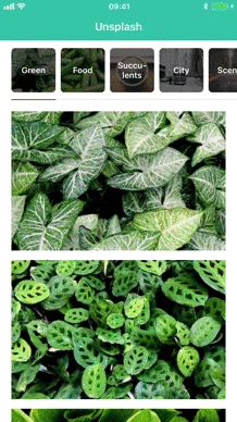
羊皮纸允许您在显示任何类型的通用指示器时浏览视图控制器。以下是使用羊皮纸的一些优点
-
高度可定制
菜单项是用UICollectionView构建的,这意味着您可以显示几乎任何您想显示的东西。您甚至可以继承布局来创建完全定制的功能。 -
内存高效:
羊皮纸仅在需要时才会分配视图控制器,这意味着如果您有很多视图控制器,您不需要在前面全部初始化它们。 -
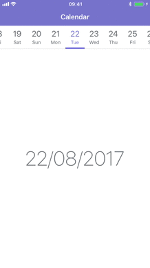
无限滚动:
由于视图控制器只在滚动时分配,因此您可以创建无穷大的数据源。这对于日历等事物非常理想。
目录
开始使用
基本用法
Parchment 框架是基于 PagingViewController 类构建的。您可以使用一个视图控制器数组来初始化它,并且它会使用每个视图控制器的 title 属性显示每个视图控制器的菜单项。
let firstViewController = UIViewController()
let secondViewController = UIViewController()

let pagingViewController = PagingViewController(viewControllers: [
  firstViewController,
  secondViewController
])更多内容请参阅:基本用法
数据源
在大多数情况下,使用一个视图控制器数组初始化 PagingViewController 是可以的,但如果您有超过几个视图控制器,可能不需要预先分配它们。如果您将显示固定数量的视图控制器,您可以通过实现 PagingViewControllerDataSource 来设置您自己的数据源。
extension ViewController: PagingViewControllerDataSource {
    func numberOfViewControllers(in pagingViewController: PagingViewController) -> Int {
        return 10
    }

    func pagingViewController(_ pagingViewController: PagingViewController, viewControllerAt index: Int) -> UIViewController {
        return ChildViewController(index: index)
    }

    func pagingViewController(_: PagingViewController, pagingItemAt index: Int) -> PagingItem {
        return PagingTitleItem(title: "View \(index)", index: index)
    }
}
然后,设置 dataSource 属性并选择初始项。
let pagingViewController = PagingViewController()
pagingViewController.dataSource = self
pagingViewController.select(index: 0)
使用数据源意味着 Parchment 只为当前选定的项及其任何同级别项分配视图控制器。如果您有多个视图控制器,这比使用 PagingViewController(viewControllers:) 更节省内存。
更多内容请参阅:使用数据源
无限数据源
使用 PagingViewControllerDataSource 意味着您需要知道要显示多少个视图控制器。如果您正在创建类似于 日历 的内容,视图控制器的数量可能是无限大的。在这种情况下,您可以使用 PagingViewControllerInfiniteDataSource 协议。
extension ViewController: PagingViewControllerInfiniteDataSource {
    func pagingViewController(_: PagingViewController, viewControllerFor pagingItem: PagingItem) -> UIViewController {
        return ItemViewController(item: pagingItem)
    }

    func pagingViewController(_: PagingViewController, itemBefore pagingItem: PagingItem) -> PagingItem? {
        guard let item = pagingItem as? Item else { return nil }
        return Item(index: item.index - 1)
    }

    func pagingViewController(_ : PagingViewController, itemAfter pagingItem: PagingItem) -> PagingItem? {
        guard let item = pagingItem as? Item else { return nil }
        return Item(index: item.index + 1)
    }
}
然后设置 infiniteDataSource 属性并选择初始项。
let pagingViewController = PagingViewController()
pagingViewController.infiniteDataSource = self
pagingViewController.select(pagingItem: Item(index: 0))
此模式与 UIPageViewControllerDataSource 协议非常相似。主要区别在于,您不是直接返回视图控制器,而是必须返回一个符合 PagingItem 协议的实例。Parchment 将递归调用这些方法,直到填满可用空间。
更多内容请参阅:使用无限数据源
选择项目
您可以使用以下方法程序化选择项目
func select(pagingItem: PagingItem, animated: Bool = false)假设您想选择第一个项目
override func viewDidLoad() {
  super.viewDidLoad()
  if let first = pagingViewController.children.first as? PagingItem {
    pagingViewController.select(pagingItem: first)
  }
}
或者,如果您已经设置了 dateSource 属性,您可以根据它们的索引选择项目
func select(index: Int, animated: Bool = false)重新加载数据
您可以使用此方法重新加载数据
func reloadData()如果之前选中的项目仍然包含在更新的数据中,则会保留之前选中的项目。如果不包含,则选择列表中的第一个项目。它还会重新加载页面视图控制器中显示的视图控制器。如果只想重新加载菜单项,可以使用此方法
func reloadMenu()当使用 PagingViewControllerInfiniteDataSource 时,调用 reloadData() 不会正常工作,因为我们那时需要知道应该选择的初始项目是什么。在这种情况下,您应使用此方法
func reloadData(around: PagingItem)这会将给定的分页项标记为选中并为其周围生成新项目
代理
Parchment 通过 PagingViewControllerDelegate 协议提供了用于转换过程每个步骤的代理方法。
protocol PagingViewControllerDelegate: class {

    func pagingViewController(
        _: PagingViewController,
        isScrollingFromItem currentPagingItem: PagingItem,
        toItem upcomingPagingItem: PagingItem?,
        startingViewController: UIViewController,
        destinationViewController: UIViewController?,
        progress: CGFloat)

    func pagingViewController(
        _: PagingViewController,
        willScrollToItem pagingItem: PagingItem,
        startingViewController: UIViewController,
        destinationViewController: UIViewController)

    func pagingViewController(
        _ pagingViewController: PagingViewController,
        didScrollToItem pagingItem: PagingItem,
        startingViewController: UIViewController?,
        destinationViewController: UIViewController,
        transitionSuccessful: Bool)

    func pagingViewController(
        _ pagingViewController: PagingViewController,
        didSelectItem pagingItem: PagingItem)
}
尺寸代理
默认情况下,菜单项的大小由 menuItemSize 属性控制。如果您需要单独控制每个菜单项的宽度,可以使用 PagingControllerSizeDelegate 协议
protocol PagingViewControllerSizeDelegate: class {
    func pagingViewController(
        _: PagingViewController,
        widthForPagingItem pagingItem: PagingItem,
        isSelected: Bool) -> CGFloat
}
然后,在 PagingViewController 上设置 sizeDelegate
let pagingViewController = PagingViewController()
pagingViewController.sizeDelegate = self
定制
羊皮纸框架设计得非常灵活。菜单项通过UICollectionView展示,因此可以几乎显示任何内容。如果您需要进一步自定义,还可以对收集视图布局进行子类化。所有自定义都由以下列出的属性处理。
自定义单元格
要使用自定义单元格,您需要子类化 PagingCell 并为特定的 PagingItem 注册单元格类型。
let pagingViewController = PagingViewController()
pagingViewController.register(CalendarPagingCell.self, for: CalendarItem.self)
然后,当您在数据源中返回给定的 PagingItem 时,Parchment 将挂起您的自定义单元格。您可以注册多个单元格类型用于不同的 PagingItem。
属性
所有自定义属性都设置在 PagingViewController 上
let pagingViewController = PagingViewController()
pagingViewController.menuItemSize = .fixed(width: 40, height: 40)
pagingViewController.menuItemSpacing = 10
menuItemSize
菜单项的大小。当使用 sizeDelegate 时,宽度将被忽略。
enum PagingMenuItemSize {
  case fixed(width: CGFloat, height: CGFloat)

  // Automatically calculate the size of the menu items based on the
  // cells intrinsic content size. Try to come up with an estimated
  // width that's similar to the expected width of the cells.
  case selfSizing(estimatedWidth: CGFloat, height: CGFloat)

  // Tries to fit all menu items inside the bounds of the screen.
  // If the items can't fit, the items will scroll as normal and
  // set the menu items width to `minWidth`.
  case sizeToFit(minWidth: CGFloat, height: CGFloat)
}默认值:.sizeToFit(minWidth: 150, height: 40)
menuItemSpacing
菜单项之间的间距。
默认值:0
menuItemLabelSpacing
菜单项标签的水平约束。
默认值:20
menuInsets
所有菜单项周围的填充。
默认: UIEdgeInsets()
menuHorizontalAlignment
enum PagingMenuHorizontalAlignment {
  case `default`

  // Allows all paging items to be centered within the paging menu
  // when PagingMenuItemSize is .fixed and the sum of the widths
  // of all the paging items are less than the paging menu
  case center
}
默认: .default
menuTransition
确定在滚动内容时菜单项的过渡行为。
enum PagingMenuTransition {
  // Update scroll offset based on how much the content has
  // scrolled. Makes the menu items transition smoothly as you scroll.
  case scrollAlongside

  // Animate the menu item position after a transition has completed.
  case animateAfter
}
默认: .scrollAlongside
menuInteraction
确定用户如何与菜单项交互。
enum PagingMenuInteraction {
  case scrolling
  case swipe
  case none
}
默认: .scrolling
menuLayoutClass
集合视图布局的类类型。如果您想使用自己的布局子类,请覆盖此属性。设置此属性将初始化新的布局类型并更新集合视图。
默认: PagingCollectionViewLayout.Type
selectedScrollPosition
确定选中菜单项应该对齐的方式,实际上是等于 UICollectionViewScrollPosition。
enum PagingSelectedScrollPosition {
  case left
  case right

  // Centers the selected menu item where possible. If the item is
  // to the far left or right, it will not update the scroll position.
  // Effectivly the same as .centeredHorizontally on UIScrollView.
  case preferCentered
}
默认: .preferCentered
indicatorOptions
将指标视图添加到所选菜单项。指标宽度将与所选菜单项的宽度相等。内边距仅应用于水平方向。
enum PagingIndicatorOptions {
  case hidden
  case visible(
    height: CGFloat,
    zIndex: Int,
    spacing: UIEdgeInsets,
    insets: UIEdgeInsets)
}
默认
.visible(
  height: 4,
  zIndex: Int.max,
  spacing: UIEdgeInsets.zero,
  insets: UIEdgeInsets(top: 0, left: 8, bottom: 0, right: 8))
indicatorClass
指标视图的类类型。如果您想使用自己的 PagingIndicatorView 子类,请覆盖此设置。
默认值:PagingIndicatorView.self
indicatorColor
指标视图的背景颜色。
默认值:UIColor(red: 3/255, green: 125/255, blue: 233/255, alpha: 1)
borderOptions
在菜单项的底部添加边框。边框宽度将与所有菜单项相等。内边距仅应用于水平方向。
enum PagingBorderOptions {
  case hidden
  case visible(
    height: CGFloat,
    zIndex: Int,
    insets: UIEdgeInsets)
}
默认
.visible(
  height: 1,
  zIndex: Int.max - 1,
  insets: UIEdgeInsets(top: 0, left: 8, bottom: 0, right: 8))
borderClass
边框视图的类类型。如果您想使用自己的 PagingBorderView 子类,请覆盖此设置。
默认值:PagingBorderView.self
borderColor
边框视图的背景颜色。
默认值:UIColor(white: 0.9, alpha: 1)
includeSafeAreaInsets
根据.safeAreaInsets属性更新菜单项的内容填充。
默认值:true
font
菜单项上标题标签使用的字体。
默认值:UIFont.systemFont(ofSize: 15, weight: UIFont.Weight.medium)
selectedFont
当前选中菜单项上标题标签使用的字体。
默认值:UIFont.systemFont(ofSize: 15, weight: UIFont.Weight.medium)
textColor
菜单项上标题标签的颜色。
默认值:UIColor.black
selectedTextColor
当前选中菜单项的文本颜色。
默认值:UIColor(red: 3/255, green: 125/255, blue: 233/255, alpha: 1)
backgroundColor
菜单项的背景颜色。
默认值:UIColor.white
selectedBackgroundColor
已选择菜单项的背景颜色。
默认值: UIColor.clear
menuBackgroundColor
菜单项后面的视图的背景颜色。
默认值:UIColor.white
安装
Parchment 将与Swift的最新公开版本兼容。
要求
- iOS 9.0+
- Xcode 8.0+
CocoaPods
Parchment 通过CocoaPods提供。要安装它,请在您的Podfile中添加以下内容:
pod 'Parchment', '~> 3.2'
Swift 包管理器
Parchment 通过Swift 包管理器提供。将Parchment作为依赖项添加到您的Package.swift:
.package(url: "https://github.com/rechsteiner/Parchment", from: "3.2.0")Carthage
Parchment 还支持 Carthage。要安装它,请将以下内容添加到您的 Cartfile
github "rechsteiner/Parchment" ~> 3.2
有关使用 Carthage 的更多信息,请参阅 此指南。
变更日志
您可以在 CHANGELOG 文件中找到它。
许可证
Parchment 采用 MIT 许可证发布。有关详细信息,请参阅 LICENSE。