PRGTipView


PRGTipView 是一个用于向您的应用程序添加引导提示的即用型解决方案。它支持:
- 标题、详细信息和取消按钮
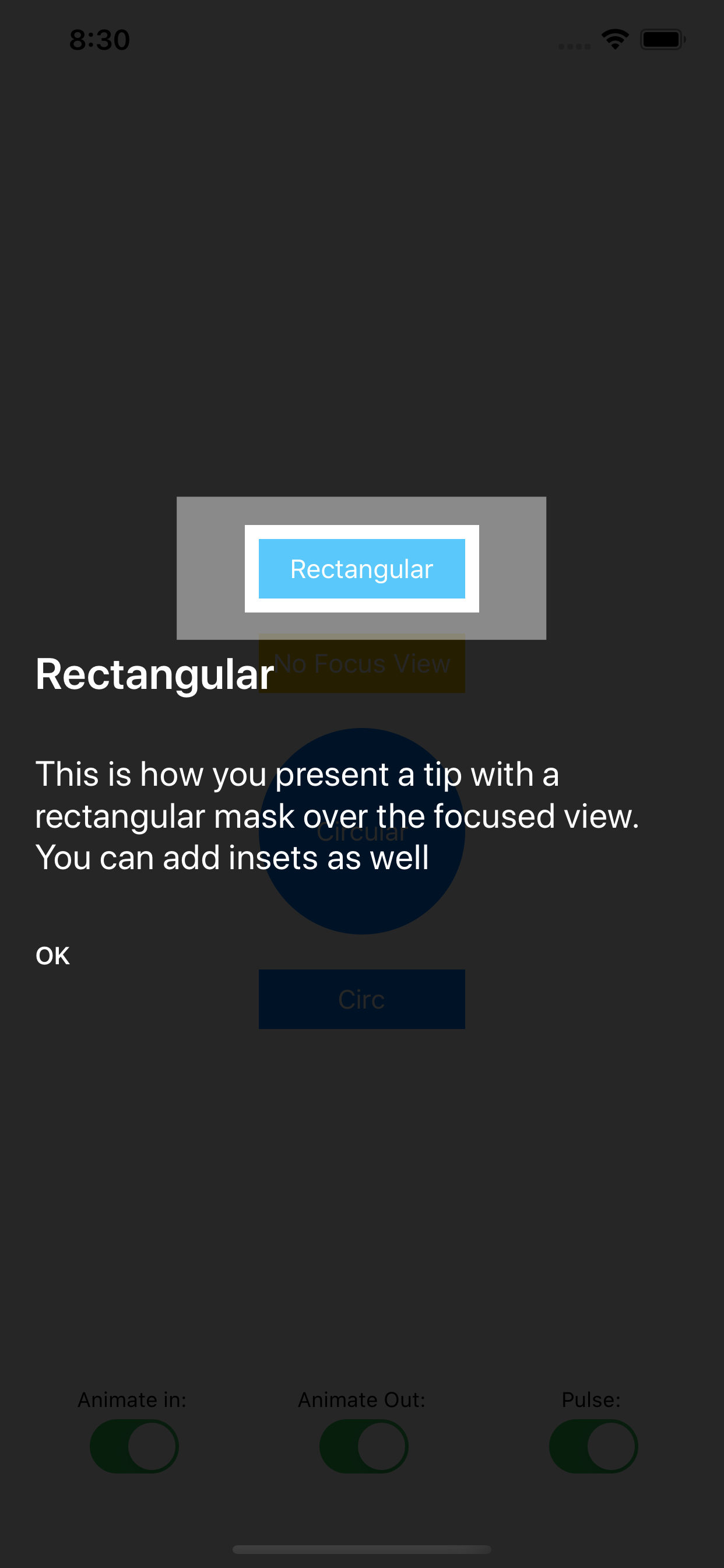
- 通过可配置的内边距将焦点放在特定的视图上
- 自动将标题、详细信息和按钮放置在焦点视图上方或下方(如果提供)
- 展示和消失动画
- 焦点视图脉冲效果(使用 Pulsar 库)

示例
要运行示例项目,请先克隆仓库,然后从示例目录中运行 pod install。
要求
- iOS 9.3+
- Swift 5
安装
PRGTipView 可通过 CocoaPods 获取。要安装它,只需在 Podfile 中添加以下行。
pod 'PRGTipView'用法
//1. Create a PRGTipViewConfiguration instance
let config = PRGTipViewConfiguration()
//2. Customize the TipView via the properties
config.titleText = "This is a title"
config.detailText = "This is the detail text, that adds more information to your tip."
config.buttonText = "OK"
config.focusView = button
config.focusInsets = UIEdgeInsets(top: 8, left: 4, bottom: 8, right: 4)
config.focusDistance = 50
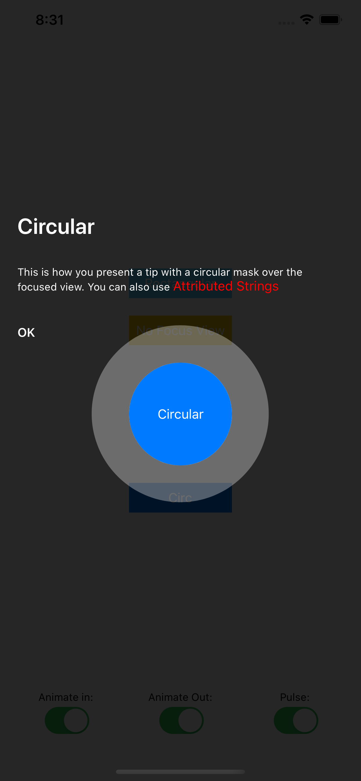
config.circularFocus = false
config.animateIn = true
config.animateOut = true
//3a. You can either use the static func TipView.show like described below:
PRGTipView.show(fromViewController: self, withConfiguration: config, completion: nil)
//3b. Or you can create a PRGTipView instance and present it (it's a ViewController subclass)
let tipView = PRGTipView(configuration: config)
present(tipView, animated: false, completion: nil)配置属性
PRGTipViewConfiguration 包含帮助自定义提示视图显示的属性
| 属性 | 类型 | 默认值 | 说明 |
|---|---|---|---|
| backgroundColor | UIColor | .black | 提示视图的背景颜色 |
| backgroundAlpha | CGFloat | 0.85 | 提示视图背景的不透明度 |
| tipTextYSpacing | CGFloat | 30 | 提示视图标题、细节和按钮之间的垂直间距 |
| titleText | String? | 显示为提示视图标题的字符串 | |
| titleTextFont | UIFont | systemFont(ofSize: 25) | 提示视图标题的字体 |
| titleTextColor | UIColor | .white | 提示视图标题的颜色 |
| attributedTitleText | NSAttributedString? | 显示为提示视图标题的属性文本。如果设置,它将覆盖 "titleText"、"titleTextFont" 和 "titleTextColor" 属性 | |
| detailText | String? | 显示为提示视图细节的字符串 | |
| detailTextFont | UIFont | systemFont(ofSize: 29) | 提示视图细节的字体 |
| detailTextColor | UIColor | .white | 提示视图细节的颜色 |
| attributedDetailText | NSAttributedString? | 显示为提示视图细节的属性文本。如果设置,它将覆盖 "detailText"、"detailTextFont" 和 "detailTextColor" 属性 | |
| buttonText | String? | 显示为提示视图关闭按钮标题的字符串 | |
| buttonTextFont | UIFont | boldSystemFont(ofSize: 14) | 提示视图关闭按钮的字体 |
| buttonTextColor | UIColor | .white | 提示视图关闭按钮的颜色 |
| attributedButtonText | NSAttributedString? | 要显示为提示视图关闭标题的属性字符串。如果设置,则覆盖 "buttonText","buttonTextFont" 和 "buttonTextColor" 属性 | |
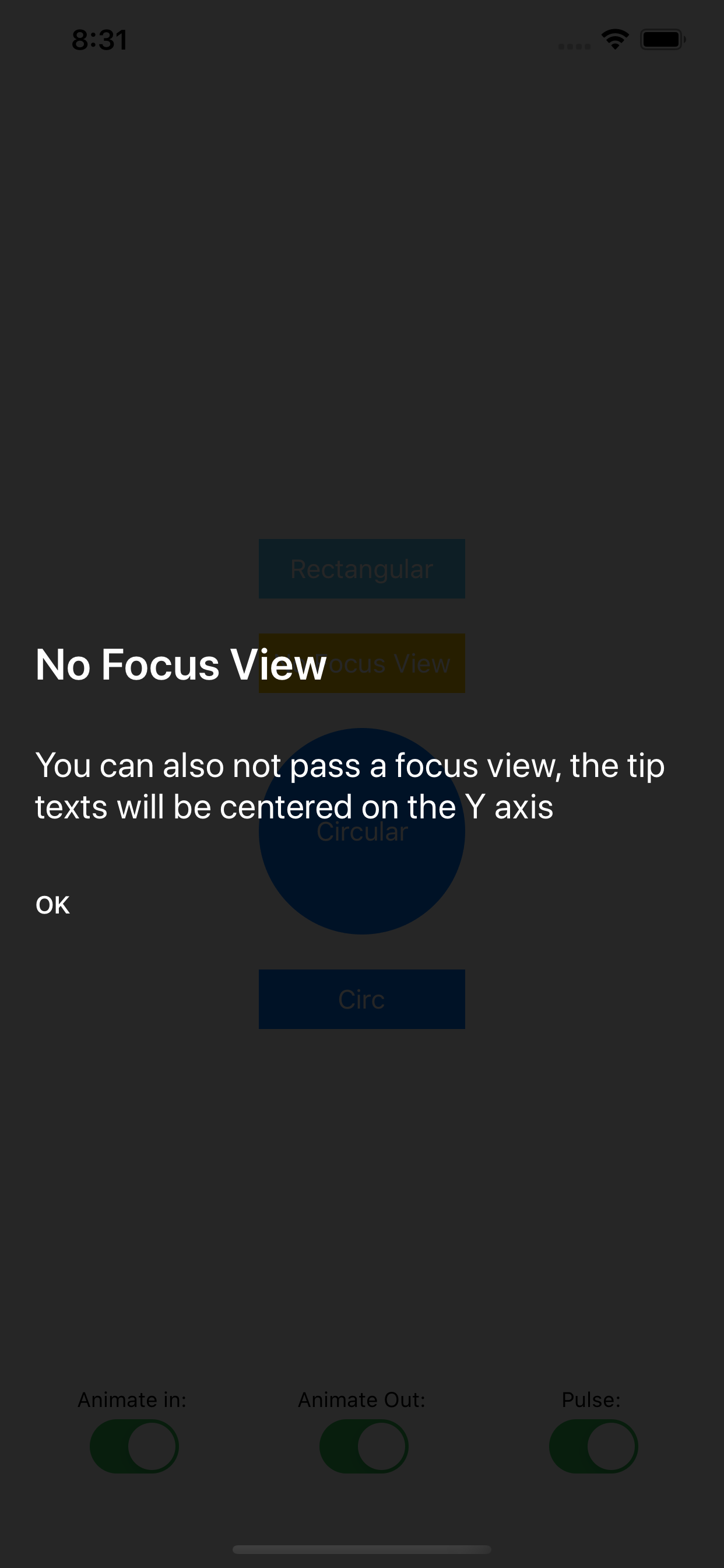
| focusView | UIView? | 在展示提示视图时需要聚焦的 UIView | |
| circularFocus | Bool | false | 如果提供了 "focusView",此属性控制用于聚焦视图的遮罩是否为圆形。在默认的 "false" 状态下,遮罩为矩形 |
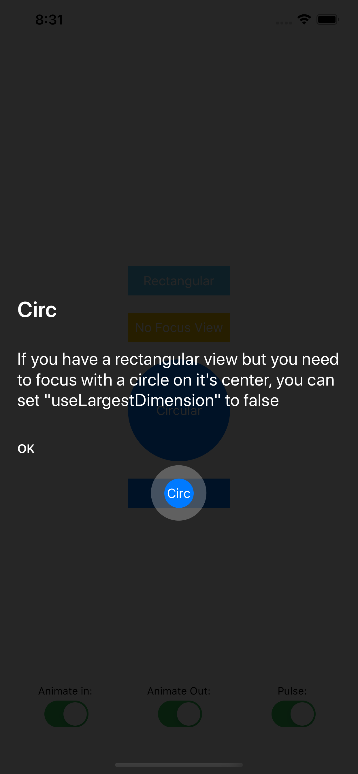
| useLargestDimension | Bool | true | 如果 "circularFocus" 设置为 true 用于非正方形的 "focusView",将此属性保留为 "true" 将使用 "focusView" 的最大尺寸来计算聚焦遮罩半径,而将此属性设置为 "false" 将使用最小尺寸,并将圆形遮罩居中对齐到 "focusView"。 |
| focusInsets | UIEdgeInsets | .zero | 向 "focusView" 遮罩添加填充。如果 "circularFocus" 设置为 "true",则仅向半径计算添加 .top 填充 |
| animateIn | Bool | true | 提示视图是否应动画呈现。在使用多个提示视图且不希望在每个视图上重复动画的情况很有用。 |
| animateOut | Bool | true | 提示视图是否应动画关闭。在使用多个提示视图且不希望在每个视图上重复动画的情况很有用。 |
| pulseMode | Enum | .none | 如果提供了 "focusView",是否应该跳动。 |
| focusDistance | CGfloat | 0 | "focusView" 与实际提示文本(标题、详情、按钮)容器之间的垂直间距。如果提供的 "focusView" 在屏幕下半部分,提示容器呈现在其上方,此属性是提示容器底部到 "focusView" 遮罩顶部的距离。如果提供的 "focusView" 在屏幕上半部分,提示容器呈现在其下方,此属性是提示容器顶部到 "focusView" 遮罩底部的距离。 |
| tipContainerLeading | CGFloat | 20 | 实际提示文本(标题、详情、按钮)容器与其父视图的 leading 之间的间距。 |
| tipContainerTrailing | CGFloat | 20 | 实际提示文本(标题、详情、按钮)容器与其父视图的 trailing 之间的间距。 |
| animationDuration | Double | 0.3 | 提示视图中发生的任何动画的持续时间(除脉冲效果外) |
| buttonAction | (()->())? | 提示视图关闭后要执行的代码 |
关于Pulsar库
在发布PRGTipView时,Pulsar库尚未在Cocoapods仓库中更新,因此只能将v2.0.5版本的源代码包含在打包中。一旦通过Cocoapods满足依赖项,我们将更新PRGTipView以使用Pulsar作为pod依赖项。
作者
John Spiropoulos, [email protected]
许可证
PRGTipView 是由 John Spiropoulos 为 Programize LLC 制作的,并按照 MIT 许可证提供。
本产品包括 Vincent Esche 的 Pulsar 代码。许可证信息存储在此处: LICENSE