#####为 Office 和 Office 365 构建体验的 iOS UI 框架。
Fabric for iOS 是一个库,为原生 iOS 平台提供 Office UI 体验。它包含颜色和字体等标记,以及为 UIButton 和 UILabel(更多即将推出)等原生控件提供的自定义功能,所有这一切都基于 Office 和 Office 365 产品中使用的官方设计语言。
##安装和使用 Office UI Fabric
###1. 使用 CocoaPods
pod 'OfficeUIFabricCore', '~> 0.1.6’###2. 手动安装
2.1. 从 Office UI Fabric iOS 仓库下载最新更改。
2.2. 将 OfficeUIFabricCore 文件夹移至项目文件夹。
2.3. 将 OfficeUIFabricCore/OfficeUIFabricCore.xcodeproj 拖放到您的 xcode 项目中。
2.4. 在 Xcode 中选择 您的项目 -> 您的目标 -> 通用 -> 嵌入的二进制文件 -> 添加 "OfficeUIFabricCore.framework"。
导入库以使用它
import OfficeUIFabricCore##标记
###颜色
您可以使用 UIColor 扩展从 Office 色彩板访问颜色
UIColor.msThemePrimary()
UIColor.msNeutralSecondaryAlt()
UIColor.msAccentBlueLight()
有关完整颜色列表,请参阅 Fabric 网站的 样式页面。
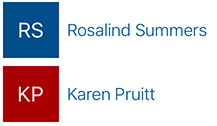
当您有一列项目时不是所有都有图像(例如,地址簿联系人或其他音乐乐队列表)时,您可以使用 HashColor 算法生成随机颜色
UIColor.msHashColor("Karen Pruitt")
UIColor.msHashColor("Norris Beardsley")
UIColor.msHashColor("Proseware, Inc.")
###字体
Fabric 使用几种字体样式。您可以在 Fabric 网站的 字体样式页面 上查看完整的列表。
Fabric iOS 使用 Apple 的 SanFrancisco 字体。
使用 UIFont 扩展获取不同样式的字体
UIFont.msFont(style: MSFontStyle.SU)
UIFont.msFont(style: MSFontStyle.XXL)
UIFont.msFont(style: MSFontStyle.SPlus)
返回的字体将是首选字体权重。您还可以指定不同的字体权重
UIFont.msFont(style: MSFontStyle.XL, weight: MSFontWeight.Light)
UIFont.msFont(style: MSFontStyle.MPlus, weight: MSFontWeight.Semibold)
UIFont.msFont(style: MSFontStyle.L, weight: MSFontWeight.Thin)
注意:字体权重仅在 iOS 8.2 和更高版本的 iOS 上工作。对于更早版本的 iOS,字体将是常规重量。
###图标
为了与其他设计标记保持一致,您可以使用具有特定线重量的推荐图标大小
TabBar Icons: 30x30pt, line weight: 1
Toolbar Icons: 28x28pt, line weight: 1
NavigationBar Icons: 20x20pt, line weight: 1
通常,我们建议您使用轮廓图标而不是实心图标。使用实心图标用于不同的图标状态(例如,跟进/不跟进)。
##原生控件自定义
###UIButton
您可以使用 UIButtonMS 扩展来自定义您的 UI 按钮
self.myButton.msStandardButton()
self.myOtherButton.msPrimaryButton()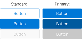
要自定义按钮颜色,可以向 msStandardButton 或 msPrimaryButton 传递参数
self.standardButton.msStandardButton(UIColor.msAccentTeal(), disabledColor: UIColor.msAccentTealLight())

self.primaryButton.msPrimaryButton(UIColor.msAccentTeal(), selectedColor: UIColor.msAccentTealDark(), disabledColor: UIColor.msAccentTealLight())
您还可以以标准方式为按钮应用字体和/或图片
self.toggleIconButton.titleLabel?.font = UIFont.msFont(MSFontStyle.L)

self.toggleIconButton.setImage(UIImage(named: "MyToggleImage"), forState: .Normal)

self.toggleIconButton.setImage(UIImage(named: "MyToggleImageSelected"), forState: .Selected)
###UILabel
您可以使用 UILabelMS 扩展来自定义您的 UI 标签
self.myLabel.msLabel(MSFontStyle.XL, fontWeight: MSFontWeight.SemiLight, textColor: UIColor.msThemePrimary())

self.myBoldLabel.msLabel(fontWeight: MSFontWeight.Semibold)

self.mySmallLabel.msLabel(MSFontStyle.XS)

self.myColorLabel.msLabel(textColor: UIColor.msThemeSecondary())

self.myColorSmallLabel.msLabel(MSFontStyle.XS, textColor: UIColor.msThemeSecondary())
###UITextField
您可以使用 UITextFieldMSExtension 来自定义项目中 UITextField。
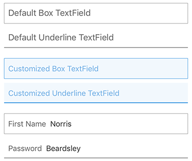
UITextField 的自定义包括三个部分:
- 文本框表单
- 文本样式
- 占位符文本样式
####1. 定义表单
您可以为文本框使用 Box 或 Underline 风格
self.myTextField.msTextFieldBox()

self.myTextField.msTextFieldBox(borderColor: UIColor, backgroundColor: UIColor, leftPadding: CGFloat)
或
self.myTextField.msTextFieldUnderline()

self.myTextField.msTextFieldUnderline(borderColor: UIColor, backgroundColor: UIColor, leftPadding: CGFloat)
####2. 文本样式
要将文本样式应用于您的 UITextField
self.myTextField.msTextFieldFontStyles()

self.myTextField.msTextFieldFontStyles(style: MSFontStyle, textColor: UIColor)

self.myTextField.msTextFieldFontStyles(style: MSFontStyle, fontWeight: MSFontWeight, textColor: UIColor)

self.myTextField.msTextFieldFontStyles(font: UIFont?, textColor: UIColor)
####3. 占位符文本样式
您可以在您的 UITextField中使用“占位符文本”或者永久的“占位符”
// Placeholder text
self.myTextField.msTextFieldPlaceholderText(text: String)

self.myTextField.msTextFieldPlaceholderText(text: String, placeholderColor: UIColor, font: UIFont?)

// Permanent placeholder
self.myTextField.msTextFieldPermanentPlaceholderText(text: String)

self.myTextField.msTextFieldPermanentPlaceholderText(text: String, placeholderColor: UIColor, font: UIFont?, padding: CGFloat)
##组件
###InitialsView
使用 InitialsView 组件来创建一个带字符串首字母的颜色框
self.initialsView.setInitialsFromTitle(title)
使用 UIColor.msHashColor(title) 来设置背景颜色。
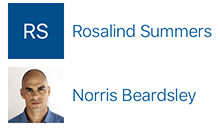
###LogoView
使用 LogoView 组件来创建一个带有首字母或图片的颜色框。此组件包含 InitialsView、UIImageView 以及根据输入显示两者的逻辑。在您有一个没有图片的项目列表时使用此组件,例如地址簿。
self.logoView.updateWithTitle(title)
或
self.logoView.updateWithImage(image)
##为 Fabric 贡献
在 问题追踪器 上发布错误报告、功能请求和问题。
##许可证
Office UI Fabric GitHub 仓库中的所有文件均受 MIT 许可证约束。请阅读项目根目录下的许可证文件。
##版本记录 我们使用 GitHub 发布 来管理我们的发布,包括每个发布之间的变更日志。您可以在 发布页面 上找到自 1.0 版本以来添加、修复和更改的完整列表。
本项目遵循 Microsoft 开源行为准则。有关更多信息,请参阅 行为准则常见问题解答 或联系 [email protected] 以获取任何其他问题或意见。