
描述
EasyTipView 是一个使用 Swift 编写的,可完全自定义的 EasyTipView 支持库。(https://github.com/teodorpatras/EasyTipView)
内容
## 功能
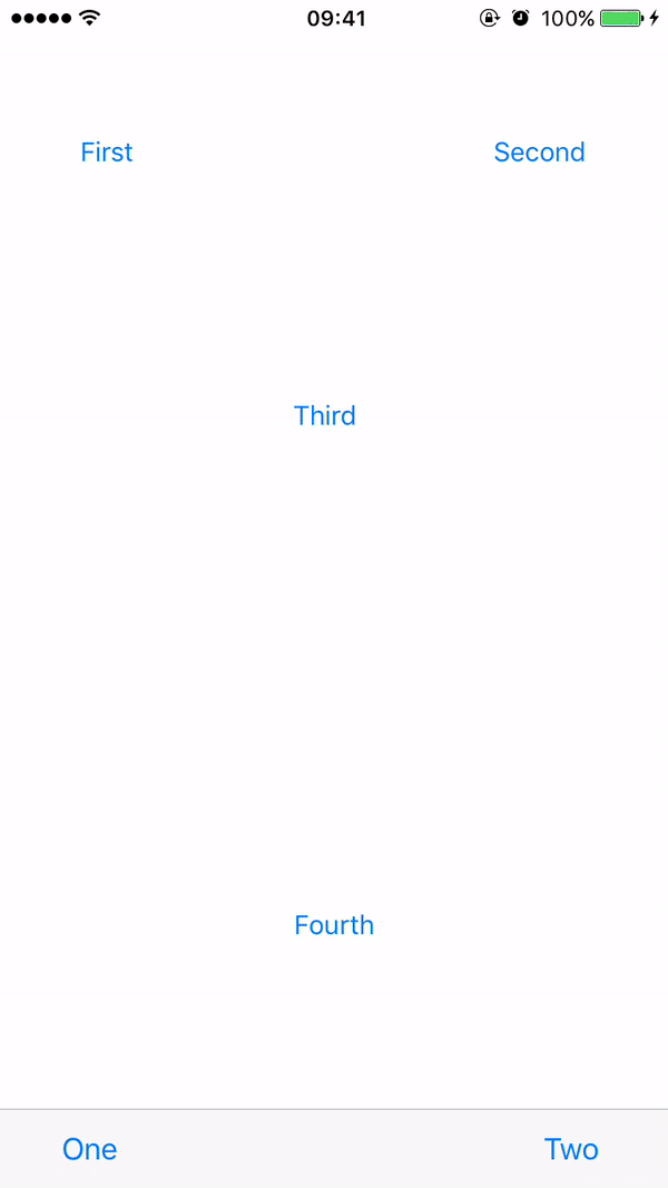
- 可以指向任何
UIBarItem或其子类。 - 支持任何箭头方向
←, →, ↑, ↓ - 自动调整方向改变。
- 完全可自定义的外观。
- 完全可自定义的展示和结束动画。
安装
手动安装
将源文件夹拖放到您的项目中。
Pods
要使用CocoaPods将EasyTipView集成到您的Xcode项目中,请在您的Podfile中指定它
pod 'NMEasyTipView', '~> 1.2'然后,运行以下命令
$ pod install使用方法
- 首先,您应该自定义设置
    UIButton *button = [UIButton buttonWithType:UIButtonTypeCustom];
    button.frame = CGRectMake(50, 100, 100, 50);
    [button setTitle:@"Click Me" forState:UIControlStateNormal];
    [button setTitleColor:[UIColor blueColor] forState:UIControlStateNormal];
    [self.view addSubview:button];


    [button addTarget:self action:@selector(handle:) forControlEvents:UIControlEventTouchUpInside];

    RCEasyTipPreferences *preferences = [[RCEasyTipPreferences alloc] initWithDefaultPreferences];
    preferences.drawing.backgroundColor = [UIColor purpleColor];
    preferences.drawing.arrowPostion = Top;
    preferences.animating.showDuration = 1.5;
    preferences.animating.dismissDuration = 1.5;
    preferences.animating.dismissTransform = CGAffineTransformMakeTranslation(0, -15);
    preferences.animating.showInitialTransform = CGAffineTransformMakeTranslation(0, -15);

    RCEasyTipView *tipView = [[RCEasyTipView alloc] initWithPreferences:preferences];
    tipView.text = @"Lorem Ipsum is simply dummy text of the printing and typesetting industry. Lorem Ipsum has been the industry's standard dummy text ever since the 1500s, when an unknown printer took a galley of type and scrambled it to make a type specimen book.";
    [tipView showAnimated:YES forView:button withinSuperView:self.view];
自定义外观 为了自定义EasyTipView的外观和行为,您可以对封装EasyTipView可自定义属性的Preferences结构进行操作。这些设置已经被分成三个结构
绘图- 封装了指定如何在屏幕上绘制的可自定义属性。定位- 封装了指定EasyTipView在其自身范围内绘制的位置的可自定义属性。动画- 封装了指定EasyTipView在屏幕上是何种方式打开和关闭的可自定义属性。
| 绘图 属性 | 描述 | |----------|-------------|------| |cornerRadius| 提示视图气泡的圆角。| |arrowHeight| 位于气泡顶部或底部的箭头的长度。| |arrowWidth| 上述箭头的宽度。| |foregroundColor| 文本颜色。| |backgroundColor| 气泡的背景颜色。| |arrowPosition| 箭头的位置。这可以是
+ Top: 在气泡顶部
+ Bottom: 在气泡底部。
+ Left: 在气泡左侧
+ Right: 在气泡右侧
+ Any: 使用此选项让EasyTipView自动找到最佳箭头位置。
如果由于布局限制不能应用传递的箭头,将自动分配不同的箭头位置。| |textAlignment| 文本的对齐方式。| |borderWidth| 应用在气泡上的可选边框的宽度。| |borderColor| 应用在气泡上的可选边框的颜色。为了应用边框,borderColor需要与[UIColor clear]不同,并且borderWidth> 0| |font| 应用于文本的字体。|
| 定位 属性 | 描述 | |----------|-------------|------| |bubbleHInset| 气泡在其容器内的水平内边距。| |bubbleVInset| 气泡在其容器内的垂直内边距。| |textHInset| 文本在其气泡内的水平内边距。| |textVInset| 文本在其气泡内的垂直内边距。| |maxWidth| 气泡的最大宽度。|
| Animating 属性 | 描述 | |----------|-------------|------| |dismissTransform| 用于指定弹球消失的方式的 CGAffineTransform。 | |showInitialTransform| 用于指定在弹球在屏幕动画之前需要应用初始转换的 CGAffineTransform。 | |showFinalTransform| 用于指定弹球在屏幕上的动画方式 CGAffineTransform。 | |springDamping| 弹性动画阻尼。 | |springVelocity| 弹性动画速度。 | |showInitialAlpha| 在弹球在屏幕上动画之前应用到尖端视图的初始alpha值。 | |dismissFinalAlpha| 弹球在屏幕上动画消失时应用到尖端视图的alpha值。 | |showDuration| 显示动画持续时间。 | |dismissDuration| 消失动画持续时间。 |
自定义显示或消失动画
默认的显示或消失动画是缩放。如果您想更改默认行为,需要更改首选项中animating属性的属性。一个例子可以是
preferences.drawing.arrowPostion = Top;
preferences.animating.showDuration = 1.5;
preferences.animating.dismissDuration = 1.5;
preferences.animating.dismissTransform = CGAffineTransformMakeTranslation(0, -15);
preferences.animating.showInitialTransform = CGAffineTransformMakeTranslation(0, -15);
这会产生以下动画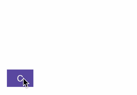
公开接口
## 委托 EasyTipViewDelegate 是一个自定义协议,它定义了一个在 EasyTipView 消失后要调用的方法。
@protocol RCEasyTipViewDelegate <NSObject>
@optional

- (void)willShowTip:(RCEasyTipView *)tipView;
- (void)didShowTip:(RCEasyTipView *)tipView;

- (void)willDismissTip:(RCEasyTipView *)tipView;
- (void)didDismissTip:(RCEasyTipView *)tipView;

@end