


📲 如何安装
使用 CocoaPods
编辑您的 Podfile 并指定依赖项
pod 'MLCardDrawer'使用 Swift 包管理器
将 MLCardDrawer 添加为依赖项。在您的 Package.swift 中的 dependencies 值中添加以下行。
dependencies: [
.package(url: "https://github.com/mercadolibre/meli-card-drawer-ios.git", from: "1.0")
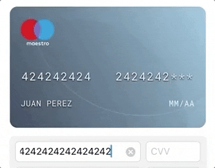
]🌟 功能
- 易于集成
- 支持卡片号、姓名、有效期和 CVV(CardData 协议)
- 支持自定义卡片左右图片(CardUI 协议)
- 支持正面和背面视图的 CVV
- 集成翻页动画
- 使用 MotionEffect 的闪亮卡片效果
🔥 🔥 - 当编辑 CardData 协议时,实时更新卡片视图
- PCI 合规性(我们不保存任何内容)
- 支持自定义叠加背景图像
- 支持自定义渐变
- 支持远程图像(可选)
🐒 如何使用
1 - 将其导入项目
import MLCardDrawer2 - 定义CardHeaderController引用及自定义容器视图。
// You can create your containerView by code or by storyboard/xib (as you like)
private var containerView: UIView = UIView()
private var cardDrawer: MLCardDrawerController?
3 - 初始化cardDrawer并传入CardUI和CardData协议作为参数。
cardDrawer = MLCardDrawerController(cardUIHandler, cardDataHandler)4 - 调用setup和show方法。
cardDrawer?.setUp(inView: containerView).show()💡 高级功能
显示安全码
// You can highlight the security code location.
// If the security code is behind, the card will transition with flip animation.
cardDrawer?.showSecurityCode()
显示卡片视图
cardDrawer?.show()🔥 基于MotionEffect的动态卡片支持🔥
cardDrawer?.setShineCard(enabled: true)💳 卡片数据结构和样式定制
您可以为您的卡片自定义数据结构和样式。
🔠 CardData协议
使用CardData协议更新卡片显示值。
@objc public protocol CardData {
    var name: String { get set }
    var number: String { get set }
    var expiration: String { get set }
    var securityCode: String { get set }
    @objc optional var lastDigits: String { get set}
}
🎨 CardUI协议
使用CardUI协议自定义:安全码位置,卡片背景,文本颜色,占位符等。
@objc public protocol CardUI {
    var cardPattern: [Int] { get }
    var placeholderName: String { get }
    var placeholderExpiration: String { get }
    var cardFontColor: UIColor { get }
    var cardBackgroundColor: UIColor { get }
    var securityCodeLocation: MLCardSecurityCodeLocation { get }
    var defaultUI: Bool { get }
    var securityCodePattern: Int { get }

    @objc optional func set(bank: UIImageView)
    @objc optional func set(logo: UIImageView)
    @objc optional var fontType: String { get }
    @objc optional var bankImage: UIImage? { get }
    @objc optional var cardLogoImage: UIImage? { get }
    @objc optional var ownOverlayImage: UIImage? { get }
}
🎨 底部标签添加协议
使用addTagBottom协议自定义:底部标签位置,背景颜色,文本颜色,占位符。
public protocol CapabilitiesComponentsViewProtocol: NSObject {
    func addTagBottom(containerView: UIView, isDisabled: Bool, cardType: MLCardDrawerTypeV3, tagBottom: Text?, padding: UIEdgeInsets)
}
😉 下一步
- Bitrise发布
- Codebeat集成
- 使用 MotionEffect 的闪亮卡片效果
🔥 🔥 - SwiftLint
- 迁移到Swift 5
- 原生支持在禁用模式下显示卡片(卡片已禁用)
- 2.0版本支持SwiftUI
😈 - 创建底部标签功能
🔮 项目示例
此项目包括一个使用 MLCardDrawer 的示例项目和另一个带有 xCTests 测试用例的目标。进入路径:meli-card-drawer-ios/Example_MeliCardDrawer 并运行 pod install 命令。之后,您可以打开 Example_MeliCardDrawer.xcworkspace
🕵️♂️ 测试用例

📋 支持的操作系统和 SDK 版本
- iOS 9.0+
- Swift 4.2
- xCode 9.2+
- 与 Objc 完全兼容
❤️ 反馈
这是一个开源项目,因此您可以自由贡献。如何? -> 分支此项目并提出自己的修复、建议,并通过拉取请求推送更改。
👨💻 作者
Juan Sanzone / @juansanzone
👮♂️ 许可证
Copyright 2019 Mercadolibre Developers

Licensed under the Apache License, Version 2.0 (the "License");
you may not use this file except in compliance with the License.
You may obtain a copy of the License at

    https://apache.ac.cn/licenses/LICENSE-2.0

Unless required by applicable law or agreed to in writing, software
distributed under the License is distributed on an "AS IS" BASIS,
WITHOUT WARRANTIES OR CONDITIONS OF ANY KIND, either express or implied.
See the License for the specific language governing permissions and
limitations under the License.