LGSegmentedControl


LGSegmentedControl 是一个高度可定制的 UISegmentedControl,因此更加美观。

要求
- 使用纯 Swift 4.2 编写
- iOS 9.0 和更高版本
贡献
- 这不是必需的,但非常受赞赏:[将您的应用程序添加到使用此库的应用列表中](/Attribution.md)
安装
LGSementedControl 可通过 CocoaPods 访问。要安装它,请简单地将以下行添加到您的 Podfile 中:
pod 'LGSegmentedControl'Storyboard
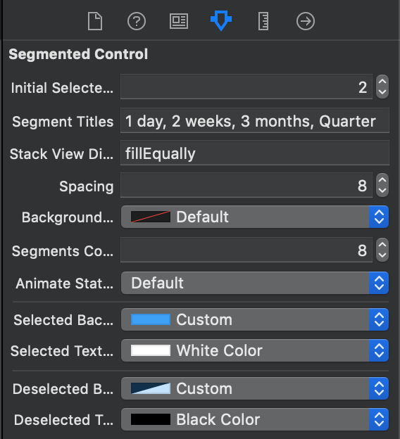
将一个视图拖到故事板中,并将其类设置为LGSegmentedControl。
从这里,您可以自定义分割控件的设置,并可以提供静态分段数据

最大的优点是它支持界面构建器中的实时渲染!

然后,在视图控制器中创建一个@IBAction并使用valueChanged操作链接到它。
编程方式
实例化一个新的视图
let control = LGSegmentedControl(frame: CGRect(x: 50, y: 50, width: 100, height: 30))
view.addSubview(control)
...然后添加分段数据
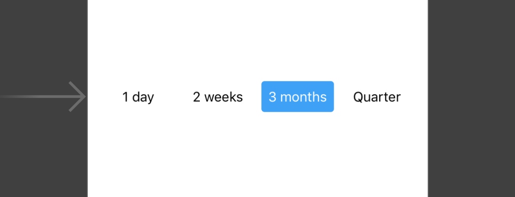
control.segments = [
    LGSegment(title: "1 day"),
    LGSegment(title: "3 weeks"),
    LGSegment(title: "2 months"),
    LGSegment(title: "Quarter")
]
最后,定义选定的分段
control.selectedIndex = 1 // selects: "3 weeks"为了跟踪用户交互,添加一个目标并使用.valueChanged操作将它们链接到视图控制器中的方法
control.addTarget(self, action: #selector(selectedSegment(_:)), for: .valueChanged)

@objc func selectedSegment(_ segmentedControl: LGSegmentedControl) {
    // selectedSegment may be nil, if selectedIndex was set to nil (and hence none was selected)
    guard let segment = segmentedControl.selectedSegment else { return }
    let title = segment.title // ex: "3 weeks"
}
徽章计数
您可以通过分配一个Int值将徽章计数添加到分段中
segment.badgeCount = 3这将产生以下效果

注意,将徽章设置为0时,仍然会显示一个值为0的徽章计数。
如果您想隐藏徽章,只需将计数设置为nil
segment.badgeCount = nil自定义
您可以自定义控件的多方面属性
// StackView distribution, set to .fill to have each segment be as wide as required; set to .fillEqually, to have all segments be the same width
// default: .fill
public var distribution: UIStackView.Distribution

// StackView spacing
// default: 8
@IBInspectable public var spacing: CGFloat

// Background color of the whole segment
// default: .clear
@IBInspectable override public var backgroundColor: UIColor?使用LGSegmentOptions获取更多选项
// Corner radius of the segments
// default: 6
var cornerRadius: CGFloat
// Determines whether there should be a short fade animation when selecting a segment
// default: true
var animateStateChange: Bool
// Background & text color of the selected segment
// default: .blue-ish (#389FF9), .white
var selectedColor: (background: UIColor, text: UIColor)
// Background & text color of the deselected segment
// default: .clear, .black
var deselectedColor: (background: UIColor, text: UIColor)
// Background & text color of the selected segment
// default: .red, .white
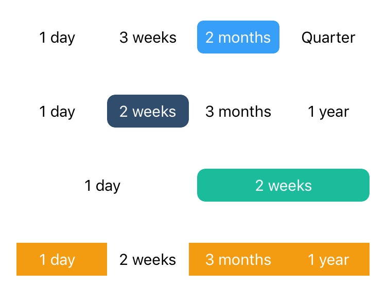
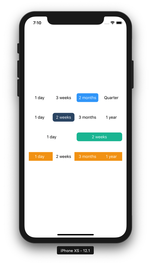
var badgeColor: (background: UIColor, text: UIColor)有几种不同的方式使用给定的选项来样式化控件,以下是一些示例

贡献
如果发现任何错误,请开启新的问题报告。
如果您想贡献更改和功能,请提交拉取请求,我会很高兴合并它!
作者
LGSegmentedControl是由Linus Geffarth(我)编写和维护的。如果您想打招呼,可以通过twitter @linusgeffarth联系我,或者发送电子邮件至[email protected]。
许可协议
LGSegmentedControl可在MIT许可协议下获取。有关更多信息,请参阅LICENSE文件。