KMSegmentedControl 1.0.7
- 由
- Kamil Mazurek
KMSegmentedControl
此库仍在开发中
注意:此库可能包含一些小错误,但会尽快修复。然而,这不会影响其任何功能。计划开发更多功能,使其更加动态和简洁。
计划功能
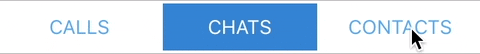
预览
WhatsApp 风格(Android)

或者您保持 Apple 风格,但也可以更改边框宽度、分隔线和许多其他属性

为了正确使用此 SegmentedControl 风格,请确保 KMSelectedItemColor 和 KMBackgroundColor 的背景是透明的(clearColor)。
用法
Swift
导入库
import KMSegmentedControl程序创建 KMSegmentedControl
var segmentedControl = KMSegmentedControl(frame: CGRect(x: 0,y: 0, width: 200, height: 50))
segmentedControl.delegate = self
// further customizable properties are listed below
使用 Storyboard 创建 KMSegmentedControl
- 创建一个新的 UIView 继承自 KMSegmentedControl
- 根据您的喜好进行设计。
代理方法
// called if an action happens. Control different behaviours by checking item.tag.
func KMSegmentedControl(selected item: UIButton)
属性
带 @IBInspectable 的属性可以通过 Storyboard 进行自定义,也可以在代码中自定义。
// Defines which UIElement will be visible
public enum UIElement {
    case HighlightedView
    case SelectorLine
}

@IBInspectable public var KMSelectedItemColor: UIColor?  // background of selected item
@IBInspectable public var KMBorderWidth: CGFloat = 0  // border width of the segmented control
@IBInspectable public var KMBorderColor: UIColor? // color of the border
@IBInspectable public var KMBackgroundColor: UIColor? // background color of segmented control
@IBInspectable public var KMCornerRadius: CGFloat = 0 // corner radius of segmented control
@IBInspectable public var KMSelectedTitleColor: UIColor? // color of the selected item
@IBInspectable public var KMUnSelectedTitleColor: UIColor?  // default title color
@IBInspectable public var KMSelectorLineColor: UIColor? // color of the animated bottom line if defined
@IBInspectable public var KMHighlightedViewColor: UIColor? // color of the highlighted view if defined
public var KMFontSize: CGFloat = 14 // font size of each item
public var items: [String] = ["First", "Second"] // defines what items will be displayed
public var KMShowSeperatorLines: Bool? // display seperator lines between each item (Will be shown as default)
public var KMShowHighlightedView: Bool? // display highlighted view (Will be shown as default)
public var UIElements: [UIElement] = [.HighlightedView, .SelectorLine] // Define which UIElement should be displayed (Both will be as default)
public var images: [String] = [] // Add Images for each button
public var placeImageAboveTitle: Bool = false // Set 'true' if you want an image to be centered above the title/label
许可证
KMSegmentedControl 在 MIT 许可证下可用。有关更多信息,请参阅 LICENSE 文件。