HTPressableButton 1.3.3
- 由
- Herin Kim 和 Thanakron Tandavas
HTPressableButton 是为 iOS 开发者设计的,以便能够花时间开发想法,而不是构建基本按钮。这些时尚且扁平设计的按钮可以轻松修改,并且几乎适用于任何项目。无需担忧颜色选择,HTPressableButton 还包括与您的应用程序完美搭配的美丽配色方案。
兼容性:iOS 6.0 及以上版本
当前版本 1.3.2
您可以在此处查看我们的文档 http://cocoadocs.org/docsets/HTPressableButton/1.3.0/。
安装
HTPressableButton 可以通过 Cocoapods 安装。
pod 'HTPressableButton'您还可以快速使用以下命令尝试 HTPressableButton 示例项目
pod try 'HTPressableButton'然而,如果您对使用提供的配色方案感兴趣(如下所示),则
pod 'HTPressableButton/HTColor'另一种选择是使用 git 子模块,或者只是为了手动将其添加到项目中,您可以 下载它。
注意:请提醒自己将头文件添加到您的项目中。您可以只添加您将会用到的的那个。
#import "HTPressableButton.h"
#import "UIColor+HTColor.h"
按钮类型
重要:您必须首先指定 frame。我们希望知道您按钮的大小。
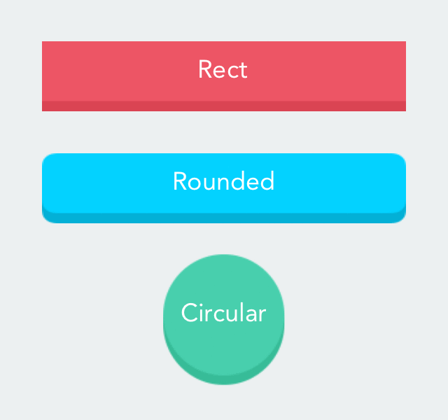
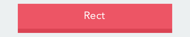
矩形按钮
    //Rectangular grape fruit color button
    CGRect frame = CGRectMake(30, 150, 260, 50);
    HTPressableButton *rectButton = [[HTPressableButton alloc] initWithFrame:frame buttonStyle:HTPressableButtonStyleRect];
    rectButton.buttonColor = [UIColor ht_grapeFruitColor];
    rectButton.shadowColor = [UIColor ht_grapeFruitDarkColor];
    [rectButton setTitle:@"Rect" forState:UIControlStateNormal];
    [self.view addSubview:rectButton];
圆角矩形按钮
    // Rounded rectangular default color button
    frame = CGRectMake(30, 230, 260, 50);
    HTPressableButton *roundedRectButton = [[HTPressableButton alloc] initWithFrame:frame buttonStyle:HTPressableButtonStyleRounded];
    [roundedRectButton setTitle:@"Rounded" forState:UIControlStateNormal];
    [self.view addSubview:roundedRectButton];

圆形按钮
    //Circular mint color button
    frame = CGRectMake(110, 300, 100, 100);
    HTPressableButton *circularButton = [[HTPressableButton alloc] initWithFrame:frame buttonStyle:HTPressableButtonStyleCircular];
    circularButton.buttonColor = [UIColor ht_mintColor];
    circularButton.shadowColor = [UIColor ht_mintDarkColor];
    [circularButton setDisabledButtonColor:[UIColor ht_sunflowerColor]];
    [circularButton setTitle:@"Circular" forState:UIControlStateNormal];
    [self.view addSubview:circularButton];
禁用按钮
如果您想创建一个禁用按钮,请添加
buttonNameHere.enabled = NO;
示例
    //Disabled rounded rectangular button
    frame = CGRectMake(30, 420, 260, 50);
    HTPressableButton *disabledRoundedRectButton = [[HTPressableButton alloc] initWithFrame:frame buttonStyle:HTPressableButtonStyleRounded];
    disabledRoundedRectButton.disabledButtonColor = [UIColor ht_pinkRoseColor];
    disabledRoundedRectButton.disabledShadowColor = [UIColor ht_pinkRoseDarkColor];
    disabledRoundedRectButton.alpha = 0.5;
    disabledRoundedRectButton.enabled = NO;
    [disabledRoundedRectButton setTitle:@"DisabledButton" forState:UIControlStateNormal];
    [self.view addSubview:disabledRoundedRectButton];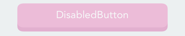
所有类型按钮的默认 alpha 值为 1.0。该值可以通过(如上所示禁用按钮)进行更改
buttonNameHere.alpha = 0.5;注意:我们为您设置了一些 默认 属性。
| 属性 | 值 |
|---|---|
| 按钮类型 | HTPressableButtonStyleRounded |
| 边框圆角 | 10.0 |
| 字体 | Avenir |
| 字体大小 | 18 |
| 阴影高度 | 按钮高度的 17% |
| 按钮颜色 | ht_jayColor |
| 按钮阴影颜色 | ht_jayDarkColor |
| 禁用按钮颜色 | ht_mediumColor |
| 禁用按钮阴影颜色 | ht_mediumDarkColor |
如果您希望设置自己的阴影高度而不是使用我们的默认值,请添加
    //Set shadow height of size 10
    buttonNameHere.shadowHeight = 10;
不同类型的按钮设置了不同的默认圆角半径值,您可以通过以下方式修改:
    //Set corner radius to 20.0
    buttonNameHere.cornerRadius = 20;
修改按钮的字体
    //Set button font
    buttonNameHere.titleFont = [UIFont fontWithName:@"Avenir" size:18];
其他颜色
您可以在项目的任何地方通过使用文件 UIColors+HTColor 中的其他颜色:
    [UIColor ht_colorNameHere]

    //Examples
    [UIColor ht_jayColor]
    [UIColor ht_pinkRoseColor]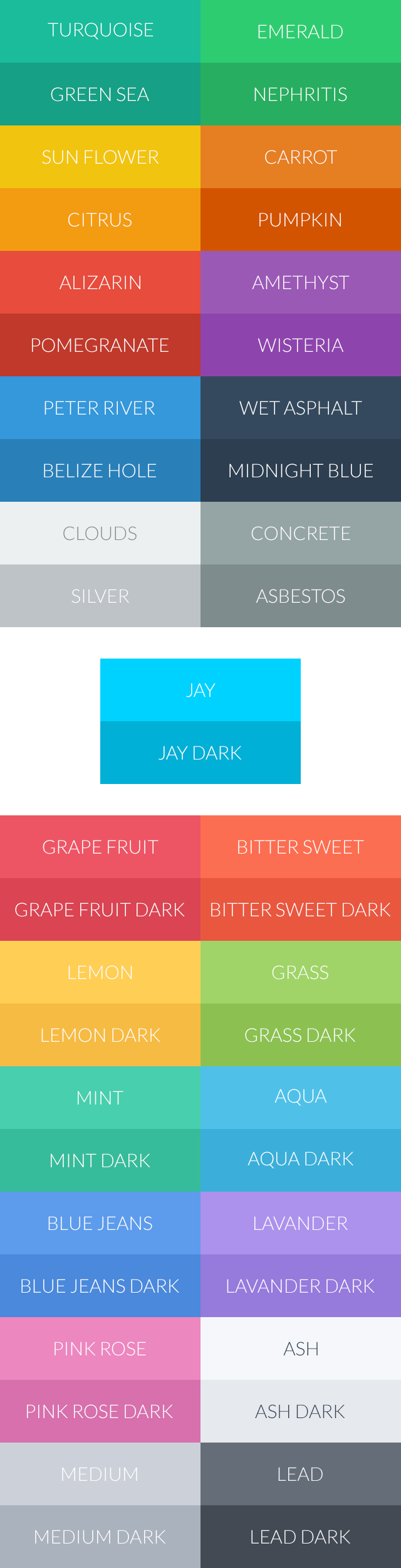
贡献者
欢迎贡献者!请随时提出问题或发送拉取请求 :)
维护者


贡献者


展示厅
我们很乐意看到我们是如何成为你们项目的一部分。发送电子邮件、问题、推特等,我们将在此处更新它们!
许可证
此项目遵循 MIT 许可协议。
鸣谢
启发于