GradientProgressBar


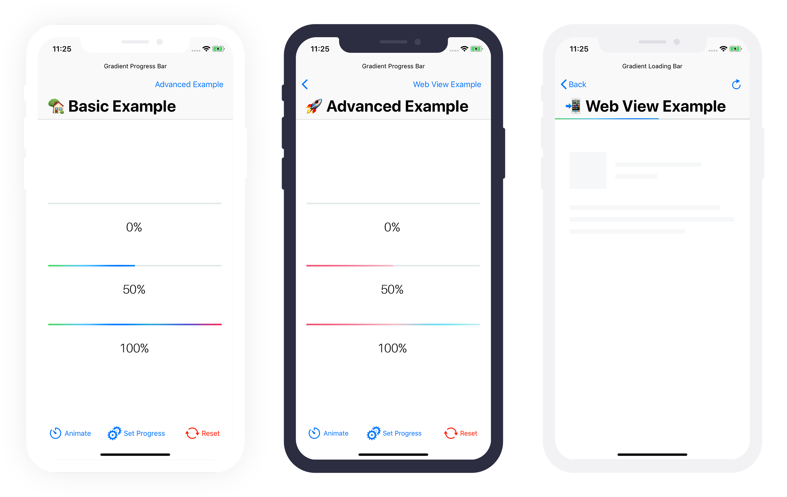
一个可自定义的渐变进度条(UIProgressView)。灵感来源于 Codepen 上的 iOS 7 进度条。
示例

要运行示例项目,请克隆仓库,并从 Example 目录打开工作区。
要求
- Swift 5.5
- Xcode 13
- iOS 13.0+
注意:如果您需要支持小于 13 的 iOS 版本,您可以回退到版本 2.X.X。
集成
CocoaPods
CocoaPods 是 Cocoa 项目的依赖管理器。有关使用和安装说明,请访问他们的网站。要使用 CocoaPods 将 GradientProgressBar 集成到您的 Xcode 项目中,请在您的 Podfile 中指定它
pod 'GradientProgressBar', '~> 3.0'Carthage
Carthage 是一个去中心化的依赖管理器,可以构建您的依赖项并提供二进制框架。要使用 Carthage 将 GradientProgressBar 集成到您的 Xcode 项目中,请在您的 Cartfile 中指定它
github "fxm90/GradientProgressBar" ~> 3.0
运行 carthage update 来构建框架,并将构建的 GradientProgressBar.framework 拖放到您的 Xcode 项目中。
Swift 包管理器
Swift 包管理器 是一个用于自动化 Swift 代码发布的工具,集成到 swift 编译器中。它仍处于早期开发阶段,但 Gradient Progress Bar 支持其在支持平台上的使用。
一旦您设置了 Swift 包,将 Gradient Progress Bar 添加为依赖项就像将其添加到 Package.swift 的 dependencies 值一样简单。
dependencies: [
    .package(url: "https://github.com/fxm90/GradientProgressBar", from: "3.0.0")
]
如何使用 (UIKit)
只需将一个 UIView 放入 Storyboard 中的 View Controller。选择您的视图,然后在 标识符检查器 中将类更改为 GradientProgressBar。
别忘了将模块也改为
GradientProgressBar。

根据您的需求为UIView设置约束。
在您的视图控制器源文件中导入GradientProgressBar。
import GradientProgressBar在您的视图控制器源文件中创建进度视图的IBOutlet。
@IBOutlet weak var gradientProgressView: GradientProgressBar!之后您可以像在普通UIProgressView中一样设置进度。
gradientProgressView.setProgress(0.75, animated: true)gradientProgressView.progress = 0.75配置
– 属性 animationDuration
调整对setProgress(_:animated:)的调用的动画持续时间
progressView.animationDuration = 2.0
progressView.setProgress(progress, animated: true)
– 属性 gradientColors
调整进度视图内部渐变使用的颜色。
progressView.gradientColors: [UIColor] = [
    .red,
    .white,
    .blue
]
– 属性 timingFunction
调整对setProgress(_:animated:)的调用中的计时函数,其中animated设置为true。
progressView.timingFunction = CAMediaTimingFunction(name: .easeInEaseOut)故障排除
界面构造支持
遗憾的是,目前Cocoapods框架对Interface Builder的兼容性已破裂。如果您需要Interface Builder的支持,请将以下代码添加到podfile中,并再次运行pod install。之后,您应该能够在Interface Builder中使用GradientProgressBar :)
  post_install do |installer|
    installer.pods_project.build_configurations.each do |config|
      next unless config.name == 'Debug'

      config.build_settings['LD_RUNPATH_SEARCH_PATHS'] = [
        '$(FRAMEWORK_SEARCH_PATHS)'
      ]
    end
  end
显示WKWebView的进度
基于我的gist,示例应用程序还包含将进度视图附加到UINavigationBar的示例代码。使用“键值监控”(Key-Value Observing),我们根据WKWebView的属性estimatedProgress更改进度条。
请查看示例应用程序以获取更多详细信息 :)
如何使用(SwiftUI)
向上滚动查看UIKit文档。
从版本2.1.0起,此框架提供了ProgressViewStyle,它可以在SwiftUI中使用。
struct ExampleView: View {

    @State
    private var progress = 0.5

    var body: some View {
        ProgressView(value: progress, total: 1)
            .progressViewStyle(.gradientProgressBar)
            .frame(height: 4)
    }
}
配置
struct ExampleView: View {

    @State
    private var progress = 0.5

    var body: some View {
        ProgressView(value: progress, total: 1)
            .progressViewStyle(
                .gradientProgressBar(
                    backgroundColor: .gray.opacity(0.05),
                    gradientColors: [.red, .white, .blue],
                    cornerRadius: 4)
                )
             .frame(height: 8)
    }
}
– 参数backgroundColor
显示在渐变后面的背景颜色(可能被cornerRadius裁剪)。
– 参数gradientColors
渐变使用的颜色。
– 参数 cornerRadius
背景和进度条上使用的 corner-radius 值。
添加/适应动画
要添加动画,您必须将 @State 属性的更新包装在 withAnimation(_:_:) 中。
Button("Animate progress") {
    withAnimation(.easeInOut) {
        progress += 0.1
    }
}
有关如何进一步自定义动画的说明,请参阅 Apple 对 Animation 的文档。
作者
Felix Mau(me(@)felix.hamburg)
许可证
GradientProgressBar 在 MIT 许可证下可用。有关更多信息,请参阅 LICENSE 文件。