GlossButtonNode
为 Texture 组合式按钮组件
为您的产品提供具有组合灵活性的按钮 UI 组件。
为什么需要它
Texture(AsyncDisplayKit) 为应用程序提供了许多优点。
尽管如此,它没有功能按钮组件。只有一个 ASButtonNode,这并不是什么坏事。
这意味着 Texture 避免了提供太多东西。
这个库 GlossButtonNode 将按钮组件引入到 Texture 世界。
GlossButtonNode 的功能包括:
- 分离的结构
- 可定制的表面样式(填充、描边、模糊)
- 为每种表面样式自定义动画
- 通过描述符(值类型)对象应用样式
这些功能对具有现代 UI 设计的应用程序非常有帮助。
第一印象
let buttonNode = GlossButtonNode()

let descriptor = GlossButtonDescriptor(
  title: ...,
  image: ...,
  bodyStyle: .init(layout: .horizontal()),
  surfaceStyle: .fill(
    .init(
      cornerRound: .circle,
      backgroundColor: .gradient(
        colorAndLocations: [
          ...,
          ...,
        ],
        startPoint: .init(x: 0, y: 0),
        endPoint: .init(x: 1, y: 1)
      ),
      dropShadow: ...
    )
  )
)

buttonNode.setDescriptor(descriptor, for: .normal)

buttonNode.onTap = {
  ...
}

// or use addAction() as a normal approach.
在生产环境中使用此 API 作为内联会有些冗长。
此 API 是为细粒度调整而设计的。
如果您的产品有 UI 设计系统,您可以定义描述符的工厂函数。
例如,如以下所示。
extension GlossButtonDescriptor {
  static func primary(tintColor: UIColor) -> Self {
    ..
  }

  static func secondary(tintColor: UIColor) -> Self {
    ..
  }
}
let buttonNode = GlossButtonNode()
buttonNode.setDescriptor(.primary(tintColor: myColor), for: .normal)结构
- 按钮
- 主体
- 标题
- 图像
- 表面
- 样式
- 主体
主体
主体包含标题和图像节点。
主体布局和突出显示动画由 GlossButtonBodyStyle 构建。
技术上,GlossButtonBodyLayout 构建主体布局。GlossButtonHighlightAnimation<T> 动态化突出显示状态。
GlossButtonBodyStyle(
  layout: .vertical(), // or .horizontal()
  highlightAnimation: .basic()
)
主体布局定制
GlossButtonBodyLayout 是一个闭包包装器对象,返回包含标题和图像节点的 ASLayoutSpec。
这意味着 .vertical() 和 .horizontal() 是工厂函数。
因此,如果需要另一种布局,您可以编写 ASLayoutSpec 来定义任何布局。
关于突出显示动画,它使用了同样的方法。您可以从中 GlossButtonHighlightAnimation 了解详细信息。
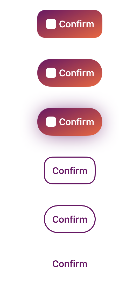
表面
表面节点将带填充显示在主体节点后面。
主要支持 GlossButtonNode 的以下两种表面
填充
配置在 GlossButtonFilledStyle
描边
配置在 GlossButtonStrokedStyle
安装
目前仅支持 CocoaPods
在您的 Podfile 中
pod 'GlossButtonNode'
LICENSE
GlossButtonNode 框架在 MIT 许可下发布。