ELTabScrollController: 使用 Swift 4 构建的易于使用的 Tab 滚动 ViewController


-
**
⚠️ ELTabScrollController 需要 Swift 版本为 4.X -
⚠️ ELTabScrollController 需要 iOS 版本高于 9.0。(<95% 的 iOS 设备版本高于 9.0)
中文说明
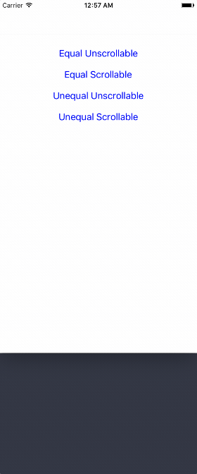
截图
使用 Swift 4 构建的易于使用的 Tab 滚动 ViewController
如何安装
使用 CocoaPods
- 将此行添加到您的
Podfile中:pod 'ELTabScrollController' - Swift 3.* 使用 3.0.0 版本 pod
- Swift 4.* 使用 4.* 版本 pod
- 使用终端运行
pod install - 然后一切就绪!
简单添加
- 使用浏览器打开 Elenionl/ELTabScrollController
- 下载或克隆项目:
https://github.com/Elenionl/ELTabScrollController.git - 将
ELCustomPickerView.swift和UIKit+EL.swift文件复制到您的项目中 - 享受使用
如何使用
如果您想在应用程序中显示 Tab Scroll ViewController,只需执行以下两个步骤
- 初始化
class TabScrollController: ELTabScrollController {
    // MARK: - LifeCircle
    init() {
        super.init()
    }
或指定宽度和类型
class TabScrollController: ELTabScrollController {
    // MARK: - LifeCircle
    init() {
        super.init(width: 200, type: .equal_scrollable)
}- 添加条目,包括可以管理按钮和按钮关联的 ViewController(包括视图)
override func viewDidLoad() {
  super.viewDidLoad()
  let ctrl1 = ViewController(nibName: nil, bundle: nil)
  let ctrl2 = ViewController(nibName: nil, bundle: nil)
  let ctrl3 = ViewController(nibName: nil, bundle: nil)
  let ctrl4 = ViewController(nibName: nil, bundle: nil)
  let item1 = ELTabScrollItem(title: "Tab 1", image: nil, viewController: ctrl1, view: nil)
  let item2 = ELTabScrollItem(title: "Tab 2", image: nil, viewController: ctrl2, view: nil)
  let item3 = ELTabScrollItem(title: "Tab 3", image: nil, viewController: ctrl3, view: nil)
  let item4 = ELTabScrollItem(title: "Tab 4", image: nil, viewController: ctrl4, view: nil)
  items = [item1, item2, item3, item4]
}
ELTabScrollController 类型
有四种类型
- equal_unscrollable
- equal_scrollable
- unequal_unscrollable
- unequal_scrollable
equal 表示所有按钮宽度相等
unequal 表示按钮宽度与其内容大小相关
unscrollable 表示标签的宽度等于 ELTabScrollController 的宽度
scrollable 表示标签的宽度可以大于 ELTabScrollController 的宽度。标签可滚动
若想使用子ViewController的其它视图
    let ctrl1 = ViewController(nibName: nil, bundle: nil)
    let item1 = ELTabScrollItem(title: "Tab 1", image: nil, viewController: ctrl1, view: ctrl1.tableView)
由切换触发的处理程序
- 当页面切换时收到通知
self.switchHandler = { (index, type) in
    print(index, type)
}- 日志如下所示
2 buttonTap
2 buttonTap
3 buttonTap
1 buttonTap
1 buttonTap
0 scroll
0 scroll
1 scroll
按钮可自定义
- 带标题和图片的按钮
let item4 = ELTabScrollItem(title: "Tab 4", image: UIImage(named: "image"), viewController: ctrl4, view: nil)- 自行自定义按钮
public init(button: UIButton, viewController: UIViewController, view: UIView?)ViewController易于自定义
override func viewDidLoad() {
  super.viewDidLoad()
  self.title = "Demo"
  tab.backgroundColor = UIColor.orange
  sliderView.backgroundColor = .white
  container.backgroundColor = UIColor.lightGray
  tabButtonHeight = 66
  sliderViewHeight = 10
  buttonFont = UIFont.boldSystemFont(ofSize: 18)
  buttonSelectedTitleColor = UIColor.white
  buttonNormalTitleColor = UIColor.lightGray
  switchHandler = { (index, type) in
    print(index, type)
  }
}
可用的设置和处理器
// MARK: - Settings

open var tabBarType: ELTabBarType = ELTabBarType.equal_unscrollable

/// Distance between buttons. Default value: 30.0 for scrollable, 0 for unscrollable.
open var tabSpacing: CGFloat

/// The zoom factor for buttons, only available in scrollable tabs. Default value: 1.05
open var buttonHorizontalZoomFactor: CGFloat = 1.05

/// Items containing buttons and viewControllers
open var items: [ELTabScrollItem]! = []

/// The width of the base view. Default value is screen width
open var width: CGFloat! = UIScreen.main.bounds.size.width

/// Triggered by switch behavior
open var switchHandler: ELSwitchHandler?

/// Height of button
open var tabButtonHeight: CGFloat = 44

/// Hight of slider
open var sliderViewHeight: CGFloat = 5

/// Font of button
open var buttonFont: UIFont?

open var buttonSelectedBackgroudColor: UIColor?

open var buttonNormalBackgroudColor: UIColor?

open var buttonSelectedTitleColor: UIColor?

open var buttonNormalTitleColor: UIColor?
需求
- Xcode 8.X
- Swift 4.X
- 使用ARC
- iOS 9.0
待办事项
✅ 更多标签样式❎ 更多滑块样式
作者
徐汉平 (Elenionl), [email protected]
许可协议
ELTabScrollController遵循MIT许可协议,有关更多信息,请参阅LICENSE文件。