
Swift 编写的 Material Design 风格 iOS 下拉菜单。


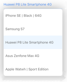
演示
在您的控制台执行 pod try DropDown 并运行项目以尝试演示。要安装 CocoaPods,请在您的控制台运行 sudo gem install cocoapods。
安装📱
自 2.3.13 版本以来,DropDown 支持 Swift 5.0。自 2.3.4 版本以来,DropDown 支持 Swift 4.2。
如果您需要 Swift 4.0,则请使用 2.3.2 版本。
- 手动:使用标签
2.3.2 - CocoaPods:`pod 'DropDown', '2.3.2'`
- Carthage:
github "AssistoLab/DropDown" == 2.3.2
CocoaPods
使用 CocoaPods。
- 将
pod 'DropDown'添加到您的 Podfile 中。 - 通过运行
pod install安装 pod。 - 在想要使用
DropDown的 .swift 文件中添加import DropDown。
Carthage
使用 Carthage。
- 创建一个名为
Cartfile的文件。 - 添加行
github "AssistoLab/DropDown"。 - 运行
carthage update。 - 将构建好的
DropDown.framework拖入您的 Xcode 项目中。
源文件
在您的项目中使用 DropDown 的常规方式是使用嵌入式框架。有两种方法,使用源代码和添加子模块。
添加源代码
添加子模块
- 在你的终端中,
cd到你的顶级项目目录,输入以下命令:
$ git submodule add [email protected]:AssistoLab/DropDown.git通过直接添加或使用子模块获取源代码后,请执行以下步骤:
- 打开
DropDown文件夹,将DropDown.xcodeproj拖入你的应用程序项目的文件导航器的应用程序项目下。 - 在 Xcode 中,点击蓝色项目图标,然后在侧边栏的“Targets”标题下选择应用程序目标,导航到目标配置窗口。
- 在窗口顶部的标签栏中,打开“构建阶段”面板,展开“目标依赖”组,在弹出窗口中,通过点击
+在 DropDown 图标下添加DropDown.framework。同样,您也可以在“通用”标签下的“嵌入式二进制文件”中添加DropDown.framework。
基本用法✨
let dropDown = DropDown()

// The view to which the drop down will appear on
dropDown.anchorView = view // UIView or UIBarButtonItem

// The list of items to display. Can be changed dynamically
dropDown.dataSource = ["Car", "Motorcycle", "Truck"]
可选属性
// Action triggered on selection
dropDown.selectionAction = { [unowned self] (index: Int, item: String) in
  print("Selected item: \(item) at index: \(index)")
}

// Will set a custom width instead of the anchor view width
dropDownLeft.width = 200
显示动作
dropDown.show()
dropDown.hide()重要⚠️
别忘了在 AppDelegate 的 didFinishLaunching 方法中添加
DropDown.startListeningToKeyboard()以使下拉菜单在显示键盘时处理其显示,即使第一次显示下拉菜单。
高级使用🛠
方向
下拉菜单可以通过此设置显示在锚点视图下方或上方。
dropDown.direction = .any使用 .any 当有空闲空间时,下拉菜单会尝试显示在锚点视图下方;否则,如果下方空间不足,则显示在上方。你可以通过使用 .top 或 .bottom 进一步限制可能的显示方向。
偏移
默认情况下,下拉菜单会显示在锚点视图上。如果您希望在方向为 .bottom 时将其显示在锚点视图下方,您可以像这样指定一个偏移
// Top of drop down will be below the anchorView
dropDown.bottomOffset = CGPoint(x: 0, y:(dropDown.anchorView?.plainView.bounds.height)!)
如果将下拉菜单方向设置为 .any 或 .top,您也可以像这样指定显示在上方时的偏移
// When drop down is displayed with `Direction.top`, it will be above the anchorView
dropDown.topOffset = CGPoint(x: 0, y:-(dropDown.anchorView?.plainView.bounds.height)!)
请注意这里的负号,这是用来向上偏移的。
单元格配置
格式化文本
默认情况下,下拉菜单中的单元格使用 dataSource 的值作为文本。如果您想为单元格设置自定义格式化的文本,可以像这样设置 cellConfiguration
dropDown.cellConfiguration = { [unowned self] (index, item) in
  return "- \(item) (option \(index))"
}
自定义单元格
您还可以创建自己的自定义单元格,从您的.xib文件中。例如,就像这样
您可以在项目中查看一个具体的示例(访问 ViewController.swift,第125行)。
为此您需要
- 创建一个
DropDownCell子类(例如 MyCell.swift)
class MyCell: DropDownCell {
   @IBOutlet weak var logoImageView: UIImageView!
}- 创建你的自定义 xib(例如 MyCell.xib)并在其中设计单元格视图
- 在 xib 中将单元格与你的自定义类链接
- 至少在你的 xib 中有一个标签,将其链接到代码中的
optionLabelIBOutlet(《optionLabel》是DropDownCell的属性)

- 然后,您只需要这样做
let dropDown = DropDown()

// The view to which the drop down will appear on
dropDown.anchorView = view // UIView or UIBarButtonItem

// The list of items to display. Can be changed dynamically
dropDown.dataSource = ["Car", "Motorcycle", "Truck"]

/*** IMPORTANT PART FOR CUSTOM CELLS ***/
dropDown.cellNib = UINib(nibName: "MyCell", bundle: nil)

dropDown.customCellConfiguration = { (index: Index, item: String, cell: DropDownCell) -> Void in
   guard let cell = cell as? MyCell else { return }

   // Setup your custom UI components
   cell.logoImageView.image = UIImage(named: "logo_\(index)")
}
/*** END - IMPORTANT PART FOR CUSTOM CELLS ***/- 那么,您就可以了!
🙆
对于完整示例,请参阅演示应用和代码。
事件
dropDown.cancelAction = { [unowned self] in
  println("Drop down dismissed")
}

dropDown.willShowAction = { [unowned self] in
  println("Drop down will show")
}
消失模式
dropDown.dismissMode = .onTap您有三种消失模式,使用 DismissMode 枚举
onTap:需要在下拉框外部进行点击以使其消失(默认值)automatic:不需要点击即可消失。一旦用户与其他东西交互而不是与下拉框交互,下拉框就会消失manual:下拉框只能通过代码手动消失
其他
您可以使用以下命令手动(预)选择一行
dropDown.selectRow(at: 3)当更改 dataSource 属性时,数据源会自动重新加载。如果需要,您可以通过执行以下操作手动重新加载数据源
dropDown.reloadAllComponents()您可以通过此代码在任何时候获取所选项目的信息
dropDown.selectedItem // String?
dropDown.indexForSelectedRow // Int?自定义UI🖌
您可以对下拉菜单的以下属性进行自定义
textFont:下拉菜单每个单元格文本的字体。textColor:下拉菜单每个单元格文本的颜色。selectedTextColor:下拉菜单选中单元格文本的颜色。backgroundColor:下拉菜单的背景颜色。selectionBackgroundColor:下拉菜单选中单元格的背景颜色。cellHeight:下拉菜单单元格的高度。dimmedBackgroundColor:背景颜色(在下拉菜单下方,覆盖整个屏幕)。cornerRadius:下拉菜单的圆角半径(如果在下方遇到任何问题,请参阅以下信息)。setupMaskedCorners:下拉菜单的遮蔽圆角。使用此属性与cornerRadius一起设置只在选择某些角时才应用圆角半径。
您可以通过每个DropDown实例或通过例如以下的UIAppearance方式修改它们:
DropDown.appearance().textColor = UIColor.black
DropDown.appearance().selectedTextColor = UIColor.red
DropDown.appearance().textFont = UIFont.systemFont(ofSize: 15)
DropDown.appearance().backgroundColor = UIColor.white
DropDown.appearance().selectionBackgroundColor = UIColor.lightGray
DropDown.appearance().cellHeight = 60专家模式🤓
在调用show方法时,它返回一个如下的元组:
(canBeDisplayed: Bool, offscreenHeight: CGFloat?)canBeDisplayed:指示是否有足够的高度来显示下拉菜单。如果其值为false,则不会显示下拉菜单。offscreenHeight:如果下拉菜单无法一次显示所有单元格,则offscreenHeight将包含显示所有单元格所需的高度(而无需滚动)。这可以在滚动视图中或表格视图中用于在显示下拉菜单之前滚动足够的位置。
问题
如果您在一行上遇到 "Ambiguous use of 'cornerRadius'" 编译错误:
DropDown.appearance().cornerRadius = 10请使用
DropDown.appearance().setupCornerRadius(10) // available since v2.3.6需求
- Xcode 8+
- Swift 3.0
- iOS 8+
- ARC
许可协议
此项目采用MIT许可协议。更多信息,请参阅LICENSE文件。
致谢
下拉菜单(DropDown)的设计灵感来源于Material Design版本的简单菜单。
设计下拉菜单的目的是为了将其集成到我所参与的项目中

在需要更新时将进行更新,并在发现问题后立即修复以确保其保持最新状态。
我在这里工作
您可以在Twitter上找到我 @kevinh6113。
祝您玩得开心!